
Material Focus: Cuba Precinct
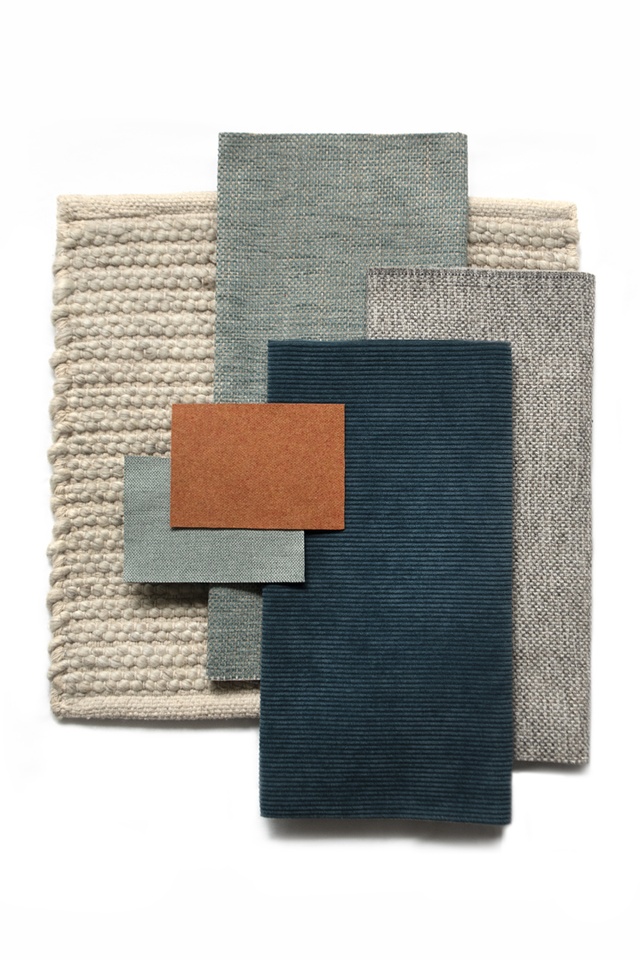
Warwick Fabrics upholstery in Bespoke Duckegg seats and Bespoke Citrus.
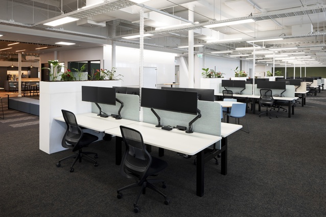
Workspace screens in Gravity Cloud and Driftwood.
Partner content: Athfield Architects associate Kim Salt was the lead interior designer on the Cuba Precinct Redevelopment project. Here, she discusses the thinking behind the fit-out of the NZIA-award-winning space for lead tenant Greater Wellington Regional Council.
What was your client looking for in the design of this interior?
Kim Salt (KS): One of the themes we incorporated was ‘the past, the present and the future’. It was developed by Greater Wellington’s inhouse branding team and Te Hunga Whiriwhiri team, which represents the partnership with the region’s six local iwi. The theme ties in well with the organisation being in a heritage building and bringing everyone together into one space, after they had been dispersed across a number of sites following the 2013 and 2016 earthquakes. The second concept was ‘mountains to sea’, referencing the physical and cultural landscape that is unique to the Wellington region; we used that as the main driver for the materiality and the colour selections
in the space.
How does the landscape analogy play out across the three levels?
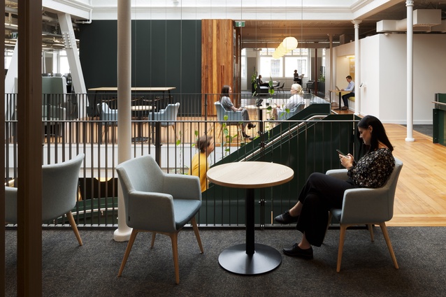
KS: The ground floor was conceived as a forest floor, with the two floors above forming the forest canopy. A large heritage skylight in the middle of the building filters dappled light down through the mixer stair and suspended planter boxes to the reception area on the ground floor. Timber features to floors, walls and ceilings are a mix of new timber and reclaimed native timbers from the original building. Reclaimed mataī was machined to create a board-and-batten lining to the lift fronts and floorboards around the lifts and mixer stair, reclaimed tōtara was used to create decorative slatted ceilings in the reception and council chambers, and the slatted timber ‘fringe’ is new hemlock. Once the façade of the building was stripped back, we found the beautiful rich-green heritage tiles of the CW Draper building, which tied in perfectly with the forest theme.
What do you consider when selecting fabrics?
KS: As a practice, we see value in selecting natural materials, including, where possible, New Zealand wool. Wool upholsters well and keeps its shape so it’s about performance as well as being sustainable and buying local.
What drove your fabric selection for the seating and workstation dividers?
KS: We used Warwick Fabrics’ Bespoke Lagoon and Citrus on the squab seating outside the lifts, as a wayfinding device to tie in with Greater Wellington’s branding, and Bespoke Duckegg on the tub chairs, to reinforce the idea of dappled light through the forest canopy and act as a foil to the rich timber and dark-green tones. The step-like pattern in the Bespoke weave is similar to the poutama pattern, which symbolises the quest to ascend to the highest level of achievement and forms part of Greater Wellington’s story. We chose Gravity Cloud and Driftwood for the workstation screens to help create groupings for the activity-based workspaces. Gravity was ideal for these dividers because of both its acoustic performance and its price point.
See more in the Material Focus series, including inspiration from the New York Grill, Naumi Hotel, Fabric Bistro and more, here.
ArchitectureNow and Architecture NZ work with a range of partners in the A&D supply sector to create appropriate content for the site. This article has been supported by Warwick Fabrics.
If your brand or clients are interested in similar creative content email mark.lipman@agm.co.nz to enquire.


