Office space: Coca-Cola
Coca-Cola’s bright-and-breezy Mexico City office was designed by ROW// Studio architects.
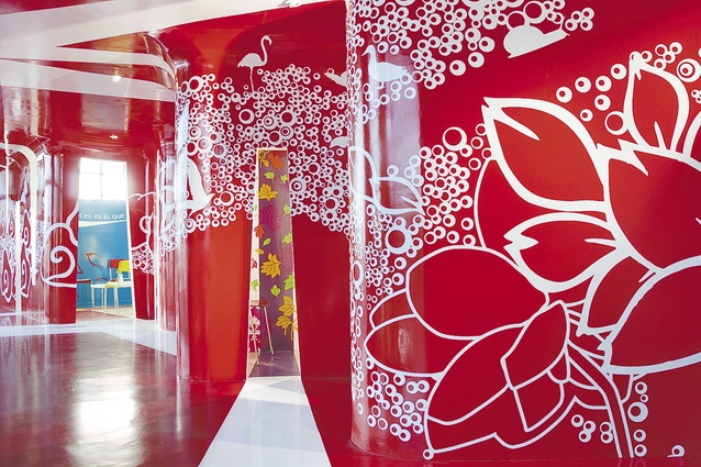
The hallways are decked with on-theme graphics featuring waves of bubbles and animals.
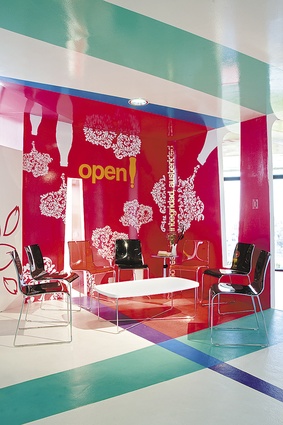
“When you’re dealing with the bright-red Coca-Cola logo, and the company’s commitment to creativity, it’s never going to be dull”
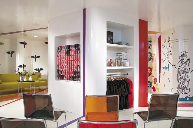
ROW//Studio’s playful theme continues with bird mobiles, a love heart made out of cans of Coca-Cola, and doodled illustrations on the wall.
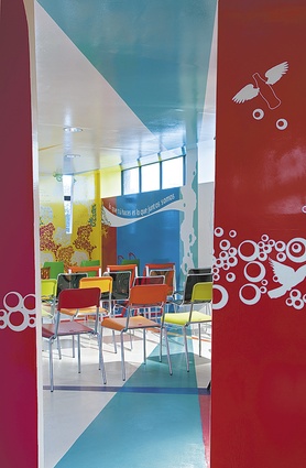
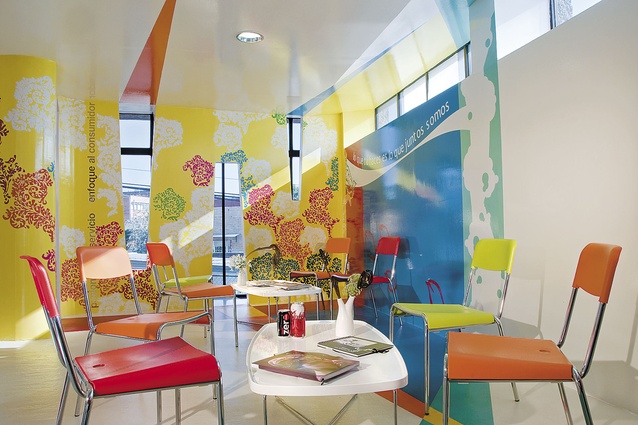
The festive training area.
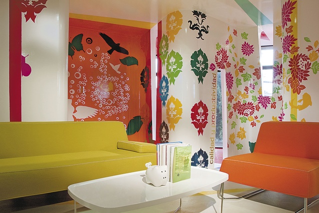
Colour is at the heart of this space.
There’s no mistaking who the client is in this bright-red office-cum-training facility in the south-western sector of Mexico City. Not only does the design include elements – effervescence and Coke-red walls – of the different brands belonging to the fizzy-drink behemoth, it also reinforces the company’s values in its moniker. It is named Espacio C, or C Space; the letter ‘C’ stands for the initial of Coca-Cola, as well as for commitment and creativity.
The brainchild of Mexican architecture and design firm ROW//Studio, the 120m2 space is used primarily for teamwork and brainstorming sessions, lectures and presentations. Hence the three rooms follow a concentric layout around a multifunctional fixed module; this allows them to be either joined together or separated out, according to need.
A key feature is the use of colourful graphics to create a composition based on the Coke logo, formed by a continuous wave of bubbles, animals and plants. According to ROW designer Alfonso Maldonado Ochoa, colour is at the heart of this space: “When you’re dealing with the bright-red Coca-Cola logo, and the company’s commitment to creativity, it’s never going to be a dull, beige space”.