On the Rise: André Bankier-Perry
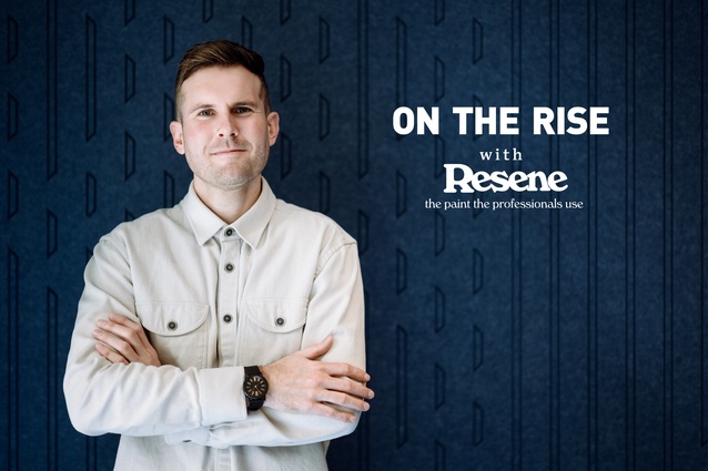
André Bankier-Perry is a Senior Associate at Designgroup Stapleton Elliott, in Wellington.
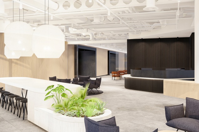
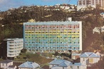
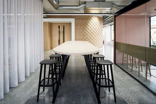
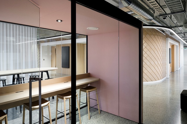
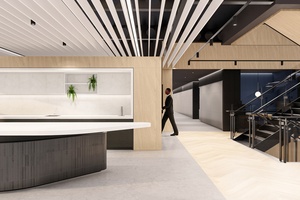
Government Agency National Premises.

Government Agency National Premises.
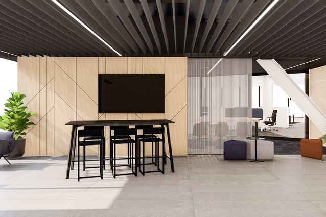
Government Agency National Premises.
Royal Commission of Inquiry (Abuse in Care) Premises.
Royal Commission of Inquiry (Abuse in Care) Premises.
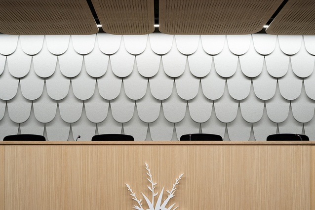
Royal Commission of Inquiry (Abuse in Care) Premises.
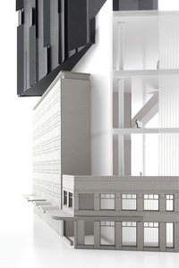
Fifeshire Bolthole Mixed-Use Development.

Fifeshire Bolthole Mixed-Use Development.
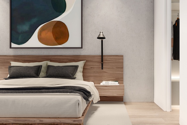
Human Rights Commission Wellington Premises.
Thesis — Bespoke Urban Factory.
Thesis — Bespoke Urban Factory.

Nodal Shift Speculative Heritage Scheme.
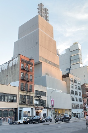
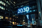
Bowery Street NYC. An example of the interesting urban configurations that capture André’s fascination.
Architectural detail NYC. André uses photography to illustrate the beauty in “slices of architectural randomness”.
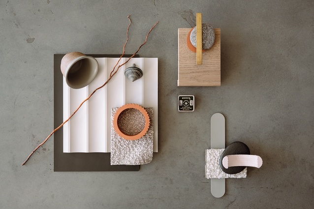
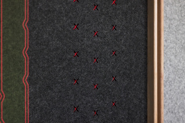
André’s flat lay features Resene Wafer, Resene Twizel, Resene Truffle, Resene Castle Rock, Resene Zeus, Resene Woodsman Canopy, and Resene Woodsman Mid Greywash.
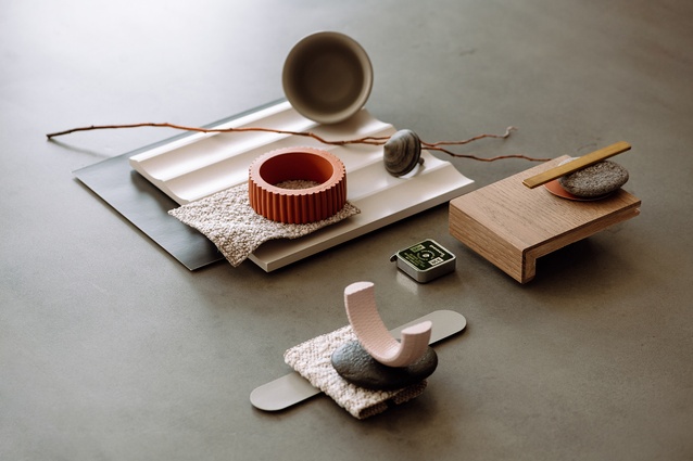
André’s chosen palette consists of colours that together exude warmth and familiarity: Resene Wafer, Resene Twizel, Resene Truffle, Resene Castle Rock, Resene Zeus, Resene Woodsman Canopy, and Resene Woodsman Mid Greywash.
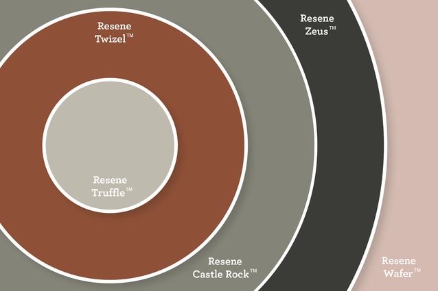
André’s colour palette uses Resene Truffle, Resene Twizel, Resene Castle Rock, Resene Zeus, and Resene Wafer.
ArchitectureNow’s On the Rise series, supported by Resene, profiles young designers from across the country who are shaping the future of the industry. In this instalment, we talk to André Bankier-Perry, a Senior Associate at Designgroup Stapleton Elliott's (DGSE) Wellington design studio about his passion for interior architecture and pushing the boundaries of design thinking.
Jacinda Rogers (JR): Firstly, congrats on becoming a Registered Architect. When did this happen and how was the experience for you?
André Bankier-Perry (ABP): Thanks, I completed my registration at the end of 2022. To be honest, it was a massive year for me, squeezing in the time to prepare my written case study after an action-packed day at work. For me, it was always a personal goal of mine to become registered, so to finally accomplish this was so incredible, not to mention a huge weight off my shoulders!
(JR): You’ve worked on an impressive array of project types, a few of which were architectural refurbishments and interior fit-outs. What is your approach to adaptive reuse?
(ABP): We often think of existing contexts as needing to have some exclusivity or heritage element to be of any true value. To me, this is not the case.
Developing a rich and appropriate architecture is about leaning into the contexts that surround a project. Some contexts may be uglier or more confronting than others, but with each existing context comes a new trajectory for a design response.
Whether physical or less tangible, there is real value in teasing out these contextual threads which will ultimately lend themselves to a richer outcome for the client.
As an architect whose projects are often contained within an existing defined boundary, there is always this process of investigation — peeling back the layers to see what we can latch onto and run with.

(JR): From reading your bio I can see that you had a passion for interior architecture quite early on. How did this come about?
(ABP): I studied at Victoria University of Wellington, majoring in both architecture and interior architecture. For me, that was a hugely positive thing, as I was empowered to explore architecture from a range of viewpoints.
I have always been fascinated with how architecture functions at a variety of scales — from the macro to the tiny — details really do matter.
Of particular interest, is the profound impact that the interior built environment has on those who inhabit it. Anything that deals directly with the human scale has the power to enhance the experience of an individual.
Whether residential, retail, hospitality, or workplace, these spaces share a powerful common thread of creating memories for those who inhabit these environments. It might be a single moment or detail, but those are the things that we hold on to.
That presents incredible opportunities for a designer (and serious pressure to get things right!).
(JR): What perspective do you take in order to navigate the process of designing such complex spaces?
(ABP): No matter the architectural typology, scope, or brief, I am continually looking to express design from a viewpoint of craft.
I focus quite heavily on the idea of assemblage — particularly at that tactile elemental level.
To truly exemplify the craft of making, architecture must be well-considered, logical, and responsive to a specific problem or environment it faces.
Interestingly, my master’s thesis somewhat dealt with this topic of craft, albeit through the lens of the consumer. Titled ‘Bespoke Urban Factory’, I asked the question; “How can the emergence of cutting-edge manufacturing technologies generate a new marketplace typology that integrates production, consumerism and public space?”
(JR): And in regard to your craft, how do you approach the design process?
(ABP): I believe in developing a strong architectural language that resonates across multiple scales of any given project. A single minute junction should be considered with as much weight as an overarching form.
However, it’s crucial not to force an idea to work. I look at the materials and their inherent limitations to get inspiration for how things may be composed.
The limitations of a structural member, sheet size, or code requirement can be a fantastic mechanism for expressing a bespoke point of view.
(JR): Are there any new ideas pervading the industry that you find are being incorporated more and more into your practice?
(ABP): Personally, I am a huge advocate for ensuring the total user experience is enhanced and meaningful.
In many of our projects, we will be asked to collaborate on a range of peripheral design items, including branding, graphic design, wayfinding, and furniture.
These elements are all very important to conveying a distilled architectural idea and language that the end user can easily grasp and resonate with.
Particularly in our workplace and public-facing projects, we are direct contributors to a person’s daily experience and well-being.
Another emerging idea is ‘social sustainability’. This is an idea that sustainable choices in architecture go far beyond material selections and energy efficiency. More than ever, we are placing an emphasis on health, wellbeing, productivity, and staff retention. Particularly in a post-Covid climate, people are expecting so much more of the built environments they so regularly frequent, which is fantastic to see!
(JR): As a Senior Associate, at DGSE what are some of your aims for your in-house project work and the wider industry?
(ABP): Working in the capacity of Design Lead, I’m constantly striving to develop our architectural responses to continue to push the boundaries of what our discipline can offer — this is something I am passionate about.
We should never default to what we are comfortable with, instead, we must continue to challenge briefs, client expectations, and the architectural interventions that come out of these explorations.
As architects, we have a remarkably unique expertise and a broad skill set that positions us to have a profound impact on the built environment and society alike. We should not take this for granted and must continue to push to create improved, more responsive, and appropriate architectural outcomes.

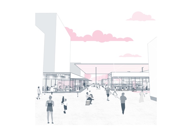
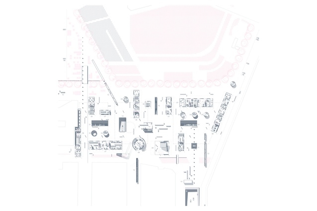
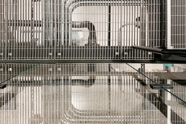
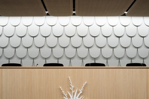
(JR): You were Project Lead for the design of the Royal Commission of Inquiry (Abuse in Care) Auckland premises. What was the process like working on a project of this magnitude?
(ABP): From the outset, there was an unequivocal significance surrounding this project. Fundamentally, we were creating a safe and inclusive environment for the people of Aotearoa to have a voice — that alone is a compelling notion that we were careful to never lose sight of.
Working collaboratively with stakeholders, we developed ideas around user equity, cultural storytelling, and affirming open-mindedness — respecting the diverse and oftentimes traumatic backgrounds of the people who enter this environment.
The resultant architecture is comprised of three distinct zones: hearing/gathering, witness/survivor, and staff/support. Our design strategy was to establish critical adjacencies within a series of organisational parameters, all the while considering the end-user interface.
One of the challenges was to create spaces that were both contextually neutral, yet welcoming and visually engaging. We landed on a somewhat restrained design expression, composed to convey softness, clarity and order. Authentic materiality, tactility and intuitive wayfinding culminate in an uplifting and equitable platform for individuals and the community.
(JR): And outside of the office, do you have any hobbies that feed into your creativity?
(ABP): When I’m not working, I love to explore.
I tend to gravitate towards heavily built-up urban places. I am just so fascinated by how a multitude of complex and often disjointed architectural ideas somehow come together to form these moments of awe.
I use photography as a way to compose these slices of architectural randomness into moments of beauty.

(JR): Lastly, tell me about your mood board. What inspired your choice of colours?
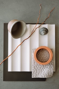
(ABP): I wanted to convey a moment in time through texture, form and colour — a record of the values of person and place in this current point in history.
Society is experiencing a renaissance with the natural. We are casting aside the austere in favour of warmth and familiarity. Perhaps in reaction to recent events, or in recognition of the world’s fragility, our built environments are expressing an earthly softness and distilled sensibility.
I’ve used a flat lay to curate a series of somewhat ordinary objects. Though simple in isolation, the amalgamation of these items tells a much deeper narrative. Enhanced by the negative space they traverse; textures and forms lap one another, bleeding with light and shadow to produce a highly tactile aesthetic.
Clays and terracottas (Resene Wafer, Resene Twizel) sit alongside the muddied greys of Resene Castle Rock, Resene Woodsman Mid Grey and gently washed timbers. Blacks are much less black (Resene Woodsman Canopy and Resene Zeus), and whites are closer to stone (Resene Truffle). In this palette, tonal variation and diversity of surface are fundamental.
In a chaotic world, there is something beautiful to be said for grounded materiality and a reductive approach to the things we create.
See more from the On The Rise series here.
Designgroup Stapleton Elliott (DGSE) is an award-winning practice with studios located across Aotearoa. Formed by a large team with diverse backgrounds and skillsets, their services include architecture, interior architecture, masterplanning, and landscape architecture. Acknowledging the weight of their responsibility as architects, a deep understanding of people, place, and culture, are at the heart of their design processes.