On the Rise: Justin Crook
Justin Crook is a graphic designer at Warren and Mahoney.
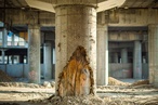
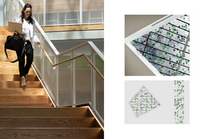
Waiparuru Hall, University of Auckland environmental graphics. Bespoke artworks and cleverly articulated wayfinding devices enhance the energy and vibrancy of the new accommodation campus. Designed in collaboration with Rob Lewis and Nick Eagles.
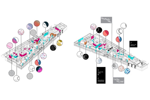
Waiparuru Hall, University of Auckland environmental graphics. The precinct sits between the urban street-scape of the city and the natural beauty of the harbour. The contrast of nature and man-made forms is the foundation for the Waiparuru Hall identity.

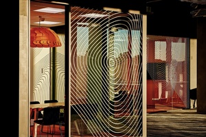
Artwork concepts for a new workplace in Auckland City – inspired by the materiality and ‘sonic-art’ concept of the interior space.
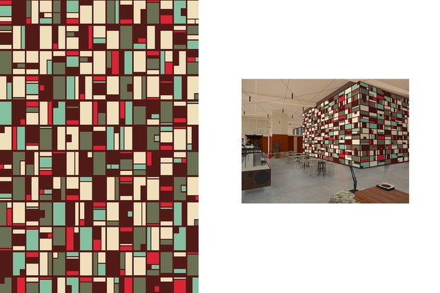
Artwork concepts for a new workplace in Auckland City – Each artwork represents a term from musical production, visualising the concept through pattern.
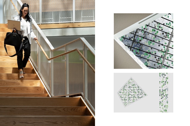
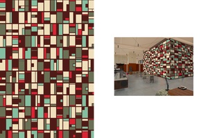
Zespri, Tauranga - Designed to replicate the dappled light experienced beneath kiwifruit vines, the frit filters natural sunlight and bounces ever-changing shadows around the three-storey atrium space below.
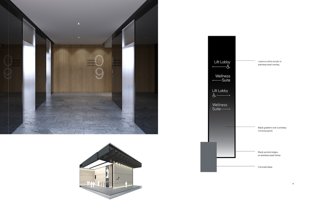
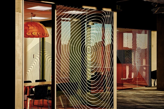
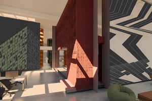
A range of wayfinding projects within Commercial Bay.
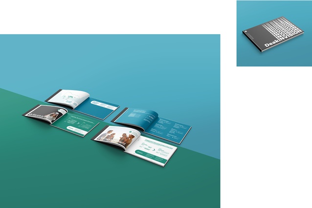
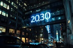
DeakINVISION – A document visualising Deakin University’s growth over the next 10 years.
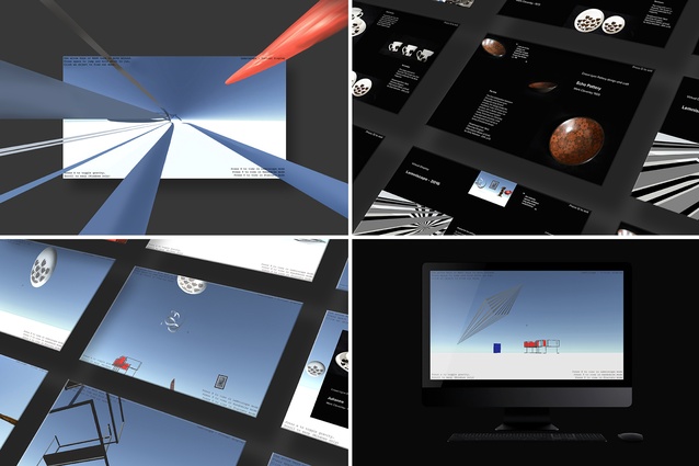
From Justin’s Honours dissertation Virtual Display Systems for Museum Artefacts - Design for the Public. Two virtual display systems, designed to offer new ways of experiencing 2D and 3D designs. These display systems seek to change the perception of design, often regarded as ‘ephemeral,’ or ‘temporary.’
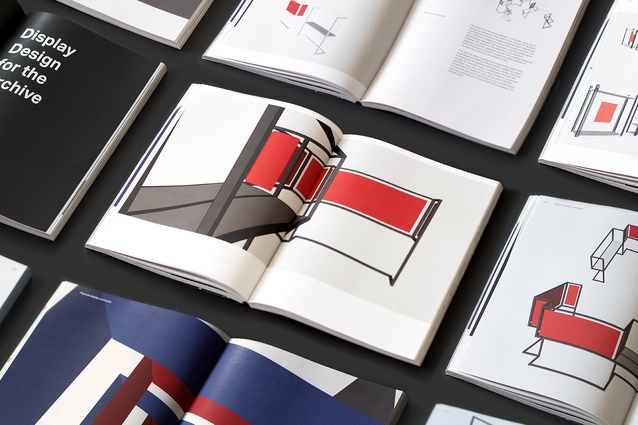
A body of work from Justin’s Honours project is presented in the form of an anthology, collecting and documenting various display concepts, findings and experiences.

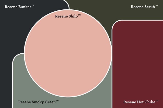
Justin’s mood board, created digitally during the COVID-19 lockdown, features Resene Hot Chile, Resene Shilo, Resene Scrub, Resene Bunker and Resene Smoky Green.
Justin’s mood board, created digitally during the COVID-19 lockdown, features Resene Hot Chile, Resene Shilo, Resene Scrub, Resene Bunker and Resene Smoky Green.
Justin’s mood board, created digitally during the COVID-19 lockdown, features Resene Hot Chile, Resene Shilo, Resene Scrub, Resene Bunker and Resene Smoky Green.
Justin’s digitally-created mood board features Resene Hot Chile, Resene Shilo, Resene Scrub, Resene Bunker and Resene Smoky Green.
This month’s iteration of On the Rise with Resene came together during New Zealand’s six weeks of strict isolation measures due to COVID-19, which meant all parties staying inside their bubbles. We thought it fitting to interview an up-and-coming young professional in the architecture industry who specialises in digital design. Justin Crook is a graphic designer for Warren and Mahoney in Auckland and, though not trained in architecture, has a keen interest in built spaces. ArchitectureNow’s Ashley Cusick spoke with him over video chat about the intersection of 2D and 3D, of art and architecture and of design and branding.
Ashley Cusick (AC): Let’s start at the beginning. Have you always been visually creative? Have you always had an interest in architecture?
Justin Crook (JC): Growing up, I was fortunate to have a mum who was pretty hands on with arts and crafts. From a really young age, I was painting and drawing and working with clay and cardboard to create little models of cars and buildings. We used to go on a lot of road trips and do a lot of camping. Instead of asking when we would get there, like most kids, I was looking at the houses that we were driving past and envisioning what it might be like to live in them. I wanted to be an architect before I wanted to be a graphic designer. I spent my time at school training to do technical drawing and learning that skill set. It wasn’t until the final year of high school where I had a subject clash and picked up design. I thought it might be the best way forward for me. So, I jumped ship and didn’t study architecture but got into graphic design.
Once I finished uni, I knew that I wanted to be involved in design of more than just 2D work and still be involved in a spatial environment somehow. [Working with Warren and Mahoney] is the perfect middle ground. I’ve found myself back in an architectural environment but as a graphic designer, where I can collaborate in both a 2D and 3D environment.
AC: Did you always envision that you would end up working for an architectural firm?
JC: I definitely knew that I wanted to do something in the built environment, but using the skill set that I’d developed in my graphic design studies. I was involved in exhibition displays throughout uni: figuring out how to arrange the space and what display systems we would use. My final honors project was focused on exactly that: how we display our projects and present them to the public. After tutoring the Design Research paper at AUT University and working at Studio Everyday, Warren and Mahoney found its way to me, and here I am almost three years later.
AC: Talk us through what kinds of things you do at Warren and Mahoney.
JC: As a graphic designer, I work as part of our branding and communications team. Part of what we do is, obviously, presenting the Warren and Mahoney brand: how we show up, what our tone of voice is, what our visual identity is, how we photograph and document our work. Another side of it is business development. That includes working with design teams to latch on to opportunities, produce submissions for design competitions and find different ways of winning work through packaging up our offering, be it a printed document or an online portfolio. The part that I think is quite unique, and that we’re starting to build more and more of, is that client-facing side of work. So, we’re starting to do branding and collateral, environmental graphics like signage and wayfinding, artwork installations and activations, design guidelines, things like that, for a range of clients. We do that across New Zealand, but also internationally, particularly when we’re competing for new projects and working with our clients in Australia.
AC: So, if you design the interiors or the base for a client, do you offer them a branding package as well?
JC: Yes, and that’s the kind of work that I’m really passionate about and wanting to do more of, is offering an integrated brand experience. If you think about an architect or an interior designer, they put in all this energy and effort to make a beautiful space. And then, the graphic design and the way that you package it up online and beyond it’s built form is the cherry on top that can either make or break a space. It can help guide your audience’s experience of the space.
AC: It makes a lot of sense, and you see some of the large global firms like Snøhetta moving into the branding and collateral space as well and even designing things like websites for clients.
JC: If you think about it working with one consolidated team, you’re not going to get anyone who has better knowledge of the project than if the graphic design team sits alongside the architects or interior designers. There is something powerful about being able to retain it all in one place and have that kind of collaboration at the core of a project.
AC: You’ve spent a lot of time working on Warren and Mahoney’s own branding and digital presence and social media. What do you think the power of good branding and a strong identity online and offline is?
JC: During my honours project in uni, I came across a reading from one of my favorite design blogs called 2 x 4 by Michael Rock. He uses the phrase, “Architecture is born and dies as graphic design”. If you think about the design process in a traditional sense – architecture, interior spaces, urban design, landscaping and spatial activations – the process is often documented and presented in a design report, either in a 2D or interactive display that’s sent digitally or in a printed document. And, the idea is that you’re trying to sell a concept to the client or even to a commercial market before the project is built. Likewise, when a project is complete, it’s documented through photographs and media, online and in publications, whatever methods are best suited to visually represent the design.
In this sense, you start to consider that the life of the built environment or the design extends beyond its physical form. You start to think about how it’s captured photographically in printed documents or in some form of a brand, digital or not. I think it’s important as a designer that we acknowledge that our audience, or the people who interact with our designs, can bring so many unpredicted factors to the table based on their own experiences, their history and their subjective views on design.
It becomes a creative dialogue where other people can embed their own meaning and understanding of a space. I quite like the idea of embracing the unexpected, or the unknown, where the way a project is received and interacted with outside of your own intent is totally up for grabs.
I think what a powerful brand, digital presence or considered documentation of a project can do is guide the interaction to ensure that people’s engagement with it isn’t dampened or misleading, but, it’s heightened and emphasized in a way that’s positive for the project.
AC: That’s probably even more true now, in an age where everything is on social media and the public can share their personal opinion and experience of a space much more readily. What has your experience with running Warren and Mahoney’s Instagram been like? How have you seen that audience engage with the content you’re putting out?
JC: I think Instagram is a particularly powerful tool for brands to curate and present themselves in a way that they can appeal to a targeted, or not targeted, audience. It means that we can effectively shape the very best of our design in a way that is visually cohesive and also potentially expose some of our processes and thoughts and ideas. It opens it up to that creative dialogue where people can start to share their thoughts and comments on the work and tag their friends. Our Instagram started to pick up probably around this time last year, and we managed to increase our following by about 5-6000 people. Part of that is just that people love to see what’s current and what’s happening. Part of it is also because you’re not everywhere at any one time. You don’t get to go to all these places and see all these projects, so you’re missing out on a lot of really incredible work. Presenting it in one place means you get a taste of it.
AC: Much of your work sits at the intersection between 2D and 3D, or visual design and physical space. How do the two work together and influence each other?
JC: All of these intrinsically creative disciplines, in my perspective, when they come together, give you more profound, long-lasting outcomes, particularly when you have interaction early-on and frequently throughout the design process. With constant collaboration between those disciplines, each with a unique perspective that they bring to the table, the results can go above and beyond what people can do independently. You end up with a more integrated result.
If you think about the interior functions of a space and how they start to inform the architectural structure of a project, likewise, you start to see how architecture integrates with landscape to create healthier and more sustainable environments. And then, you think about how art installations can be used as a way to activate a space and enable human engagement, be it with your brand or with the space itself. For me, graphic design helps elevate these projects by amplifying a sense of place. That’s through environmental graphics, like signage and wayfinding, larger format artworks and, as we spoke about before, the ways in which a space is represented beyond its built form.
AC: How does the process of integrating those elements that you might work on into a project work? When would you normally come on board?
JC: It varies a lot. Quite often it can be a little bit of an afterthought. They set up the structure and the shell of the project, and then they think, oh, there’s an opportunity here to really make something pop. I worked on the Zespri headquarters down in Tauranga where there was a massive, three-storey atrium with a big skylight at the top that let in a lot of natural light. The design team needed to find a way to filter all the light that was coming in. When we started to collaborate together, the opportunity arose to use it to create a powerful experience that welcomes visitors into the space. To do that, we tried to replicate the experience of being in an orchard, where you’re standing underneath kiwi fruit vines, and there’s all this dappled light being filtered down below and all around you. The pattern that I designed with the interiors team does just that; it creates these really cool shadows down below that move and shift with the light above and the clouds that pass through.
AC: Your job covers a lot of aspects from social media through to the more project-based work. Is there one particular type of work that you enjoy the most?
JC: I think that’s probably the best thing about my job; it varies day to day. No day looks the same. I love being able to dip my toe into a bunch of different work environments and with different design teams. I like figuring out how different processes work, or don’t necessarily work, and then choosing the best of those to make my own approach; it’s really energising.
AC: How has your design philosophy evolved in light of working with an architecture firm? Or, how has working in the built environment influenced your approach to design, whether that be 2D or 3D?
JC: I’ve been particularly inspired by the interior designers and architects that I work with and their ambitions to always realize potential beyond the brief. They’re thinking about ways to ensure that the project is future-proofed, finding ways to add extra value for the clients, but also starting to consider how they’re making positive impacts on people’s lives and the environment in which they’re working. While we all typically pursue more beautiful outcomes, it’s not just about design for design sake. And, that’s something that has really resonated with me.
The likes of Instagram and Pinterest – which obviously have many, many benefits – make it all too easy to get caught up on style and preconceived notions of form. I’m much less interested in an aesthetic-led design, or about retrofitting sources of inspiration, without unpacking what the intent of the design actually is. Something that I’ve developed while working in the environment that I do, is starting off any creative project by first understanding who you’re designing for and then figuring out why it needs to be designed. What need is it fulfilling, or what problem is it trying to solve? For me, from there, it’s about drilling into the core idea and finding the most succinct and impactful way to communicate that idea. I think that’s really been influenced by all these sectors coming together and collaborating.
Something that’s really important to me is longevity of design, and that relates to the idea of the life of a design beyond the initial intent. For me, good design should look just as good in five years as it does when it’s first finished. So, I’m not interested in following trends or being inspired directly by current culture necessarily. But rather, I’m thinking about design as timeless and thinking about how it can last. If I walk into a space and there’s a sense that it will continue to evolve and it will continue to look as great as it does now, I think that makes for a really strong piece of work – no matter what discipline, be it interior, architecture, graphic.
AC: Are there any core values in your design that never change for you?
JC: I’ve always believed in design that is purpose-driven. That’s to say that it’s inspired by ambition and with people at the core. That’s something that has been enhanced further by working in this cross-section of different disciplines.
As I said before, I’m not interested in decorative work. I’m interested in making sure that the intent is considered and its ambitions are realised. I don’t go into a project with preconceived ideas, and I never have. All of these things have continued to be enhanced through my career. I think that’s why I’ve really found my place in this role, because a lot of the designers that we work with perceive things in the same way. It really amplifies those core values and ideas I have.
AC: During the home isolation period here in New Zealand, what have been your work-from-home essentials?
JC: I’ve been fortunate where I live, there have just been two flatmates in a nice, quiet place in Herne Bay, where I can walk to the beach or I can walk around Westhaven and the waterfront. My work station soaks in the sun all day long, and I look out over the neighbours beautifully-maintained lawn.
Music has been very important for me in this kind of environment. The music depends on how tight the deadline is. We range from soothing sounds of Bon Iver, James Blake or Tame Impala to more rapid, get it done tunes like Flamingo Pier or Kaytranada. Regardless, you’ll catch me cutting some shapes while I’m working away.
My top three survival tips for working from home are to have a good playlist, maintain a healthy regime of working out and make sure that you take time away from your desk and find moments to breathe and reset.
AC: As part of our On the Rise series, we ask participants to create a mood board using Resene colours. As we conducted this interview during the COVID-19 shut down when Resene Colour Shops weren’t able to be open, we asked you to create some digital illustrations using the Resene Swatch Library. Tell us about the process behind what you’ve created and the colours you chose.
JC: The concept for this series of mood boards evolved through the use of colour in place of physical form. They explore ways in which buildings and spaces can be represented without usual materials, texture, light and shadow.
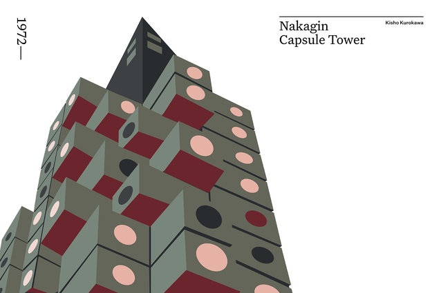
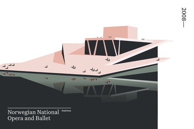
My creative practice has continued to be influenced by physical environments and forms that I grew up admiring. Falling Water, Nakagin Capsule and the Norwegian National Opera and Ballet have, in many ways, informed my approach to design: in particular, the importance of scale and proportion, the contrast of materials, and the reference of a structural grid. I wanted to see what would happen when these design elements were simplified and juxtaposed with an entirely new colour palette.
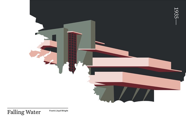
The palette is inspired by my love of 70’s interior design, attempting to balance elegant and refined tones with pops of colour that are more audacious and loud. The ‘opulent’ Resene Hot Chile is seen on the underbelly of light. Resene Shilo – ‘pleasant and young’ – has been used in place of smooth, sweeping forms and materials. Resene Scrub – a touch of ‘lichen and moss’ – reintroduces the impact on materials and form caused by nature. The ‘sophisticated and complex’ Resene Bunker blue replaces the sparkle that bounces off of glossy and reflective surfaces. Resene Smoky Green provides a ‘classic soothing’ tone that anchors and grounds the above.
In applying this palette to buildings from different eras, familiar forms of their environments are imbued with the unique traits of each colour. The overall mood and impression of the place is changed, and similarities and resemblances are enhanced.
Read more from the On the Rise series here.