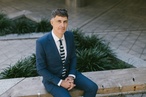
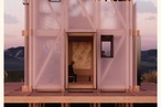
On the Rise: Micheal McCabe
Interdisciplinary designer Micheal McCabe photographed at his Kingsland home.
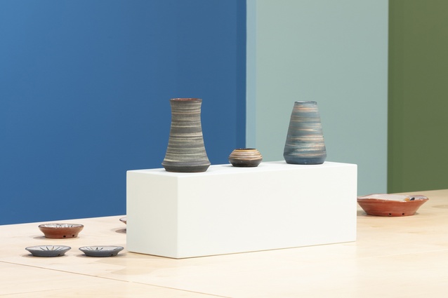
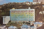
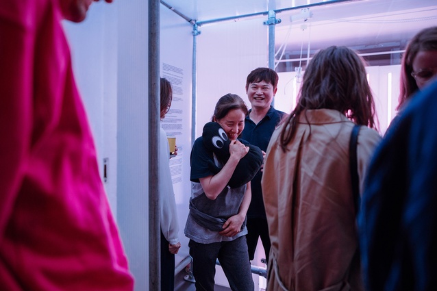
Micheal has worked on many exhibition designs with Objectspace in Ponsonby. Seen here is Elizabeth Lissaman: the Art of Pottery with Resene St Tropaz, Resene Gum Leaf and Resene Fiji Green.
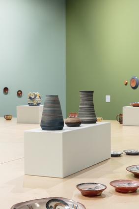
The design for Elizabeth Lissaman: the Art of Pottery featured bold colours like Resene Gum Leaf and Resene Fiji Green.
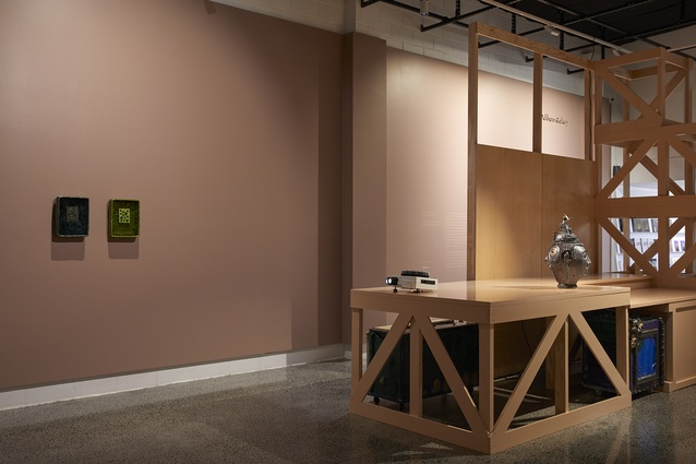
Another Objectspace exhibition that Micheal designed was Deadweight Loss, featuring a more subdued palette with Resene Hemp and Resene Flesh .
Part of the
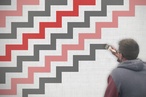
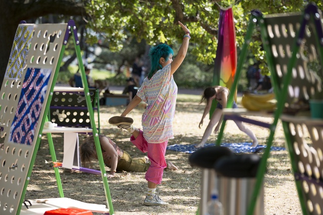
Satellites was a series of installations and activations organised by Rosabel Tan.
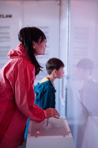
The Claw, which Micheal worked on in collaboration with Rosabel Tan, Hanna Shim, Adam Ben-Dror, Amelia Murray (Fazerdaze), Angus Muir, was part of the 2018 Satellites series.

Micheal says The Claw got him “thinking about the ways in which you can engage different communities through play and games and fun”.

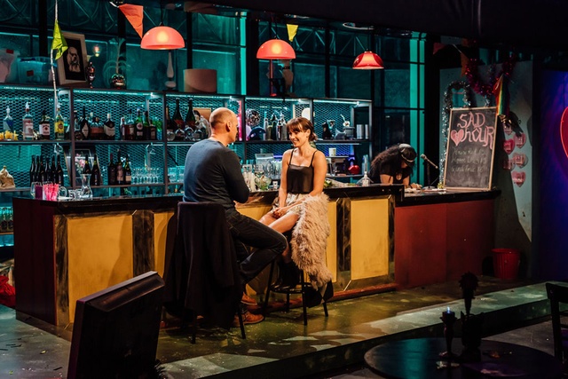
For The Blind Date Project, Micheal worked with Selina Ershadi and invoked some of his thesis research to create a lesbian dive bar set.
In making the Queer Pavilion for the 2020 Auckland Pride Festival with Richard Orjis, Micheal notes he got to directly apply the themes he explored in his thesis.
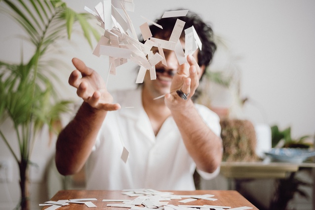
Micheal’s mood board subverts the norm of brightly coloured confetti and opts for neutrals instead. Featuring: Resene Bleach White, Resene Buttery White, Resene Half Beryl Green, Resene Merino, Resene Soapstone, Resene Flesh and Resene White Pointer.
Utilising neutrals in his mood board was a challenge, Micheal says, as he traditionally favours brighter hues.
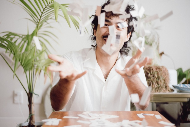
“I wanted to balance or create dissonance between these pared-back colours and an exceptionally fun gesture, like throwing confetti,” Micheal says.
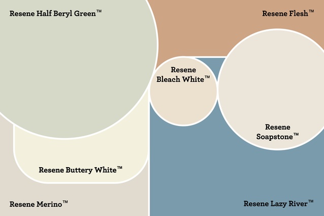
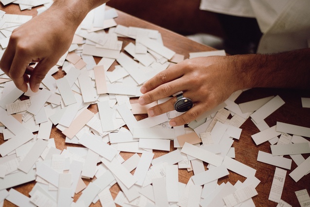
A palette inspired by Micheal’s mood board featuring: Resene Bleach White, Resene Buttery White, Resene Half Beryl Green, Resene Merino, Resene Soapstone, Resene Flesh and Resene Lazy River.
The ArchitectureNow On the Rise series, supported by Resene, aims to highlight young designers who are making their mark across Aotearoa. This month, I chatted with Micheal McCabe, an M.Arch graduate from the University of Auckland who now works as an interdisciplinary designer – creating sets, installations and exhibitions across sectors with diverse artists – and teaches at the new Architecture and Future Environments school at AUT. We talked about queer architecture, unconventional career paths, the beauty of the transitory and much more.
Ashley Cusick (AC): When did you become interested in architecture as a career? When did you decide to go to architecture school?
Micheal McCabe (MM): When I was deciding what I wanted to do for tertiary education I was very split. I was going to do law, but also applied for fine arts and for industrial design. I finally got accepted to the architecture school at the University of Auckland, so that really sparked the process for me. Throughout high school, I did lots of arts-based subjects like sculpture, painting, photography. And, I did drama throughout the whole five years and a lot of design-assisting work for the local youth theatre company up in Whangārei.
AC: Did you always have an interest in theatre?
MM: Never until high school, but within an all-boys school in Northland, it felt like a refuge.
AC: Starting at an architecture school must have been a bit of a shift because it can be quite rigid in some ways.
MM: It was definitely a shock. But, more so, it was a shock being surrounded by incredible people. It also was an incredible learning experience, I learnt so much from my friends there. I was kind of surprised by how arts-focused it was as well. My background in sculpture, photography and installation became really helpful in trying to find different pathways at university.
AC: Your thesis was based around queer architecture, or queerness in built spaces, which I feel is a conversation that we don’t have enough. Tell us a bit more about what you learned through your research.
MM: My thesis was called Tracing Steps on an Empty Dancefloor, or Nightclubs as Queer Spaces. I was about trying to think about the nightclub as a convergence point for queer people. Generally, it is one of the very few built forms that exist for queer people within the landscape of a city. It had a particular interest in the history of the queer nightclub within Tāmaki Makaurau from about the 1960s to 2016. The thesis was written around the time of the Pulse shootings in Florida, so there were these big questions around the safety of these spaces and my question – one of my questions – through this thesis was what safety is within queer space. Can there ever be safety? I did a lot of research in queer archives, so I looked at the Auckland Lesbian Archives, the Lesbian and Gay archives down in Wellington, and a lot of that was about trying to consider the many ways that people occupy the city.
I was also trying to tackle the idea, that perhaps exists outside of the queer community, that LGBTQIA+ people exist as a monolith by thinking about the ways in which queer people also perpetrate violence against queer people, or thinking about the idea of homonormativity within the city. It also explored our obligation to tangata whenua and what it means to have a club on colonised ground and ways we might tread more lightly and with more nimbleness around the city. Part of it was an installation I made and I took that as an opportunity for myself to be able to think about myself as a queer person within a traditionally masculine space and build this temporal nightclub that could break down into a set of components and be set up anywhere within the city.
AC: Was there much of a body of work around queer architecture when you decided to pursue those themes for your thesis?
MM: When I was doing my thesis it really felt like a reinvigoration of a queer theory or a theoretical agenda within architecture. A lot of it was happening in the US, but at the University of Auckland there hadn’t been an architectural thesis exploring queer theory since around 1991, I believe. I was kind of shocked by that. But, there is a lot of beautiful work around queer spaces coming out now. There is an incredible book, Queer Theory Now, which is a whole collection of new queer politics. Log is a great architecture publication that did a whole journal on the topic. During the time I was doing my thesis, there were exhibitions by the then director of Artspace [Misal Adnan] called The Bill, which was a series using the work of Fiona Clark who took a lot of the photos that I referenced in my thesis book of queer nightclubs.
It’s been amazing to see that since graduating – and, the point of me doing my thesis was to reinvigorate an inquiry around this topic – there have been many other theses in the subject matter, including some students who I have supervised myself. One was about queering within an educational framework and asking what it means to create an educational space that is safer for queer people.
AC: I was thinking about this on the drive here: We have gotten comfortable talking about diversity in the sense of women in architecture or ethnic minorities in architecture, but talking about queer people or other LGBTQIA+ issues in the industry still seems almost taboo to me. It’s strange because being queer forms such a large part of people’s identity.
MM: For sure. And, it is not because we don’t have queer people within the field. I think that the fact that there isn’t an organisation for queer people who are architectural practitioners in Aotearoa is an issue, right? It is one of those things, where, if we don’t have visibility or organisations that can champion LGBTQIA+ people within practice, what does that mean in terms of the way that we design and build environments? If we don’t articulate that position specifically, even though queer people still very much exist within practice, our built environments suffer from that.
AC: I agree. And, it is about representation as well, and other queer people seeing environments that were made with them in mind and believing they can also have a place at the discussion table. How has that research, or even just your own identity, carried over into your professional work now?
MM: It hasn’t been explicitly engaged since my thesis apart from one project that I did in 2020, working with Richard Orjis and a whole bunch of LGBTQIA+ artists from Tāmaki Makaurau to produce a temporal pavilion that easily moved around Albert Park for seven days during the Auckland Pride Festival. That allowed me to deploy some of the thinking that I had around ephemeral spaces and thinking more openly about collaboration and the idea of how you designate a blurred boundary that allows for a much more inclusive approach. Culturally, within the space of whiteness, being queer is pretty tick, tick, tick, all the boxes. But, for people who sit outside of that, it is much more of a complex idea about what it means to be visible, or open, or out. So, creating a space that has a much more diffuse that allows for passing by or passing through is a way that we can negotiate queer spaces. Before that, though, my thesis built a confidence in me to be able to go out by myself and build things. For so long, I had a huge hangup about building or making and working in traditionally masculine spaces, and that confidence has been really critical for me doing theatre work and exhibition design and public artwork.
AC: How did you get involved in freelancing? What have been your favourite parts of working freelance, and what projects have stood out to you in your career so far?
MM: I was very lucky to work at a practice for about 18 months and they were understanding of my wanting to work on other projects. So, I did some part-time work and was able to get a bit of a running start into freelancing. I feel like I should fully disclose that because freelance work is one of those things where you have to build relationships and have people that you talk to and connect to. One of my biggest jobs off the bat was Company Of Potters with Objectspace that Elisapeta Heta sort-of referred me on to, and I have been working with Objectspace and the team there ever since. It has been really beautiful in freelance being able to learn more intimately about fields of practices that are adjacent to architecture and the field of design, but you never are fully intertwined with when working in a traditional practice. You never get to literally hold a pot that is decades old and hope you don’t drop it.

From the beginning, I have also been working with theatre companies doing small jobs, to begin with, and doing projects at The Basement and then working with bigger companies doing shows at the Silo Theatre Company, Rangatira Theatre and Q Theatre. The last big show I did before the last lockdown was called Upu, where I worked with a bunch of Pasifika and Māori poets and with an anthology of contemporary poetry from the pacific and from Aotearoa. I hadn’t ever engaged with texts like that, and it really shifted the way I thought about practice and my way of working.
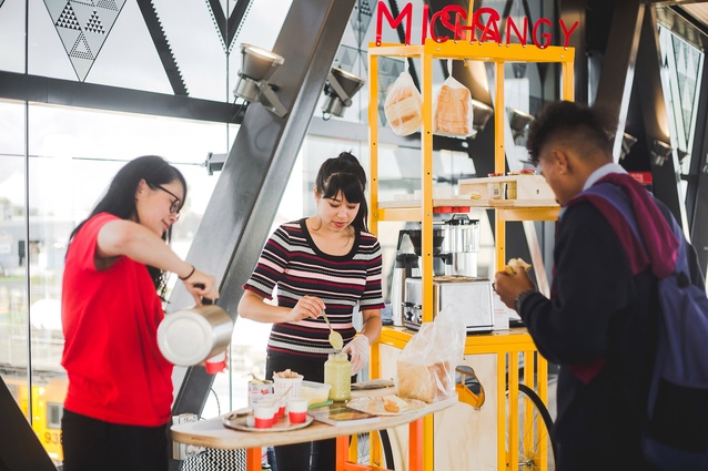
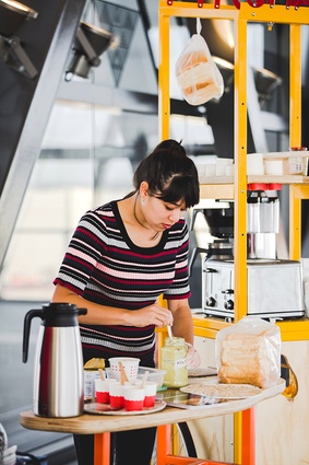
And, oh, of course, there was Satellites by Rosabel Tan, which really changed the game for me. We worked with Asian diasporic artists in Tāmaki Makaurau. The first project we did was with Ruby White, who went by the moniker Miss Changy at the time, and we made a mobile food cart that we set up around different train stations offering people different Malaysian street food breakfast like kaya toast and kopi si. The cart was meant to all stack together, but I was definitely still learning things about fabrication and it didn’t quite work out that way. I have been really lucky in freelance projects to be able to learn and grow and, at times, fail productively and be around very forgiving people. That project was eye-opening for me to be able to practice in a way that was about bringing a cultural exchange, thinking about the ways in which public art can be fun, engaging, but also political and culturally nuanced.
I also worked on The Claw project in Northcote the following year and I was mentored by Angus Muir and we worked with the soft sculpture artist Adam Haversham and Adam Ben-Dror who, at that time, was working at Alt Group, who is kind of amazing. That taught me about finding new ways to collaborate outside of a hierarchical structure of an office. I was thinking about ways that we can laterally organise, work and collaborate with each other and troubleshoot different things and also thinking about the ways in which you can engage different communities through play and games and fun.
More recently, I got to work on The Blind Date Project and I was able to use some of my thesis information. I wanted to make a lesbian dive bar and I had a lot of fun working with Selina Ershadi, who I teach alongside and who works in film and props. We had a great synergy where I do a lot of macro design and she does a lot of micro design. In general, I think working on projects is amazing, but collaborating is even more important. So the question is not so much what projects did you enjoy but who did you enjoy working with. So, I come back to Rosabel Tan, who I truly look up to and is a powerhouse in art spaces, starting The Pantograph Punch and Satellites. She has this incredible ability to bring people together and work with them in a way that bestows agency upon them. I felt I gained a lot of confidence working with her and learning what value I bring and how I work with other people and how I collaborate successfully.
AC: You’re also teaching now at the new school of Architecture and Future Environments at AUT. How is that going?
MM: It has been amazing. I think the culture of that school is really warm and generous and the students are very supportive of each other. That has been a key focus of the school: thinking about decolonisation and indigeneity and ecological systems and political action. All these things feel really urgent when we have contemporary discussions about architecture. It is an amazing place for another strain of architecture to be woven into the larger field amongst the other university programs.
AC: I think every programme attracts different kinds of students, so having a new degree offering at AUT allows a more diverse set of people to pursue architecture, which can only be positive.
MM: We definitely have a beautifully diverse student cohort and I think that is about making a programme that makes people feel seen and heard and acknowledged, and they feel that they can have knowledge or expertise to contribute to a larger conversation around architecture.
AC: Can you tell us about any projects you have coming up? And, are there any dream projects that you’d love to work on?
MM: Thinking about what I’m looking forward to is a little bit harder in the time of a pandemic. It’s an interesting challenge for people of my age in their late twenties moving into early thirties and trying to find new career pathways in a world that’s shifting so quickly. We’re asking ourselves what doors are shut to us, but also maybe what are the doors that were already open but we haven’t really looked through. One thing I want to do is keep teaching. I learn so much from my students and I hope they learn enough from me.
I am working on a show called Pinay which is set in the Kapampangan region of the Philippines in 1985 and in Christchurch during the earthquakes. It is a show about rupture and upheaval and displacement through two natural disasters: the explosion of Pinatubo, a maunga or a volcano, in the Philippines and, obviously, the Christchurch Earthquake, It talks about the story of a Filipino family and the relationship between diaspora children and their parents. It is one of the first bodies of work that really connects with my whakapapa and my mum growing up in Cebu in the Philippines as well. I have been really excited about this project because it has also been an avenue to connect back with my heritage.
Another exhibition I worked on just opened on the 13th of March, which is a Ron Te Kawa quilting show at CoCa [Centre of Contemporary Art]. I love working with people like Objectspace and CoCa because I get exposed to these people I had no idea about, like Ron, who is an incredible quilter and makes these bodies of textile work that connect people to their whakapapa. They are so joyous and fun and an absolute delight.

AC: Lastly, tell us about the mood board you created using Resene colours.
MM: My process when I select colours a lot of the time is to chop up a bunch of drawdowns to be able to create different pairings. I can never decide which colours I want to choose, so I order about twenty drawdowns in one go and then file through them. Chopping them up reminded me a bit of confetti, and my partner has a great story about when he went to Berlin during New Year’s and the waiter did a really simple but evocative gesture, which was throwing confetti on the table before they sat down. I wanted to pair the celebration aspect with tones or colours that might not necessarily be traditionally used in confetti, like neutrals. Neutrals are also the colours I really struggle to use.
So, I came up with the idea to create a whole neutral confetti, and I wanted to balance or create dissonance between these pared back colours and an exceptionally fun gesture, like throwing confetti. The idea is to explore how you can have fun with neutrals. For a long time I was colour, colour, colour, why would you ever use neutrals. And, recently, with my show Deadweight Loss, I decided to use neutrals. There are people I really look up to for their use of colour, like Katie Lockhart, who has chosen every single amazing colour combination you can do. But, I thought, she doesn’t do neutrals, so maybe that can be my thing.