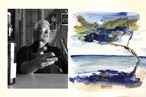
Colour Collab: Dajiang Tai
As a principal at Cheshire Architects and project architect for one of the country’s most elegant hotels, The Hotel Britomart, Dajiang Tai is making his mark in the world of interiors.
Your designs are a magical mix of whimsy, sophistication and an organic, handcrafted aesthetic. Who or what inspires you?
For me, one of the most important aspects of architecture is to create a holistic experience, so that there is almost no difference between interior design and the building itself. The hope is always to create a seamless transition from outside to inside, from sitting on a chair or lifting a teacup.
Ideally, every moment in the experience or the object one touches speaks to the very core idea of the building design, not unlike in film director Wong Kar-wai’s movies. This might be the reason that many of the spaces or objects created for projects I have worked on feel bespoke or crafted, as I find it hard to assemble off-the-shelf products to achieve the goal of a ‘complete experience’.
Tell us about the role that colour plays in your design process.
I have always admired those masters who are extremely good with colours, like Donald Judd or Josef Albers, because I don’t feel overly confident with colour. The endless choice brings with it endless possibility and, with that, there is always the potential for a better result. That thought concerns me.
In the practice of architecture, I’ve gradually developed a way of seeing colour as an abstraction of real material rather than simply a pigment to the surface. I’ve used that way of thinking as a tool to navigate space-making and this is reflected in the artwork I have produced here with Thomas.
Your collaboration is based on the paintings of Li Huayi. What is it that draws you to his work?

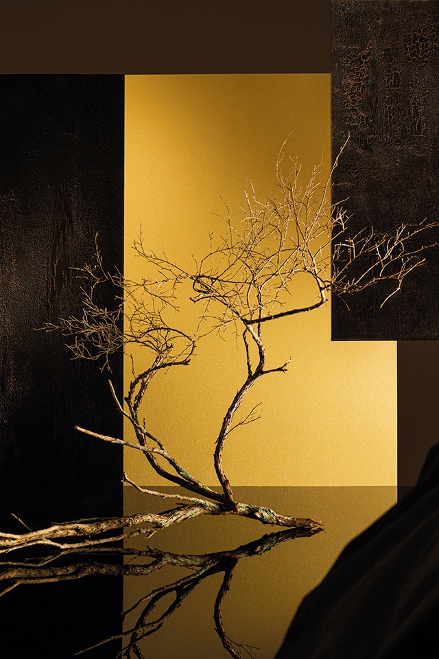
In this collaboration, I was very interested in the idea of colour versus materiality and the possible emotional connections that colour and material carry. I’ve always been captivated by the traditional Chinese or Japanese gold foil screens; they’re usually placed in dimly lit tea rooms, each one in front of a candle.
There is something very elemental about gold as a colour and its metallic nature means it reflects light softly. When a candle is placed in front of a gold foil screen, the reflection of candlelight becomes amplified by the golden glow and begins to define the space in front of it, in the midst of a dark room.
Li Huayi’s recent gold foil painting series, integrating gold foil with ink and brush strokes on silk, produces a unique luminescence, evocative of these screens.
Tell us about your choice of colour.
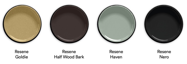
The gold, Resene Goldie, is one of Resene’s metallic range and it’s a delight to play with. I find gold is very beautiful when balanced carefully with darker tones such as Resene Half Wood Bark and Resene Nero, especially when golden light shimmers into the depth of the shadows. This is what I find in Li Huayi’s paintings.
He uses the organic structure as a way to re-composition the golden canvas and the dark brush strokes to break the glow subtly into small shimmering pieces. There is a great Resene paint system called Resene FX Crackle, which allows the top layer of paint to have a cracked finish. This effect gives the dark colour selection depth and lets the golden glow find its way into the cracks. Resene Haven forms the moss on the kanuka branch and it adds a sense of life and fragility to the composition of calm, dark tones and the burst of energy from the golden glow.
I find that very beautiful.
See more from the Resene Colour Collab series here.
ArchitectureNow works with a range of partners in the A&D supply sector to source appropriate content for the site. This article has been supported by Resene.