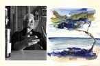
Colour Collab: Felicity Brenchley
Specialising in residential new builds and renovations, artist and architect Felicity Brenchley brings a client-centred, collaborative approach to her projects, working with simple composition, proportion, materiality, colour and texture.
How did you come to specialise in residential architecture?
I’ve always been fascinated by people and I love the intimacy of working with clients to design their own homes. I look to understand them and then enjoy collaborating with them to produce bespoke outcomes that are suited to their ways of living. I’ve also spent much of the last 10 years designing, renovating and building homes for myself, which has really helped hone my design skills and given me the ability to speak from personal experience.
You recently won a Resene Colour Award for your work. What role does colour play in your design process?
Much of my work focuses on materiality, colour and texture. I love anything handmade or well-crafted that tells a story of its creation and connects you to those involved in its making. I build my colour palettes starting with any natural materials that feature in the design, such as timber, concrete and brick, followed by key interior features, such as tiles, door hardware and lighting — selecting quality items that will endure beyond trends. Paint colours and fabrics are used to pull a scheme together and I often take more risk with these as they can easily be changed in the future.
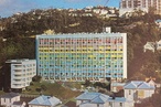
The colour award was for the home I spent five years renovating myself — a classic Titirangi mid-century beauty with exposed timber rafters and lots of windows. In the living area, I balanced the lightness with Resene Jurassic, a deep green that also referenced the surrounding bush. The remaining walls were Resene Concrete, with Resene Half Merino ceilings, giving a calm neutrality to the bedroom wing.
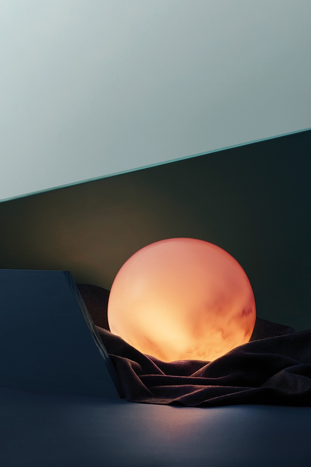
Your collaboration evokes an image of the first light at daybreak. What was the thinking behind it?
I was inspired by the ritual that anchors me in a ‘being’ state each morning. I head outside to practise Qi gong, yoga or breathwork, or take a simple soak in my hot tub; this grounds and connects me with my body, my intuition and my creativity before I start to overthink, overwork and overdo. My favourite mornings are those when the sun is rising over the hills near my home. As I step outside, the colours of the sky are calming and awe inspiring.
By engaging in this morning routine, I’ve vastly altered my mental landscape from one of feeling not good enough, which led to overworking, chronic stress and anxiety, to a deep knowing that just being here, in this moment, is enough; I have nothing to prove. I still actively work towards my goals but I approach work differently, allowing days to unfold as they will, without trying to achieve everything at once.
“Architecture has the ability to inspire moments of presence, beauty and connection in the same way that the sunrise does. …Spaces that allow for human connection or quiet corners for reflection, buildings can add a sense of ritual to the routines of daily life.”
I aim to sit in that space of creative flow for as much of the day as possible. Architecture has the ability to inspire moments of presence, beauty and connection in the same way that the sunrise does. Whether that’s a window-framed view, the play of light and shadow throughout the day, spaces that allow for human connection or quiet corners for reflection, buildings can add a sense of ritual to the routines of daily life.

How did you choose the colours?
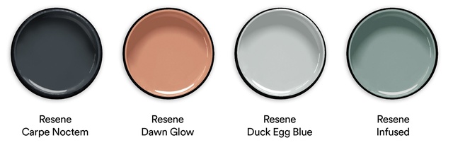
The colours I’ve selected connect me to the sky at dawn. The deep blue of Resene Carpe Noctem is a reminder of the vast and limitless potential of this universe. The lighter hues of Resene Duck Egg Blue and Resene Infused represent the progressive dawning of the new day, the colour shifting moment to moment until day is upon us: a reminder that every moment is an opportunity for renewal, to begin again, over and over. The pinky-orange hue of Resene Dawn Glow is our first glimpse of the sun bringing warmth and light to our planet; without it, life here would be impossible. These colours remind me of everything I have to be grateful for.
See more from the Resene Colour Collab series here.
ArchitectureNow works with a range of partners in the A&D supply sector to source appropriate content for the site. This article has been supported by Resene.