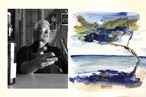
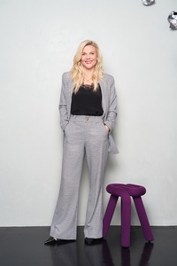
Colour Collab: Liv Patience
Material Creative co-founder Liv Patience is known for the elegant, inspiring spaces she and her team create for clients around the world — from residential to hospitality, workplace and more.
How did you come to choose a career in interior design?
Liv Patience (LP): I grew up in a family where my parents would renovate houses and then sell them. I lived in about five or six houses growing up. My mum was constantly moving things around and updating furnishings and paint colours and, as a teenager, I loved to rearrange my bedroom — it was my idea of a ‘reset’. I was also surrounded by incredibly creative people and family friends so it was only natural that I ended up in design. I have my mum to thank for that. Most of the subjects I took at school veered off into the creative although I wasn’t consciously thinking about it at the time. It wasn’t until I was 18, when a friend of my brother’s told me that I should take up a career in interior design, that it all made sense to me. I’ve never looked back.
How does colour come into play in your work?
Liv Patience (LP): I do believe that one gathers their ‘palette’ over their lifetime. This priceless advice was given to me in my 20s by a fiercely creative friend. She told me we gather colours as we go; look at the way you dress, the things you’re drawn to, the places you travel to. They all inject a little influence over the colours that you end up loving. After hearing that, I’ve been much more conscious of the colours and materials that I love. I’ve really refined my palette and have a much better understanding of it now that I’m older but I’ve also been very intentional about it.
The same goes with the work that I create — I try to get to the heart of the person I’m designing for, to understand who they are, what drives them and what they have gathered over their lifetime. Colour brings character, personality and joy. Nature is full of colour and we go into nature to relax. I feel quite passionate about this. New Zealanders tend to love living in a world of white because it can be safer but, every time we’ve brought colour into a project we’re working on, the client loves it and often asks for more.
What influences your work?
Liv Patience (LP): Travel has a big influence and I love seeing what other designers are doing overseas. Our work at Material Creative can be quite adventurous and I’ve found some international designers who are kindred spirits, doing work that inspires me greatly. I love vintage furniture, decorative elements and different materials, and I find inspiration in natural stones, handmade tiles and craftspeople.
At the moment, I’m very influenced by the chalet in France where I used to work, its amazing timber work and the timber work in Pierre Yovanovitch’s projects. I’m drawn to French architects and design. I lived in France for some time in my 20s and it feels like my ‘spirit’ country — I love so many things about it. I love Laura Gonzalez’s work as well.
What was the thinking behind your collab?
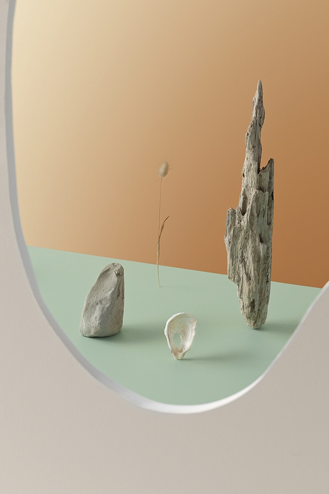
Liv Patience (LP): I started with the reference of the Mountain House that my husband and I are doing up near Ohakune. During winter, there was this incredible frost that came overnight. It was sparkling silver and white on the pale-green lawn early in the morning and it was the most beautiful colour palette. It reminded me of a Christian Liaigre project with a green onyx bathroom that I adored. I loved it so much that I’ve used it in a recent project of ours in the States. I also wanted a soft tonal and textural palette because that reflects where I am at the moment as a designer and the colours I’m using.
Tell us about your colour choices.
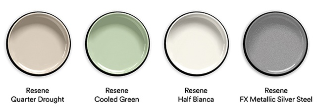
Liv Patience (LP): It felt very natural to incorporate a tone of green into my scheme because green has always been a favourite colour and, over the years, I’ve gravitated towards different hues. Right now, I’m loving a minty, citrus tone like Resene Cooled Green and I’ve paired this with soft creams, Resene Half Bianca and Resene Quarter Drought, and the sparkly Resene FX Metallic Silver Steel to pay homage to that frost.
See more from the Resene Colour Collab series here.
ArchitectureNow works with a range of partners in the A&D supply sector to source appropriate content for the site. This article has been supported by Resene.