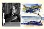
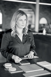
Colour Collab: Tessa Pawson
Senior associate and interior design lead at Peddlethorp, Tessa Pawson is passionate about creating bespoke and individual experiences for clients across the hospitality, residential, retirement and workplace sectors.
What inspired you to choose a career in interior design?
My dad is a builder so I have always been in and around building sites. When I was just 14, I had to choose the exterior and interior colours for our new family home. After a week’s work experience at an architectural practice as a teenager, I decided I didn’t want to pursue a career as an architect, even though I had a talent for drafting and visualising 2D drawings in 3D. When I arrived at Unitec, I’d decided to be a graphic designer but, in the first year of my Bachelor of Design studies, a friend exposed me to the Interior major and there was something about the work they were creating that really appealed to me. My first full-time job was with ECC and that’s where I really fell in love with great design and met some of New Zealand’s top designers. This motivated me to seek out roles where I was responsible for creating interior spaces, not just filling them with beautiful things. Ironically, what I do now is much more architectural than I ever dreamed it would be and I know as much about how a building is detailed as I do about creating a beautiful concept.
What role does colour play in your work?
Colour plays a huge part in the way I design, particularly when the budget doesn’t stretch as far as it should. I always try to be brave with colour and texture, even in my own home. It needs to be thoughtfully curated, not adding colour just for the sake of it. It also has to have real meaning for the design of a space; this could be a point of reference based on the client brief, a nod to the history of the building or to represent a clear relationship to the concept narrative. Colour creates dimension and adds personality to a space and I feel that confidence with colour is the most important skill you can have as a designer. It doesn’t always have to be a loud statement – even a subtle shift of tone cleverly located can make all the difference in an interior space.
Your collab is inspired by Moooi at Salone del Mobile. Tell us about that installation.
My first trip to Salone was in 2017. It had always been on my bucket list since working with ECC. I love Moooi and Marcel Wanders’ whimsical design and this was the showroom for their new collection launch of the year. The installation was a labyrinth of spaces, each presenting a new product of the season and the final show-stopper was the mass installation of hundreds of their pendants in a pitch-black space. The inspiration for that year’s collection was based around extraordinarily high-resolution photographs of beetles, capturing the depth and iridescence of jewelled colours in microscopic detail. It was one of my first realisations of the magic of space curation and experience-making. I recall being blown away when we walked in; we sat and observed the delight on others’ faces as they came through the door for the first time. Each space was like a new discovery, inspiring curiosity, and I think this was one of the first times it really ‘clicked’ for me – the importance of user experience and the power of a designed space to inspire.
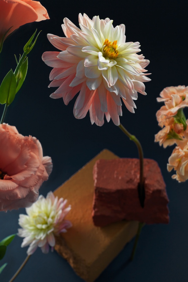
How did you choose the colours in the artwork?
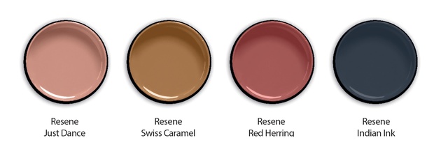
The colour selection was inspired by cues from the final room of the Moooi installation. Resene Indian Ink relates to the inky blackness that enveloped the viewer during the whole experience. Resene Just Dance and Resene Swiss Caramel are representative of the warm tones that stood out to me: the hints of brass and pink in the glazed porcelain, which glistened in the dark space. Finally, the selection of Resene Red Herring is inspired by the deep-rose tones of the Moooi printed-art rugs.
See more from the Resene Colour Collab series here.
ArchitectureNow works with a range of partners in the A&D supply sector to source appropriate content for the site. This article has been supported by Resene.