Colour Collab: Toni Brandso
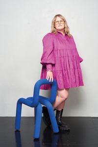
On a mission to challenge the status quo and disrupt the norm with inspiring, creative and contemporary spaces, Material Creative co-founder Toni Brandso is as colourful and full of life as the interiors she crafts.


You grew up within a particularly creative family. Did this drive your career choice?
Toni Brandso (TB): I think so. From a very young age, I had a love for sewing, art, cooking and all things creative. I was sewing Barbie clothes at age five and drawing my dream houses at around the same time. My parents always fostered our creativity. I also spent a lot of time with my grandparents and many hours in my grandad’s elaborate cabinetry factory at the bottom of their section, tutu-ing around with making turned-wood bowls, etc. It was around that age that I decided I wanted to be an architect and it seems I was driven to follow this career from then.
Material Creative is known for its often very colourful projects. What role does colour play in your work?
(TB): We love colour, and that doesn’t always have to be bright and bold. We’re drawn to using new combinations of texture and colour, and are inspired by the world around us, especially when we’re travelling. I love ‘living’ in colour and I think colour plays a huge role in helping us feel connected and enriching the spaces we’re in. Over the last couple of years, we’ve added another string to our bow and are doing a lot more high-end residential projects, bringing our unexpected design and love of hospitality to people’s homes in Mount Maunganui, Auckland, Hamilton and Portland, Oregon, in the USA.
We’re featuring Resene neutrals and also some fashion brights, such as Resene Fast Forward, to wrap wall to wall and ceiling of the most luxurious home bar and entertaining area. We recently finished Huddle Cafe. Connection happens over food and the goal was to create a space that feels slightly accidental and cosy, and has oodles of personality so we used Resene Big Bang and Resene Daredevil. It’s a space where everyone is welcome — locals, sportspeople and spectators, businesses, destination drop-ins and families on the weekend. It’s situated on the edge of Colin Maiden Park, a 20-hectare sportsground, so we injected a sports aesthetic by using bold marmoleum forms on the floor, powder-coated mesh (like in a locker room), and stainless and block tile accents. A custom resin block at one end of the counter and on some of the tables playfully references the bold colours and patterns in sports gear and equipment, adding another layer of repetition to the space in a quirky and interesting way.

Your collaboration is dynamic and full of movement. What shaped it?
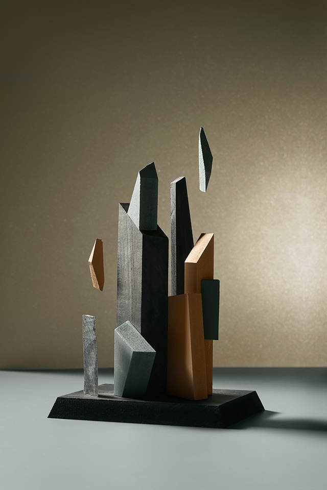
(TB): It’s based around my favourite things, either made by or gifted to me from my family. The first thing that came to mind for this project was an oil painting my dad did in his 30s of a rock out at sea, with the waves crashing against it. It has a cubist, almost sculptural feel in its composition and reminds me of the works of Bruce Beasley and Andrew Stonyer. I have a quilt that my mum made for me, which is composed of hundreds of angled pieces of fabric, and I also have my grandad’s art deco walnut side table, which he made in the 1970s; it has veneer parquet inlays at the corners. All of these pieces, on reflection, have beautiful angles and movement that bring them together in dynamic ways.
Tell us about your colour choices.
(TB): I pulled colours from all the aspects of my inspiration and added some metallic hues, being the magpie that I am. My father’s 40-year-old painting was a mix of dusky browns and a blue-grey sea so I chose Resene Salted Caramel and Resene Inside Back to touch on those colours. Mum’s quilt has a range of pink, mustard and deep-chocolate shapes on a cream background — the Resene Crowshead reminded me of the dark elements. And my nana left me a beaten-copper sculpture of two hands in prayer. I’ve loved it since I was a child and, when the light catches it, it has a nearspiritual quality. I referenced this with Resene Gold Dust.
See more from the Resene Colour Collab series here.
ArchitectureNow works with a range of partners in the A&D supply sector to source appropriate content for the site. This article has been supported by Resene.


