
Shine’s reinvigoration by Veneer
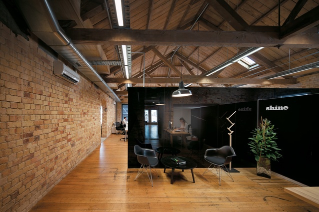
The reception area is reflected in the high-gloss storage systems built into the various spaces.
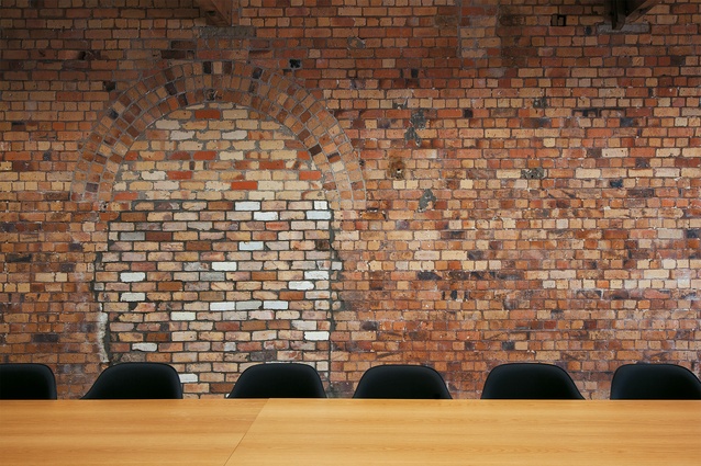
A bricked-in archway provides an interesting variation in texture.
Rips and tears in the building’s fabric were repaired during the building’s restoration by Cheshire Architects.
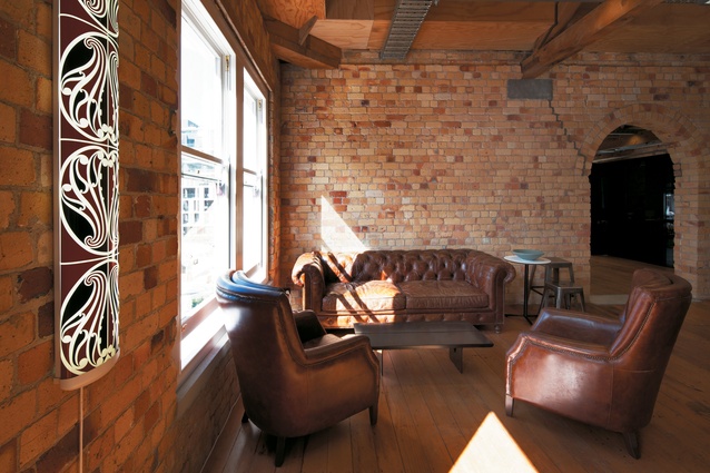
Lounge seating area alongside an artwork by Michael Parekowhai.
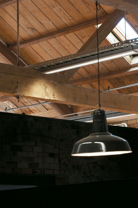
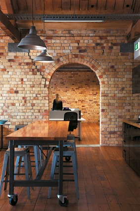
Details from the fit-out – ceiling joinery and industrial-style lighting.
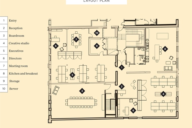
Lay out.
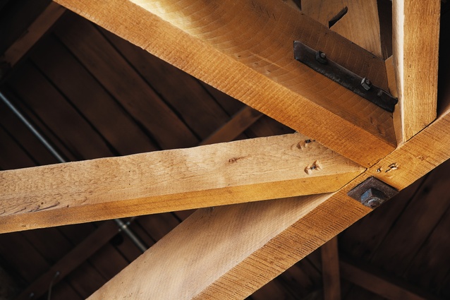
Details from the fit-out – ceiling joinery and industrial-style lighting.
Oiled wooden floors and glossy black glass divisions are highlights of this advertising agency fit-out in a recently reinvigorated Britomart heritage building.
Shine’s offices at the Britomart precinct have a sense of laid-back glamour, without ever trying too hard. Kirsty Mitchell of Veneer has used a light touch to overlay an utterly modern fit-out in a building with a very strong sense of history.
The historical Stanbeth House was built in two halves. The first, facing Customs Street East was built in 1885, and the Galway Street-facing half was built more than 20 years later. Natural light streams in the original windows from each street frontage, and from skylights that add further life and drama to the timber ceilings. As part of the base fit-out by the owners, the amazingly textured brick walls were given a protective coating, and the floors oiled ‘to smell like a cricket bat’, as visitors sometimes note.
Taking up the whole top floor, and straddling the two halves of the building, is the office of advertising agency Shine.
“The philosophy of the project was always to honour the original building and leave it as untouched as possible,” Mitchell explains. It is with this in mind that cabinetry boxes, like oversized pieces of furniture, were designed to house all the “functional office stuff”, without touching the shell of the building. Like a game of hide-and-seek, the cabinetry designed to conceal is the most striking feature. Super glossy black panelling reflects the brickwork beautifully, bouncing the image delicately around the space, and back on itself.
These storage devices also serve to break down the larger spaces without interfering with the high volume of the ceilings, or reducing the feeling of expansiveness. In addition, they delineate the space within the office, which is made up of four distinct rooms, each with a clear separation of function: creative, accounts, boardroom and rest space.

Beautiful arched brick doorways are a particular feature, although even more charming is the defunct opening that has been bricked over, and sits behind a hugely generous boardroom table by Simon James. New openings are simply plastered in but, because of their honesty, don’t look out of place. Doors that have been inserted as part of this project are sympathetic to the old, in stained oak and Georgian wired glass, although they are unashamedly modern at the same time.
Cable trays skim over the bottom chords of the exposed trusses, and lights are slotted in between. These rather industrial elements are entirely appropriate to the building’s history – at different times in its history these premises have housed a wool store and produce merchant. Retro industrial light fittings from Flotsam & Jetsam complete the picture, hanging from the ceilings and sitting on desks.
The furniture selection is effortless in style: ‘beat up’ leather sits comfortably alongside new in the same space as a custom-made leaner with industrial castors and an artwork by Michael Parekowhai. The kitchen’s cabinetry pieces are finished in a similar glossy black. Here, a custom-made recycling receptacle sits easily alongside the obligatory ad agency beer fridge, pool table and dartboard.
With other tenants in this building including a bar and a private club, it’s fair to say Stanbeth House has taken on a new lease of life. This lively fit-out, sensitive to the history of the building while not compromising modern values, is the perfect addition.


