
Writ large: Albert Park House
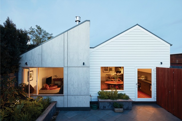
The raw-finish cement sheet cladding on the new volume was chosen for its “honesty” and the contrast it provides to the weatherboard of the original home.
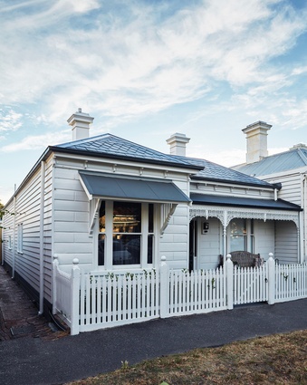
The original Victorian cottage, built in the late nineteenth century, had remained largely unchanged.

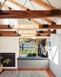
In the living room, the garden has been raised to the level of the daybed to create a reading nook that feels quasi-tropical.
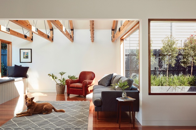
The new living volume is shaped by a series of curious timber trusses.

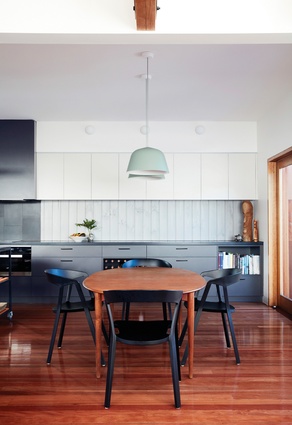
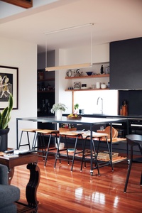
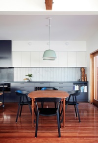
An island bench topped in concrete terrazzo sits confidently under a slender suspended light.
Colours and materials have been carefully considered and the palette is free from bling.
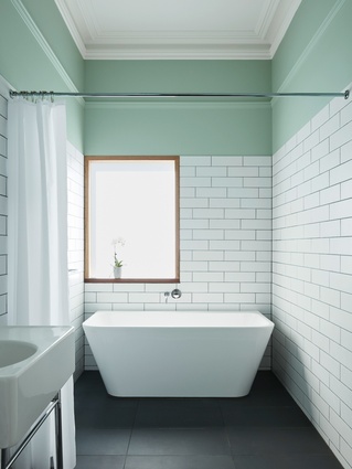
Black tiles used for the bathroom are also used on the kitchen bench, revealing an interest in unitized materials.
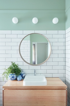
The green paint chosen for the bathroom, also referenced in the kitchen pendant lamp, assists in creating a tranquil space.
In remodelling a typical double-fronted Victorian terrace in Albert Park, Claire Scorpo Architects designed a home that unexpectedly ended up smaller than it started, but created comfortable, useable areas.
The scale of a project often correlates inversely with the architect’s ability to maintain some quantum of restraint. Whether it’s a forced and inevitable fussy minimalism (which somehow only serves to make a small space feel even less unhabitable), or the pursuit of an abstract and parametrically driven geometry (which inevitably overtakes the project and becomes the veritable elephant in the room), the inclination to squeeze into a tiny brief as many architectural doodads as possible is seemingly a very tantalising one.
Thankfully this isn’t always the case, as Albert Park House by Claire Scorpo Architects demonstrates. Here, the overt “hand” of the architect has been eschewed in favour of clever interventions and well-conceived new spaces realized with simple, “honest” detailing that respects the scale and character of the existing house.

The project is a familiar one: refurbish and remodel a typically picturesque double-fronted inner-urban Victorian terrace on a long and narrow block, fix the poor solar access and, nearly always, relieve it of the accumulated horrors of piecemeal lean-tos. This time the site is in Melbourne’s well-heeled suburb of Albert Park, with a home that had remained largely unchanged since it was built in the late nineteenth century.
The brief, as given to practice founder Claire Scorpo, was more like a mantra than a wish list. “Everything gets used – no dead space.” This was surprisingly general, given the client had spent several years ruminating over the addition before seeking the advice of an architect. In that time, the client hadn’t imagined what Claire would propose, that the project could end up smaller than it started. Claire admits that this was the project’s first (and biggest) hurdle, however, a reduction in floor area wasn’t the goal, just a result of “making sense of the plan” to create usable areas.
The original house was typically Victorian, with the rooms lined up like soldiers heading into battle and a ’90s extension, which had living areas hugging the fence and facing due west. The original plan created an awkward L-shaped yard, too narrow in both “legs” to be used for anything consequential. In response, Claire proposed that the house be pulled back from the rear boundary by relocating the laundry, which had previously cut off access to the garden.
A new living area was then added off-axis to create an internal L-shaped space. This one simple move resulted in a whole suite of benefits. The first was the bisecting of the outdoor space into an internal courtyard and a rear garden. Claire notes that these external areas “were thought of as rooms just like the internal spaces, with usable proportions, not just the result of what the architecture leaves behind.”
The two gardens now comfortably accommodate outdoor settings and provide opportunity to create myriad outlooks from in side the house. Claire, who finds the idea of a single hero view of the backyard “troubling,” uses the analogy of an art gallery: “Would you rather have just one knockout painting in the gallery, or a lot of little masterpieces?”
This is best exemplified in the living room, where the garden has been raised to the level of the daybed, with the dense foliage planted up against the glass to create a quiet reading nook that feels quasi-tropical – quite distinct from the window on the opposite side of room, which frames a view to the more formal internal courtyard.
Within this new living area, the volume is shaped by a series of curious timber trusses. When looking across the space from the kitchen, the botto chord of the trusses forms a closed ceiling in timber, due mostly to the scale of the hardwood members and their close spacing. This plane is set at 2.1 metres, a surprisingly low datum used throughout the project, referencing an existing picture rail and used to compress and “humanize” the tall Victorian ceilings. Once you’re standing under the trusses the space expands dramatically, revealing a hidden volume with a clerestory window that captures eastern sunlight in the morning.
The colours and materials have been carefully considered and the palette is free from bling. Black tiles used for the bathroom floor are also used on the kitchen bench, while the large island bench is similarly topped in simple concrete terrazzo tiles. This interest in unitized materials is also present in the external cladding of the additional volume, sheathed in raw-finish cement sheet, which Claire prefers for its “honesty” and the contrasting it provides to the weatherboard of the original home. There is also delight taken in the opportunity to artfully arrange the expressed joints in the panels.
Albert Park House, a study in the judicious use of the basic elements of architecture, compression, volume and natural light, shows how quickly a modest project can be transformed to become something very special, no smoke or mirrors required.
This article was first published on ArchitectureAU.com.


