Airport dreams
Melanie McDaid explores the new Novotel Christchurch Airport, designed by Warren and Mahoney, which takes its cues from its geographic context.
[Editor’s note: This article was published in Interior magazine prior to New Zealand’s Level 1 lockdown period. We recognise the effects that COVID-19, international border closures and subsequent lockdown periods have had on the hotel and tourism industries and acknowledge that fact, figures and opinions may have changed since the time of writing.]
Sitting prominently in the Christchurch Airport campus area, this hotel project by the team at Warren and Mahoney is both a seamless extension of the arrival into Christchurch and the unique and picturesque South Island, and an “engaging and hospitable” presence within the wider airport zone.
“Creating a strong narrative of place was essential,” explains Angela Pelham, who headed the interior team. This is reflected in the layered design of the hotel, coupled with the materiality and spaces that celebrate the special character and qualities of the South Island, and its unique colours and textures. The design team has successfully created this sense of place by “interweav[ing] rawness with refinement” and, as a consequence, it would be hard to imagine you were anywhere else in the world when you were experiencing the spaces of this hotel.
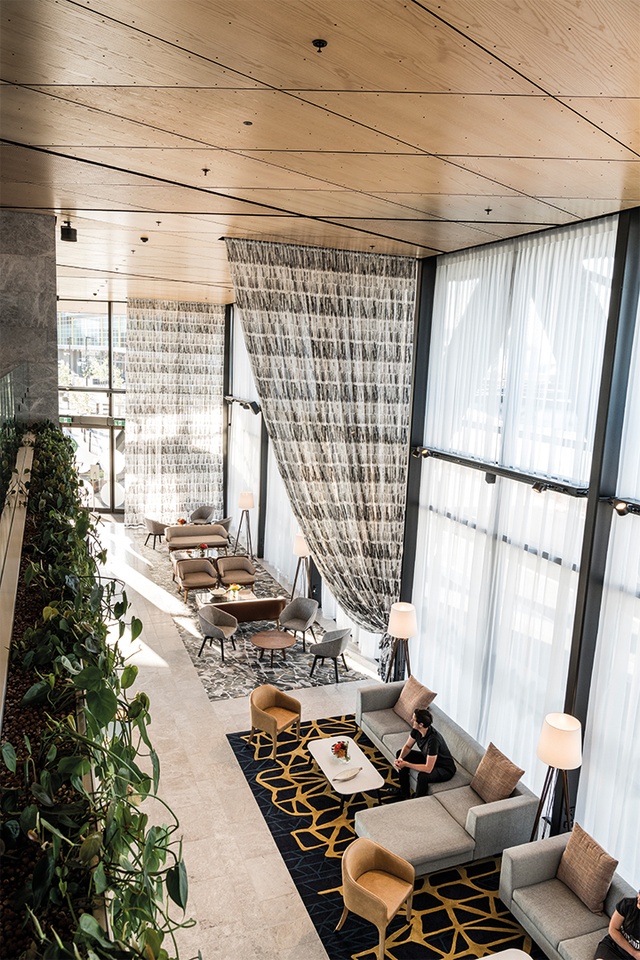
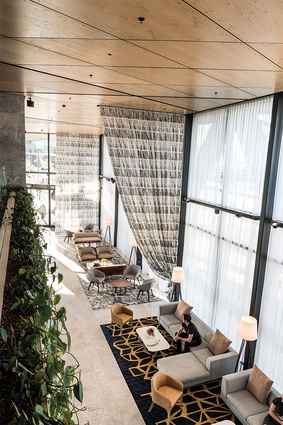
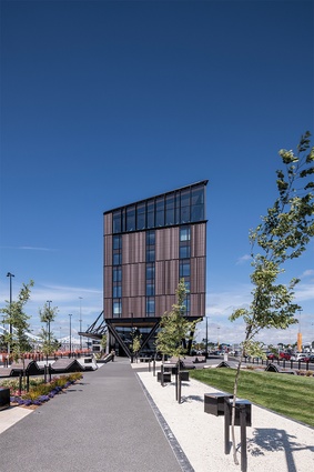
Distinguishing itself from the glazed, silver and grey airport terminal buildings, the exterior of the hotel is clad in warm terracotta and has engaging timber soffits. A double-height foyer is the first experience of the interior for guests and offers multiples spaces for checking in, relaxing, socialising, meeting, eating and drinking. Pelham elaborates: “The ground floor consists of lobby space, a café, office space and [back of house] services. The mezzanine incorporates break-out space open to the lobby below, a suite of meeting rooms, a gym and staff amenity.” There is also an outdoor courtyard and a mezzanine above it.
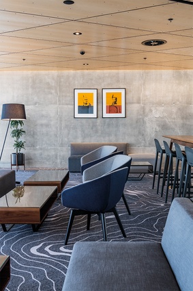
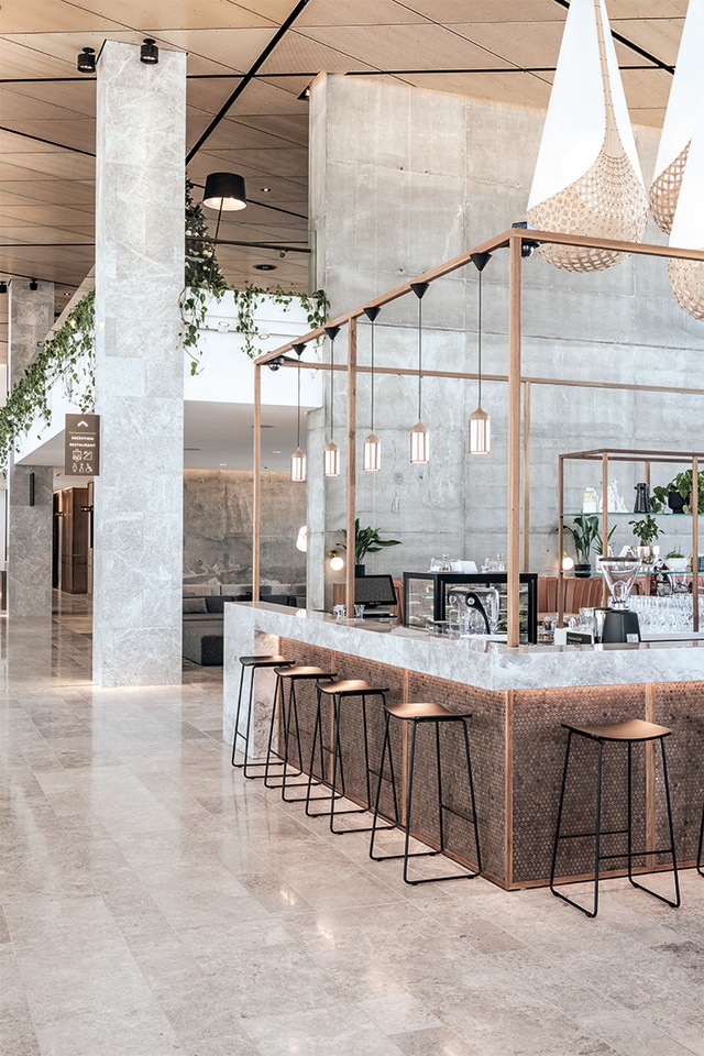
Furnished beautifully (with custom-designed furniture, manufactured by Hadi International with Warwick Fabrics), the lounge areas and an outdoor courtyard offer plenty of spaces in which to relax. Standout pieces are the shiny, warm pendants (Steven Banken’s Copper Lamp No.1 from ECC) in the lobby café and simple, angular bar stools by Harrows. Each of these spaces within the ground floor and mezzanine “explores a slightly different theme, tailored to the experience,” explains Pelham.

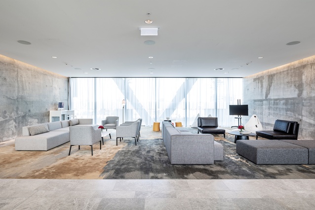
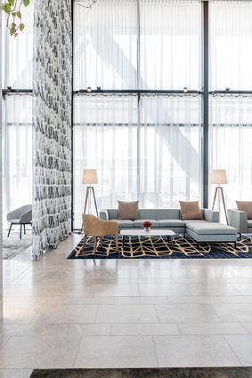
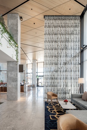
“The lobby is open and light with a soft, neutral backdrop of grey tundra, concrete and timber, giving emphasis to the feature rugs, timber joinery and furniture. The exaggerated double-height space, expansive timber ceiling and soaring sheer walls ensure an impressive arrival experience,” says Pelham. Other big-idea moments on the ground floor include: “exposing the sheer structural walls as a feature element, designing the ceiling as an integral element, which extends past the building envelope, [and] creating a 6x8m custom-designed tiled mosaic artwork feature behind reception”.
Sitting alongside the grey tundra marble on the floor of the lobby are woollen, hand-tufted, custom-designed rugs by Heritage Carpets, which are favourite pieces of the scheme for Pelham. “Each rug was designed to represent the changing topography of the local landscape. Working through the hundreds of colour poms and the pile design from low loop to sheered cut was an intricate and timely process. The largest was 10x7.5m and it took at least 10 people to move it into place.”
The experience up to the room levels is warm and inviting. Pelham elaborates: “When you arrive at your floor, the level of finish continues from the lobby space.An open lift lobby with full timber panelling and grey tundra marble flooring greets you, allowing you to find your bearings and head to your dedicated suite. The long corridors are considered, with a rhythm of timber panelling and textured wallpaper. Organic land contours sweep the floor, interrupting the monotony.” To help with wayfinding, soft wall lighting and feature wall lights guide the guest to their destination.
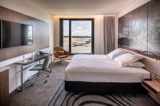
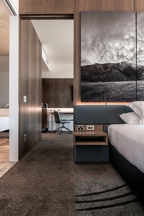
“There are 200 rooms occupying four floors from [levels] two to five,” explains Pelham, and these rooms are spacious, individual and fit in with the local theme. Each room is adorned with large graphic prints, which showcase some powerful photography of the surrounding New Zealand scenery (by John Doogan). Each of the rooms has uninterrupted views and, as Pelham explains, these views are the “first thing that grab your attention as you walk in”.
Bespoke fabric-covered chairs in greys, tangerines and mustards are scattered throughout and are paired gently with custom-stained American white oak panelling and joinery throughout the suites and rooms (a theme which is continued from the corridors). The bathrooms, with their stark white Corian vanities, “are cleverly designed with sliding panels that enable both open and private integrated bathroom facilities,” says Pelham.

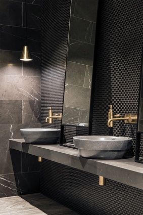
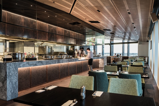
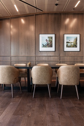
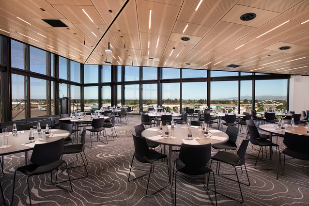
Another key feature is the fact that the bar, restaurant and conference facilities are all on the highest floor, and offer premium, panoramic views of both the Southern Alps and the airport runway. Pelham describes the sixth floor in more detail: “the restaurant and bar are an intimate space populated with cosy leather booth seating, dark flooring finishes of black marble [small mosaic hexagons] and walnut timber flooring and soft lighting. The view wraps the space and leaves a lasting impression.” The bar, restaurant and open kitchen area is modern and chic, accentuated with custom-treated burnished copper throughout, showcasing itself next to the heavily veined super-white granite.
And what is she most proud of? “The immersive quality of the design through all elements to achieve a true sense of place and identity.” This hotel has certainly taken advantage of its proximity to the airport and what has been created is a warm, rich collection of welcoming spaces, which tell a story of the place in the world where they are located.

