Colour Collab: Annabel Cropper
Her day job is that of graduate architect at C Nott Architects in Christchurch but in her time off, Annabel blends graphic and object design with curiosity and architecture for the sake of large, sculptural objects. As part of our Colour Collab with Resene, Annabel tells us about the process and how colour inspires her.
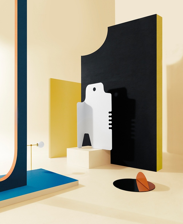
Is this recent work (pictured above, white sculpture on pedestal) part of your ‘useful sculpture’ series?
Annabel Cropper (AC): Yes, it is. Three of the pieces in the series are more vertical so I think of them as standing figures. They are intended to be a shape in their own right, as well as a partition that you can fling your coat onto.
How do you come up with such shapes?

AC: I’m interested in the design behind everyday objects such as envelopes, packaging, bread bag tags, etc. I also admire the graphic qualities of stencils and rulers, combs, and various little cast-plastic objects that we all have lying around our homes.
I started by investigating the shapes of unfolded envelopes and the relationship between the flat shape and the folded envelope. Folding Yellow and Folding White evolved from this. I then started creating my own shapes from hybrids of edges of stencils and other objects I use or find. Once I had a shape, I folded it in various ways to transform it into a 3D object.
Your day job is as a graduate architect for C Nott Architects. Do you think your sculpture and your architecture work share any similarities in form or theme?
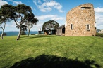
AC: I do like the idea of the monolithic form. The cut-out shape or the object cast from a mould are constants in both my art and architecture. With the Montreal Street House [winner of a 2017 Canterbury Architecture Award and the Total Colour Residential Exterior Colour Maestro award] in particular, I wanted it to appear as a collection of abstract objects, which is why I used a single colour for each. The play of light and shade on an object also informs my design work.
Although the sculpture you chose for this collab is white, the rest of your series is very colourful: how do you select those colours and what is the inspiration behind your choices?
AC: The colours work together with each playing its part: bright, rich, synthetic, earthy. For me, the green and blue are the colours of the Pacific; whereas the yellow and red are industrial, and the brown is earthy and woody. I also feel there is a fifties feel to these colours and they are influenced by artists like Joan Miró, Piet Mondrian and designers Charles and Ray Eames.
How did you come up with this Resene colour combination to counterbalance the whiteness of this piece?
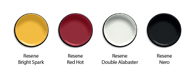
AC: I see the white as negative space, so, for this piece, the figure/field relationship is reversed. To come up with the Resene colours, I thought I’d start with my own house, which I share with my family here in Christchurch. We used Resene Bright Spark, Red Hot, Double Alabaster and Nero. I really enjoy the graphic quality of the black and white, with smaller elements, such as windows and doors picked out in red and yellow. The graphic colours and geometry of the house sit in contrast to the organic shapes and vibrant green of the garden.
I also love the clarity and freshness of Resene Picton Blue and used it as the linking colour between the red houses at the Montreal Street project.
See more from the Resene Colour Collab series here.
ArchitectureNow works with a range of partners in the A&D supply sector to source appropriate content for the site. This article has been supported by Resene.