The Sky Tower: revisited
Taken by Simon Devitt for the 20th anniversary of the Sky Tower.
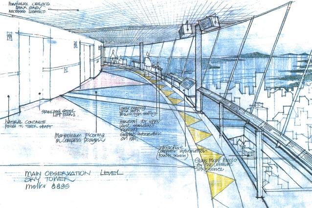
Sketch by Gordon Moller of Sky Tower’s main observation deck. August 1995.
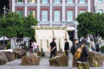
Sky Tower plaza from east, Sky City entry at left. Taken in 1997.
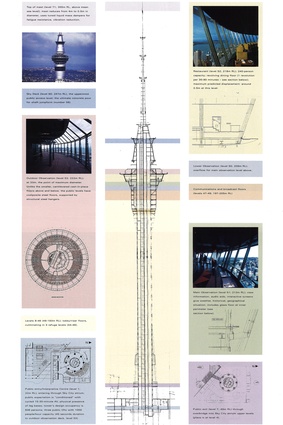
1997 diagram of the different levels of the Sky Tower. For more detail, see the PDF file at the bottom of the article.
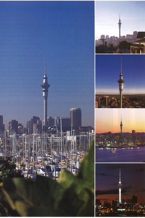
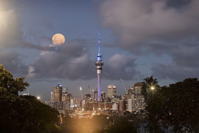
The Sky Tower from afar. Taken in 1997.
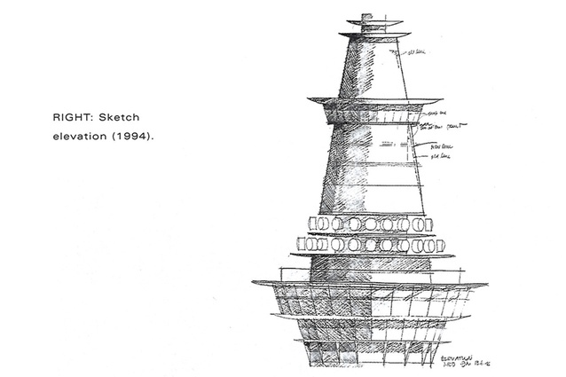
Sketch elevation by Gordon Moller, 1994.

Taken by Simon Devitt for the 20th anniversary of the Sky Tower.

Taken by Simon Devitt for the 20th anniversary of the Sky Tower.
On the 20th anniversary of Auckland's Sky Tower we revisit a review by Hamish Keith on the iconic structure, published in the September 1997 issue of Architecture New Zealand.
Vertical Challenge: Tall is as tall does? Some insights into the design genesis of Sky Tower.
Gordon Moller, a tall man, is understandably enough intrigued by heights and vantage points. The family bach at Te Horo presents itself more immediately as watchtower and rampart than crib. His choice as designer of New Zealand’s tallest structure and the world’s sixth highest tower has, therefore, a touch of serendipity about it.
Designing a public vantage point was the architect’s primary given. That, and acquiring a view that allowed the viewer to experience the Auckland isthmus and the two oceans that hold it in place. Despite its volcanic geography, a view at once of the Pacific and the Tasman is not one that the city affords. It is a view only just glimpsed from the 250m vantage point of Sky Tower’s highest public outlook. But the view from the tower is not the only view that defines the shape of this isthmus city; the view of the tower itself is equally significant.

Definitions
Towers define landscape. Sky Tower defines Auckland City. The ubiquity of the tower is a source of offence to some and of pleasure to others. (I count myself amongst the latter as, I suspect, do a majority of Aucklanders.) The offence is easy enough to grasp. Towers are territorial. They tower. They intrude and assert themselves. There is about them more than a whiff of their author’s hubris.
From a crude mountain top pile of rocks to the 553m CN Tower in Toronto, that is the nature of towers and defines the genre. Within that genre is a pretty infinite variety and some extremely elegant and some very clumsy towers.
Gravity determines two families of structure: the pile — the Eiffel and the Empire State; and the stick in the ground —Munich’s Olympic Tower and Toronto’s CN. Moller chose the latter, perhaps a culturally determined choice, given that we are by nature more likely to erect pole structures than pile up stones.

In discussing Sky Tower’s design origins Moller alludes to sticks in the ground, pou and markers. The choice that followed that design decision was then either a flexible, tensioned structure like, for example, Sydney’s Centrepoint, or the rigid, rooted structure that prevails here.
There was an important, even critical, design evolution of Auckland’s tower that followed on that choice. The original design was not unfairly described by one architect at the public hearings as “Post Thunderbirds Go”. The solid, flaring base did have rocket ship echoes to it — take-off rather than anchor.
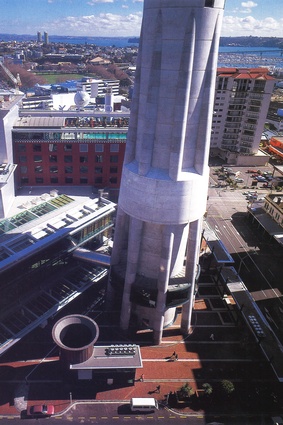
On less aesthetic grounds the city’s planners also criticised the lack of public space at the base. Moller’s solution was to open the structure into the eight cylindrical buttresses of the final design. The open and anchoring effect of these is greatly enhanced by the ring of glass around the base of the central shaft which allows a visual reading of the below-ground structure.
At the other end of the shaft, the rocket ship references were reinforced by the seamless running of the aluminium pod into the shaft. Replacing this detail with fins not only overcame the Thunderbirds problem but provided an easier transition between the silvered aluminium cladding and the concrete of the shaft. One of the design felicities of Sky Tower is in the quite different definitions of habitable areas and shaft.
In towers of similar design, there is a tendency to soften the transitions between various levels and, perhaps more critically, levels and shafts. Moller’s firmer transitions are much to be preferred and are certainly an appropriate design choice for the clear, sea light of Auckland.
While levels and shaft in the Auckland tower feel distinct, there is no feeling that the one has been pinned or spindled on the other as there is, say, in the Sydney tower. Nor is there any sense that the various levels have simply been crudely piled one on the other as there is in London’s Telecom Tower.

Not by chance
The pergola that spins out from the widest point of the tower, above the restaurant level, is not a pergola by chance. Moller intends it to refer to the way we commonly provide shelters and thresholds to outdoor spaces. There is an echo of this below the upper viewing level and in the more assertive canopy above it.
Immediately above the main pergola is the outdoor viewing level, which reinforces the reference with its elegant wooden decking recalling yacht decks and verandahs. In general the public and communication levels of the tower are enriched with negative detail. The refuge and private communication levels, on the other hand, are enclosed within the pod.
Along with those whose distaste for the tower seems instinctive, is another group of towerphobes whose response is based on vertigo. As one who has cherished a lifetime’s belief that standing on a chair was an unnecessary risk, I was originally among them and, had work not forced me up the tower, I would have remained in their ranks.
I have to report to the vertiginous, that the viewing spaces, including the outdoor deck, are of a curiously comforting scale. Comforting that is, save for the main, enclosed viewing area which, for the vertically masochistic, has areas of glass floor around the perimeter.
Like the exterior, the materials and colours of the interior are muted to a point of reticence. Intemal light levels are low, colours dark and neutral and materials succeed each other in simple but elegant transitions.
Moller’s clear intention is to let the views impress and that is an intention that largely succeeds. It is, in any case, the primary purpose of this and any tower and, while that might seem to state the obvious, the obvious has been sorely treated by the majority of architectural design decisions in this city.
Auckland, according to myth, was originally populated by giants. They were supplanted and replaced, first by fairies and then by people. Sky Tower, planted like a pin in the navel of the isthmus, restores the viewpoint of giants to the modern city. In design terms, it is a viewpoint that we sorely need.
For a detailed diagram of the different levels of the Sky Tower, see here.