Houses Revisited: Hard case
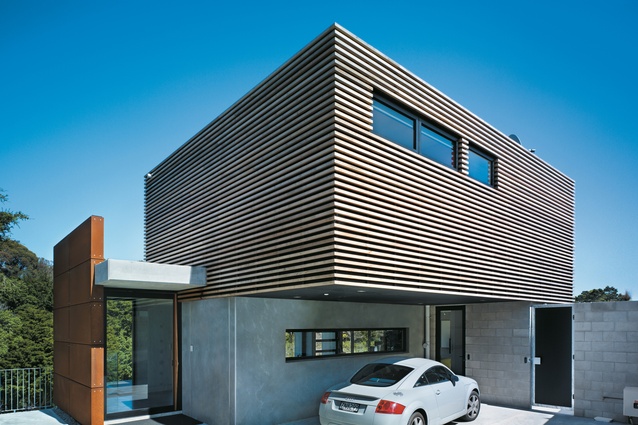
Entry and carport on the south side of the house.
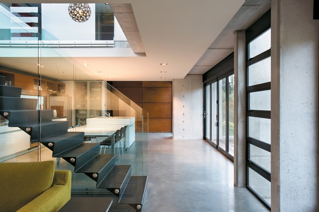
Looking past the dining and kitchen areas and out to the deck on the north side of the house.

Looking back from the dining area to the living space.
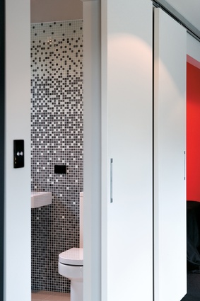
Kitchen and bathroom details.
Tough materials and flexible spaces characterise Archimedia’s Hamilton house by the Waikato River, from the Houses magazine 2007 archives.
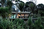
Hamilton has something of a reputation, and it’s not for design. Modern and innovative wouldn’t, perhaps, be appropriate words for the Hamilton City coat of arms. But on the bank of the Waikato River in Hamilton East, Steve King of Archimedia has designed a house that is both innovative and modern. It is a bold design statement in a quiet, leafy suburb of uniformly quaint ex-state houses. It is on the sub-divided back section of one of these houses that this house is built.
From the street, only a small portion of the house can be seen. This made the considerations of the streetscape less of a concern, says King. The top storey can be glimpsed only briefly. Directly down the drive, a tall wall of Corten steel creates the frame for two large windows that allow a large framed view of the green reserve beyond. Inside, this is a small, sun-lit gallery-style space that has been wisely left empty.
The driveway leads to a small carport in the space beneath the cantilever of the top floor, a box clad with thin cedar battens that will silver with age and blend in with the concrete surfaces and concrete blocks of the rest of the building. The entry door, behind the carport, is on the second of three levels that run down the very steep site. The door opens to a small entryway that serves as a small informal study. The absence of a garage and the small-scale entry exemplify the restraint that is evident throughout the house.
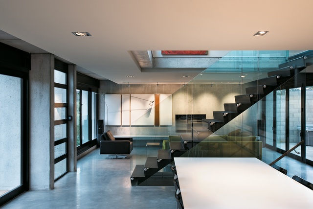
The entry is open to the plan of the whole middle floor, which incorporates the small sun bay, the kitchen, dining and living spaces and a deck. The client wanted a modern, clean house that didn’t adhere to strict uses of space. She was also interested in using industrial materials such as concrete and steel. The floor and walls in this area are concrete, polished on the floor and unfinished on the walls. The kitchen has a white island that incorporates the kind of hide-a-way laundry you usually find in small apartments. The large dining table is on wheels and is usually pushed up against the island, but it can be rolled onto the deck on the south-west side of the house for summer dinner parties.
Floor-to-ceiling glazed doors open to the deck. From here, there is a view that would normally belong to a house in the country. The site backs onto a reserve and the always-impressive Waikato river. The only clue to the proximity of the property to the centre of town is small glimpse of the road past the bush on the far bank of the river. Strengthened glass balustrades allow for the view to be enjoyed, uninterrupted from indoors as well as out.
Upstairs, there is a second, larger office space in a large room that can be used as a living space or a bedroom. The north-west facing wall has a large window to frame the view of the reserve and river. Through the square cut-out in the floor where the stairs are, light from the top floor can filter down into the living floor. It also allows for good ventilation between floors when the windows are open.
There are doors that look like a wardrobe access along one side of the room. One opens up onto a small, square, bright red double bedroom with a small window placed high on the wall. King describes the room as a bed pod. The space was designed for flexibility of use. It can be a bedroom, or it can be storage for the larger area it adjoins. Again, this is a departure from the modern trend of designing bedrooms so large they effectively become living spaces. These sleeping pods are like the boarding school-style bedrooms that children in large families might have had 50 years ago. Next to the bedroom/storage rooms, another door slides across to reveal a bathroom with a complex glass mosaic wall of black, grey and teal shades. This is a slight, but beautifully detailed, departure from the less-is-more interior scheme of the house.

On the ground floor, the layout is similar to the top floor, with another large room for living or a bedroom that is currently being used as a summer living space. On the other side of the stairs is the only bedroom in the house that couldn’t easily be converted to anything else. There is an en suite bathroom here, with long, thin, earth-coloured tiles. These tiles line the wall excavated out of the slope and were used to create the impression of the wall being cut out of rock. The second sleeping pod, painted a light brown, and another small bathroom are accessed from the lounge area. Doors lead from here to the downstairs deck and a lap pool.
The pool, which acts as a retaining wall, had to be designed and built before the house was constructed. It is a dark grey colour that is alarming for its lack of clarity, but ties in with the feel of the house better than any pop-ish blue. From the top deck, the view is completed with something of a natural waterway feel about the pool. The deck and pool get afternoon sun as they face south-west. From the reserve below, the house stands tall and strong. The levels of the house were designed for a layered effect, with the idea of strata layers. This strategy is clear from beneath the house where all the levels can be seen. On the lower floors, dense concrete runs up the site; the cedar top floor rests lightly above the concrte walls.
This house is clean and spare but not impersonal. It is an accessible kind of modern and clearly designed to the requirements and living patterns of the owner. It is a thoughtful and original house and, like the best designs, by ignoring fads it will hold its grace for a long time to come.
Click here to see more Houses Revisited. And sign up to our email newsletters to receive Houses Revisited straight to your inbox.