Sacred feathers
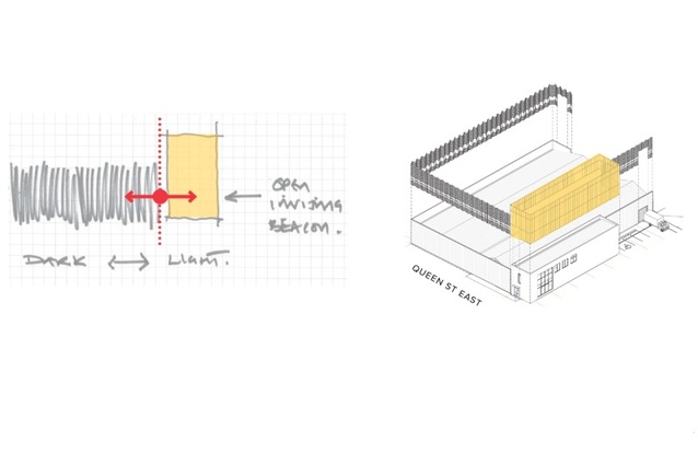
The building is conceived as two ‘houses’ — one dark, accommodating the collection, the other a light, inviting beacon.

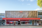
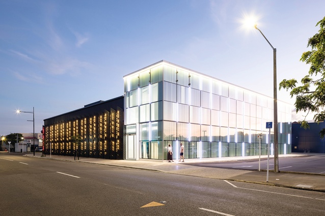
The Hastings Street North and Queen Street corner plays host to Amokura.
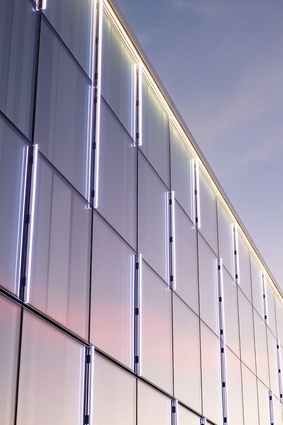
TheLighthouse is clad in a curtainwall façade, disguising the limited number of actual windows on an otherwise ‘blank’ wall.
The interior of the Darkhouse is necessarily light — the finishes make identification of unwanted dirt, mould and insects much easier.
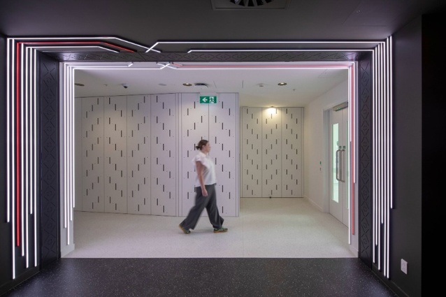
The threshold leads from the Darkhouse back to the Lighthouse.
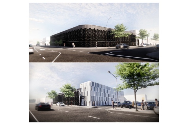
RTA’s original concept renders illustrate the two parts: dark and light.
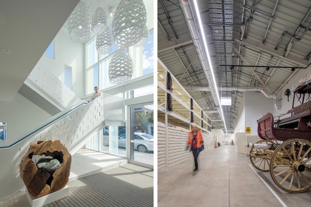
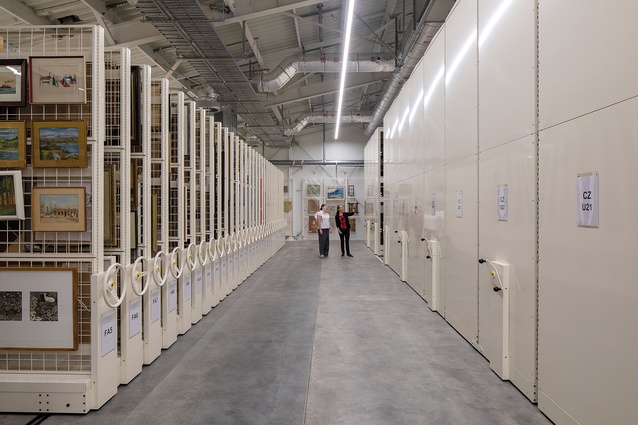
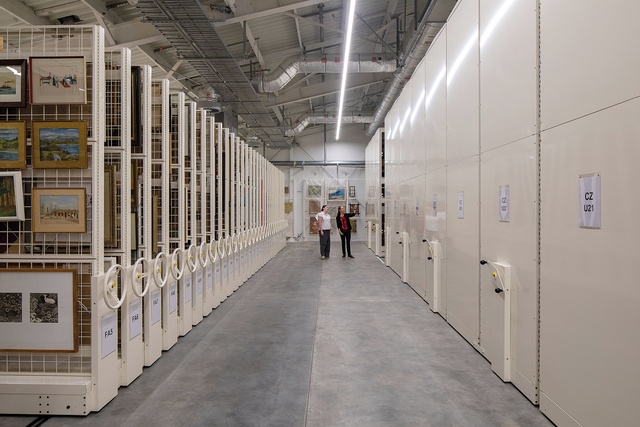
Left: The entrance foyer stair leads to staff areas on the upper level. Right: The arrangement of the collection was carefully planned by the client.
RTA’s concept and 3D modelling.
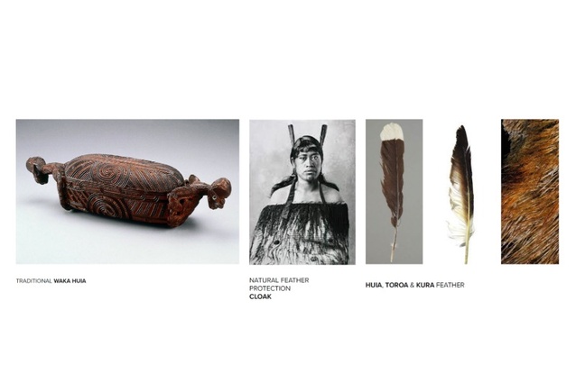
Waka huia, cloak and feather precedent imagery informed the concept design of Amokura.

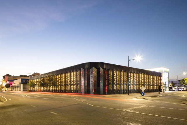
Left: The three most important feathers on the façade (huia, toroa and moa) display an inscription acknowledging the people of Hawke’s Bay, Te Iwi a Te Matau-a-Māui. Right: The folded 6mm laser-cut aluminium feathers are cleverly set off the façade to enable back lighting at night.
Jon Rennie investigates the layered mana whenua narrative and its expression in Amokura Hawke’s Bay Museum by RTA Studio.
Amokura Hawke’s Bay Museum is a new home in the centre of Hastings for the Hawke’s Bay Museum collection.
The Hawke’s Bay Museum is shared between – and funded by – Napier/Ahuriri City Council and Hastings/Heretaunga District Council. To date, the institution has been housed primarily in a storage facility in an outlying industrial park and at the former MTG, now Hawke’s Bay Museum building, in Napier.1 In 2020, this project for a new collection storage facility commenced, with an intention to improve public access to the collection of more than 90,000 artifacts and taonga.
The building’s architecture, by RTA Studio, has been developed from rich mana whenua narratives of waka huia and protective cloaks, and of Te Kura and the sacred feathers — symbols of mana, unity and leadership.
RTA had explored a number of early commercial bulk and location options for a longstanding client’s site on the corner of Queen Street and Hastings Street North – a former Briscoes store2. The client became aware that MTG was considering sites for its collection and the bulk and location was adjusted to suit their purposes and they bought the site. RTA then worked with council and vendor to refine according to its brief before entering into mana whenua consultation and further iterations of the scheme.
While a simpler response may have been to use another warehouse on the outskirts of town, it was a braver and better decision to place it in the city. It may not provide the most pedestrian activity but it does provide a destination and another reason to come into town. While engagement with the collection is theoretically possible online from home, unlike online retail shopping, it is not possible to receive a collection item in the post. So, to truly connect with taonga, a visit is required.

The site is near Hastings’ main street, on a corner site that is adjacent to a large public car park. RTA’s architectural planning concept has a simple clarity to it. The existing large ‘warehouse’ is stripped back to its primary structure and reclad as a 1670m2 ‘Darkhouse’ for archival storage, and a new two-storey, 399m2 ‘Lighthouse’ is added to provide an open and inviting beacon to the facility. This conceptual approach and the mana whenua narratives that align with it have been maintained through both the design and the construction phases of the project; the result is an architecture with mana that enriches the urban environment and gives greater access and presence to the taonga that Amokura houses.
Narratives of waka huia, pātaka and korowai for contemporary New Zealand architecture – particularly public buildings – are more and more commonly used as design generators, and RTA’s use of them – in particular the feathered korowai cloak (of which there are a number in the collection) – is not surprising. However, it is the specificity of the Te Kura narrative and its expression through the architecture, in pattern, colour (black, white and red) and texture, that connects Amokura to its place and takes the architecture far beyond pattern-making to mitigate a blank façade.
Like all great, layered narratives, the story of this project cannot be conveyed succinctly — RTA provided documents of 5000+ words from the wider project team that resist abridging. ‘Amokura’, gifted by Ngahiwi Tomoana and Ngāti Hori to the building (and ‘Kahukura’ to the existing Napier MTG building), is incompletely paraphrased as follows:
“The… names Kahukura (Napier) and Amokura (Hastings) reflect the spiritual and navigational significance of Te Kura, symbolising the rainbow, divine wisdom, and leadership, rooted in Tākitimu traditions and Heretaunga’s mana whenua narratives.
“The names tie directly to Heretaunga’s whakapapa… Kahukura reflects the guardianship of past treasures while Amokura signifies active leadership in sharing knowledge at the new Hastings collections building…
“Amokura also embodies the navigational leadership of the Amokura bird and its role in guiding knowledge-sharing at the Hastings site.”3
RTA’s most literal expression of Te Kura, Amokura and feathers in the architecture is through the feather forms affixed directly to the exterior of the Darkhouse. “The rich narratives of Te Kura and the sacred feathers, symbols of mana, unity, and leadership became the inspiration for the feather designs that adorn the building’s exterior. These designs echo the legacy of the huia, the toroa, and moa feathers, carrying forward their meaning as emblems of strength, harmony, and the enduring vision to bring people together.”4
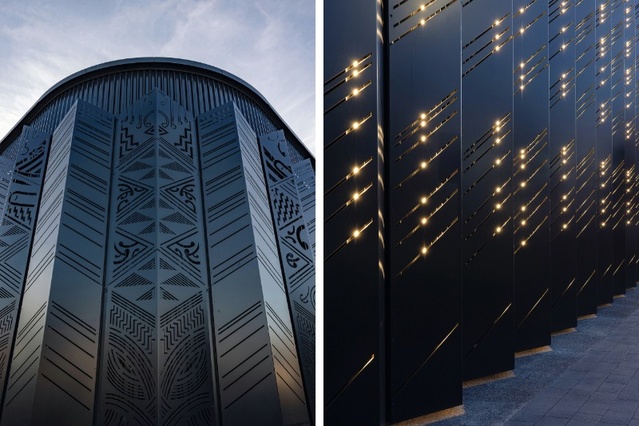
These folded 6mm laser-cut aluminium feathers are cleverly set off the façade to enable back lighting at night. Encroaching over the boundary (through cunning local knowledge of the ‘signage’ by-laws…), the feathers create a depth to the façade and a satisfying cadence to a pedestrian’s journey along the street. At a certain height, fingerprints are visible along the length of the elevation — indicating a common and repeated tactile engagement by passers-by. At the corner are placed the three most important feathers (huia, toroa and moa), with a red backlight and an inscription that acknowledges the people of Hawke’s Bay, Te Iwi a Te Matau-a-Māui.
Internally, the arrangement of spaces, sequence and journey balances the desire to connect the community with the collection and share knowledge while observing tikanga, security and environmental control requirements.
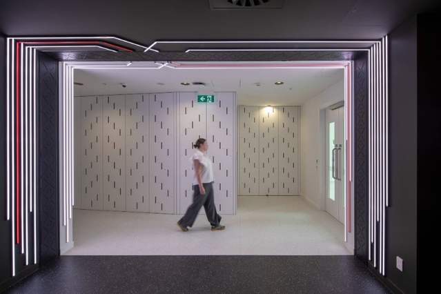
A key move has been to place the front door to Queen Street and not towards the adjacent car park While RTA is realistic about the low likelihood of the car park ever being removed for infill of the block, this design move does not preclude this occurring in future. In the meantime, the curtainwall glazing of the Lighthouse with its external lighting bling does act as a beacon, calling visitors from their cars. The front door is marked with a contemporary pare and the compact sequence of entry — pare/threshold, then wai/water and into a compressive space (that leads into the ‘Darkhouse’ or to a ground-floor Education/ Function space in the Lighthouse) — is imbued with pattern and narrative. “Here, architecture and pattern come together to reinforce a central idea: that the guardianship of taonga is an intergenerational journey.”5
The threshold into the collection is heavily articulated with pattern – poutama and pātiki – both on the doors to the archive and along the line of the seismic gap that separates the Darkhouse from the Lighthouse.

Entering the Darkhouse, the architectural concept is a little undermined by the requirements of archive facility standards to have light surfaces so dirt, mould or insects are visible. The interior is brightly lit and somewhat institutional and cold in feel as a result. Perhaps, if budget had allowed, greater variation in lighting might have enabled a ‘slumber’ mode of dimness or perhaps even moody red backlight with task lighting to specific areas when needed.
But it is only on rare occasions like this that the tight budget for a project of this ambition — challenged like most over this period by the ravages of Covid-19, lockdowns and escalation — is evident. The budget was constrained and, as it is with all public projects, it was impossible to find more funds easily or efficiently when circumstances changed, hydraulic engineers threw curveballs or detailing challenges occurred on site.
Some may question this assertion about the budget and point at the Thermosash curtainwall glazing of the Lighthouse, external feature lighting and Corian foyer finishes, and query this specification for a storage ‘shed’. But, at the urban level, the project is an architectural exercise in designing a building with few openings and little interaction between inside and out — i.e. inner-city big-box ‘retail’ — in a context where neighbouring buildings have done this very badly. RTA has worked hard to put the money “in the right places” and not only to provide a fit-for-purpose storehouse but also to improve the social and physical context through generous and aspirational architecture.
This is evident when Amokura is compared to both the adjacent City Fitness and the former Briscoes store that the new building replaced. Briscoes (viewed in Street View) faced the car park and provided no wider urban contribution. The ‘City Fitness’ (oh, the irony…) building’s street façades are a train-wreck composition of columns, cornices and pediments, slapped on the face of a big, blank box. It has the minimum glazed openings and token ‘retail frontage’ required to appease (hopefully begrudgingly) the urban designers — while its front door opens to the car park on the other side. This poor effort by its designer to ‘activate’ the street is significantly undermined by the vinyl graphics covering the windows — close-up depictions of lycra-clad, buff young things being active, but not really contributing to the street environment. Meanwhile, the urban rear/car park frontage of City Fitness is a quintessential big-box façade. Away from the street, its design was presumably freed from planning and urban design controls and consists of blank pre-cast concrete panels, paint finish and a series of garish logos slapped on the side. Second-rate graphic design is responsible for the elevation and urban interface.
Juxtaposed against its neighbours, Amokura is a great demonstration of the skill of architects designing with these same elements — blank walls, paint and ‘signage’ — to take a simple brief and produce ambitious architecture, articulated street façades and a civic building that contributes positively to the urban development of Hastings and Hawke’s Bay.
References
1. Refer to Architecture NZ March/ April 2014.
2. RTA’s conversion of this former Briscoes and Irving Smith Jack Architects’ library in a former Briscoes in Whakatane raises questions for the scholars — are there other Briscoes that have been adaptively reused so positively? Or that could provide opportunity for urban repair? Refer to Architecture NZ Jan/Feb 2013 – perhaps this calls for a special ‘Converting Briscoes’ typology study…?
3. Kaupapa – Hawke’s Bay Museum naming and cultural narrative, prepared by Waiariki Davis, Mana Whenua Representative for the Hawke’s Bay Museum Joint Working Group 2022.
4. Amokura – Artwork Cultural Narrative – page 1.
5. Amokura – Artwork Cultural Narrative – page 6.