In:situ 2019 series #5: Betsy Williamson
The fifth interview in our series from the NZIA conference is with a Toronto architect Betsy Williamson who is creatively tackling housing and spaces for an ageing population. She speaks with Melanie McDaid about creating an engaging waterfront, equity in architecture and more.
Melanie McDaid (MM): Welcome to Auckland. As a visitor to Auckland what are your first impressions about our built environment?
Betsy Williamson (BW): I arrived yesterday morning and immediately got outside and started walking around and I was directed to Queen Street first of all. What was most interesting was that I was immediately drawn off to the side into the lane ways, the smaller shops, the arcades and then into the parks and connective tissue in between some of these places. I think it was Myers Park that comes up from the kind of main square [Aotea] and then through to Karangahape road. That beautiful arcade [St Kevin’s], I thought was a really lovely moment in an otherwise busy, transit oriented city.
Secondly, I saw the waterfront and the red fence. I sit on the Waterfront Toronto Design Review Panel where we look at aspects of design excellence and quality of public spaces and the community ownership of the waterfront. So as I was walking into the arena this morning, I was speaking to my guide Lindley [Naismith] about what the plan is for Auckland and how can you start to bring the city down to the water and actually develop a public infrastructure as opposed to just a virtual infrastructure.
There are ways to be able to carve out public areas, where you could actually make a continuous path for walkers, cyclists and scooters and then have little parks or urban squares that kind of dip into it at an opportunistic times to start to make people feel like they own the waterfront and that it is not just commercial activity.
MM: Your architectural education includes a Master of Architecture from Harvard University. How was that experience and what do you think was the most valuable takeaway form it?
BW: The most valuable part about architectural education in general is that you become experienced in the defence of your ideas. It was really intense in the late 90s, putting the students in the spotlight. I learned that I’m stubbornly optimistic. One of my third year professors was always amazed that no matter what kind of conversation we had, I was like, it’s gonna be great. I would absorb all the pieces and then optimistically move forward very much with my own voice. I think that very early on in school I learned that you have to stand up for your creativity and optimism in that world.
MM: You established your award winning architecture and design studio Williamson Williamson with your husband, Shane. You seem to be focusing on residential architecture recently, can you tell us about any themes, preoccupations or threads you see happening within this work?
BW: We’re always striving to create beautiful pieces of architecture. I don’t think beauty gets discussed enough in our world because it is subjective. We work on tailored projects that speak to moments of engagement with how you occupy space. So, we have a preoccupation with movement in section; we do a lot of stair studies, for example, where your hand is touching a railing and your body is moving on through the space. Those moments of engagement, whether it be a house or some other type of project, are always highly scrutinized and deeply developed in our in our office.
This, of course, is always balanced in terms of value proposition because construction in Toronto is expensive. You can’t sustain yourself on a meal of desserts. So, that kind of tactile experience tries to be balanced with affordability. There’s no point in doing something and designing things that are not affordable.
MM: As self-described architects and academics, can you tell us a bit about Williamson Williamson’s design approach?

BW: Well, Shane and I have very different ways of working; we’re complimentary and we don’t overlap. I’m the nuts and bolts, the day-to-day architect running the office and reviewing all the drawings. He is an academic, which is a kind of a strange word to apply to him, because he’s not an academic in the sense of someone who is just about writing and criticism. He has a very close affinity with fabrication, three dimensional modelling and digital fabrication. So, he’s an academic in the sense of being a maker at the same time, and he is very much a critical voice in an office.
When I’m in the reeds with my nose in the drawings, Shane has the ability to really step back and look at the big picture and the direction and ethos of a project to make sure that as a team, we’re not following a thread that may be taking us off course. We obviously don’t always come up with the same idea but have an incredible way of convincing each other that the other person’s ideas are the better ones, and then we flip and everyone around us doesn’t really know what to do!
MM: Tell us about some of your tips for maintaining a strong relationship with the craftspeople that work in your project. What makes for a successful partnership with wood workers, engineers and et cetera?
BW: I have always been very open and receptive to learning to having conversations with trade and crafts people and engineers. Working as a collective as opposed to just saying, this is how you should do it please, is always so much better. We try to run our office this way.
It takes some time to really encourage everyone in an office setting to learn that their voices are important and if they don’t talk, it doesn’t work. The same thing happens on job sites. I’m very interested in speaking to a craftsperson and saying this is what we drew, how do you think you could achieve it?
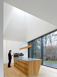
MM: Williamson Williamson’s House on Ancaster Creek has won multiple awards and was shortlisted for the annual Interior Design Best of Year Awards in 2017. What was the most successful interior element for you?
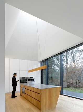
BW: It’s the sectional development of the project. The kitchen has a pyramidal ceiling. So the top of the kitchen ceiling is probably 22 feet tall. And that was because massing of the overall home isn’t actually as big as it looks from the outside, because we only had so much program we needed to accommodate. But in order to balance the house, we really needed to create a double height on the left hand side. That developed with coming into a space that was slightly unexpected, so that you’re almost not occupying one level of floor but you have moments where it compresses and then expands in section.
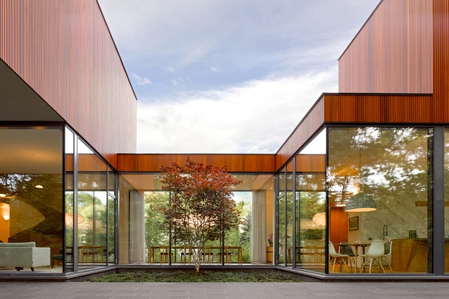
And then the second moment that I really think is successful is the pinched dining room space. The client came to us and said, we never use a dining room, we have dinner there three times a year, so we actually don’t need one. We said, okay, well, how about if we create this glazed link to a garden in the front and courtyard in the back and have the landscape travel through? They said, oh, that’s perfect.
So we made this little space that you have to pass through a lot because they also said we don’t want a room in the house that we never use. They told us the space is so great and that they just like to sit there and so I thought that was kind of a really transformational, successful piece of the house.
MM: A number of Williamson Williamson’s projects address the design challenge of creating residential spaces for ageing residences and their families. You also work with the Royal Architectural Institute of Canada’s Age Friendly Housing Task Force. Why is this important to you and architecture?
BW: My generation is called the sandwich generation – when you’re in between raising children and taking care of your parents. The number of elderly is increasing globally. The huge wave of baby boomers that are now aging is something that that the world has to deal with. That coupled with the inability for a lot of young families to afford single family homes in Toronto has kind of come together to create situations where we’ve got lots of people coming to us and saying, well, how can we do this living together so that, as a young family, I can afford to live in the city and meanwhile we can take care of our parents?
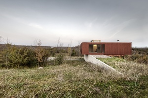
The system that takes care of the elderly is based around the medical and hospitalisation aspects of care. And I think the system is radically the wrong system. Why can’t the home actually be part of this system, keeping people at home longer, keeping them around their family and friends? All this I learned from my incredible colleagues on the on the Age Friendly Housing Task Force, who are older and have just a wealth of experience.
That’s the big picture of how we got into it. None of the work that we do would be possible without clients who come to us and are either open to the idea or have come to us with an idea.
MM: You actively contribute to excellent design at an urban scale through your role as vice-chair of the Waterfront Toronto Design Review Panel. Why is superior quality design a critical consideration for the development of cities?
BW: I think you can break it down into a few aspects. One really easy answer is that high quality design often has a high quality material presence. Meaning that you can do things cheaply or you can do things that bring better value that are slightly more expensive. Simply asking, are we making this out of something that isn’t going to look like junk in five years? If it has to be something that lasts 50 years, bringing really long lasting and durable materiality that can withstand weathering in a city like ours is really important, and every place has its own version of that.
There’s also the aspect of a high quality public realm, which translates into understanding what a really excellent urban space can look like and feel like. Building parks and urban infrastructure that aren’t navel gazing and just turning in on themselves to be to be insular, but actually connect with their neighbours, spatially or materially, either by being the same or by being different. Great spaces tend to be magnets for people and for community.
A great example is a urban park called Sugar Beach designed by Claude Cormier and Associates from Montreal (a wonderful landscape architect) that took over a dilapidated edge of a slip next to a sugar refinery right on the waterfront. It was beautifully designed in a fun and engaging way with pink umbrellas and giant rocks and sand and chairs. And, the amount of use it gets on a day-to-day basis is incredible. The amount of abuse that it takes and can withstand is also critical. So, you’ve got thousands and thousands of people in this space all the time. It’s beautifully designed and it’s just really, really good.
It goes back to your high quality material. Sometimes there’s a bottom line and sometimes that bottom line needs to be shifted to say, look, you can’t cut corners where it’s going to make the most impact, which is the first four metres of a project.
MM: What are some of the key urban challenges Toronto is experiencing at the moment and how do you think architecture/design can help?

BW: One challenge that Toronto is experiencing at the moment is housing affordability and transit. These are inseparable ideas.
The cost of construction for our private clients can make projects untenable because there’s so much development that is absorbing the trades. Trades can cherry pick projects and the cost of their services is really, really high. Affordability is such a broader topic than just how much would it cost to build enough housing for all the people.
Building the right kind of density, which means increasing density in our low density areas that is this huge fabric of single family homes. That single family home is as much Toronto as the high rises in the downtown. The right density should be coupled with effective and broader transit opportunities to get the people from those densified areas to where they live, work and socialize. This is a critical piece and something that everyone is discussing and trying to bring to the conversation. Making sure that it is connecting the right parts of the city together.
MM: High-quality design seems to be a critical consideration for the development of Toronto as a waterfront city. Our waterfront city is rapidly developing (including an expanding, tall building skyline) and over the next few years several major projects will be completed in central Auckland. What advice would you have for us in developing our city?
BW: Having a public realm component that can be seen to link together the existing city with the new pieces that are being developed in a way that is beautiful, engaging, safe and welcoming to the to the community is probably the most important thing.
MM: You are an advocate for equality in the design profession. You founded BEAT (Building Equality in Architecture) in your local Toronto. Why did you create BEAT and why is equality important in our industry?
BW: For me, equity isn’t just about getting more for the communities that have been under represented in our industry and in the associated industries, but it’s about normalizing equity. I am still so often the only woman in a trailer on site. I want it to be normal – that it is not unusual to have a design team and engineer, a contractor and a client of all women doing these amazing projects. So it’s that normalizing aspect, which I think is really important.
The 2019 in:situ conference was presented by the New Zealand Institute of Architects. Betsy Williamson was brought to New Zealand with the support of Metalcraft Roofing.


