Living with art

Click to enlarge
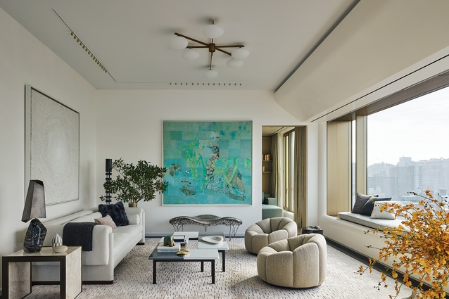
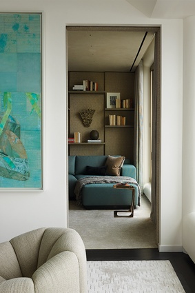
The living room encompasses two seating areas oriented to capture panoramic views that sweep east and south. A captivating painting by Ellen Gallagher, the very first work selected for this project, informs the room’s elements from form to colour palette.

The living room encompasses two seating areas oriented to capture panoramic views that sweep east and south. A captivating painting by Ellen Gallagher, the very first work selected for this project, informs the room’s elements from form to colour palette. Image: Richard Powers

1 of 11
In the dining room, <a 
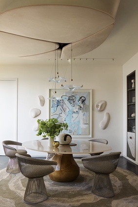
href="https://www.studioitalia.co.nz/products/platner-dining-chair"style="color:#3386FF"target="_blank"><u>Warren Platner’s classic chairs</u></a> surround a custom table. On the ceiling, suede upholstered petals frame a shower of lights.

In the dining room, Warren Platner’s classic chairs surround a custom table. On the ceiling, suede upholstered petals frame a shower of lights. Image: Richard Powers

2 of 11
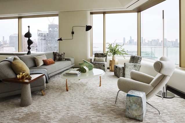
A coffee table of kiln-fused glass and cast bronze, designed by Stacklab, slips neatly into the living room. Along the window perimeter are a pair of Hervé Langlais club chairs and an Ox chair by Hans Wegner.

A coffee table of kiln-fused glass and cast bronze, designed by Stacklab, slips neatly into the living room. Along the window perimeter are a pair of Hervé Langlais club chairs and an Ox chair by Hans Wegner. Image: Richard Powers

3 of 11
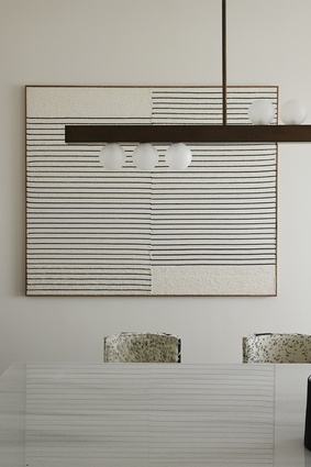
On the kitchen wall, Brent Wadden’s <em>Untitled</em> adds another variation on the recurring black horizontals.

On the kitchen wall, Brent Wadden’s Untitled adds another variation on the recurring black horizontals. Image: Richard Powers

4 of 11
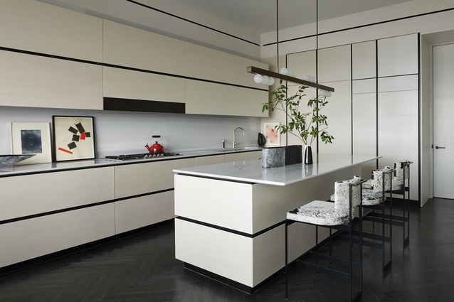
Horizontal reveals bring a clear geometry to the flush cabinet doors, complementing hide- upholstered stools by Powell & Bonnell. Works by Mary Heilmann, Joel Shapiro and Ed Ruscha add a sophisticated note.

Horizontal reveals bring a clear geometry to the flush cabinet doors, complementing hide- upholstered stools by Powell & Bonnell. Works by Mary Heilmann, Joel Shapiro and Ed Ruscha add a sophisticated note. Image: Richard Powers

5 of 11
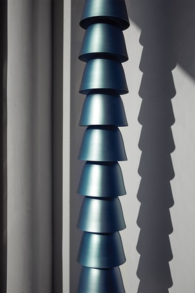
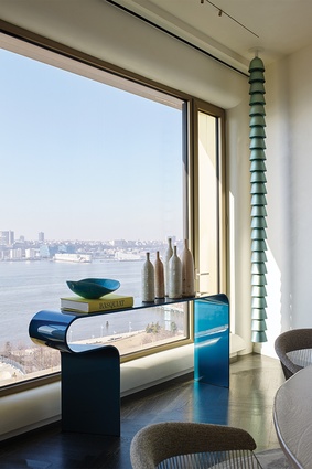
By the window, Ronan and Erwan Bouroullec’s anodised aluminium Chains emphasises the room’s height next to a cast-aluminium console that mimics the colour.

By the window, Ronan and Erwan Bouroullec’s anodised aluminium Chains emphasises the room’s height next to a cast-aluminium console that mimics the colour. Image: Richard Powers

6 of 11
With interior and exterior architecture as distinctive as Norman Foster’s, it is natural to take advantage of the design cues and opportunities they provide.

With interior and exterior architecture as distinctive as Norman Foster’s, it is natural to take advantage of the design cues and opportunities they provide. Image: Richard Powers

7 of 11
On the focal wall, Rogan Gregory’s unique terrazzo sculpture forms a corolla around George Condo’s <em>Female Composition</em>. The chairs are <a 
href="https://www.studioitalia.co.nz/products/platner-dining-chair"style="color:#3386FF"target="_blank"><u>Platner Dining Chairs</u></a> (available in New Zealand from Studio Italia).

On the focal wall, Rogan Gregory’s unique terrazzo sculpture forms a corolla around George Condo’s Female Composition. The chairs are Platner Dining Chairs (available in New Zealand from Studio Italia). Image: Richard Powers

8 of 11
Lucio Fontana’s <em>Concetto Spaziale</em> pops against walls panelled in flat-cut, custom-bleached ash, finished with just a hint of charcoal. Eric Schmitt’s Dragee Console of patinated bronze and marble makes a strong, functional statement below.

Lucio Fontana’s Concetto Spaziale pops against walls panelled in flat-cut, custom-bleached ash, finished with just a hint of charcoal. Eric Schmitt’s Dragee Console of patinated bronze and marble makes a strong, functional statement below. Image: Richard Powers

9 of 11
Shelves for the clients’ collection of art books and exhibition catalogues float off the library wall of fabric-wrapped panels set in a stepped formation.

Shelves for the clients’ collection of art books and exhibition catalogues float off the library wall of fabric-wrapped panels set in a stepped formation. Image: Richard Powers

10 of 11
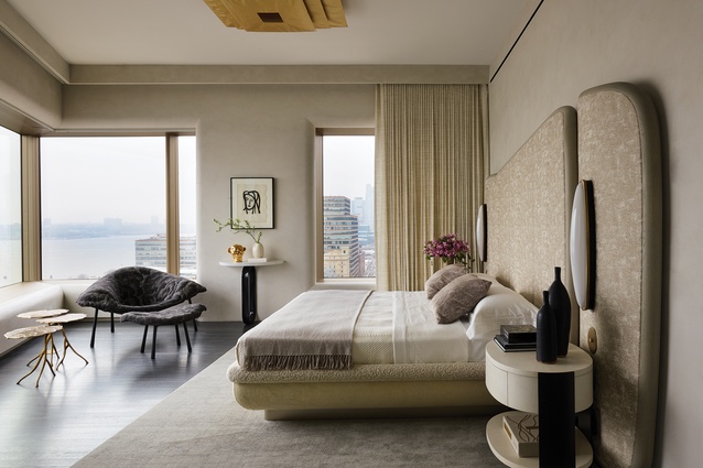
A backdrop for Dimorestudio’s sconces, the custom headboard reinterprets the curve of the soffit in yet another way. Overhead, Ingo Maurer’s Lil Luxury ceiling light introduces a touch of gold, repeated by Franck Evennou’s set of three nesting tables.

A backdrop for Dimorestudio’s sconces, the custom headboard reinterprets the curve of the soffit in yet another way. Overhead, Ingo Maurer’s Lil Luxury ceiling light introduces a touch of gold, repeated by Franck Evennou’s set of three nesting tables. Image: Richard Powers

11 of 11

In this apartment, designed by Grade New York for an art-loving couple, proportions and flow are just as important as are surfaces and detail. Art, however, reigns supreme and in complete unison.

Trust is design’s great intangible. Once it is implicit, the project has the best possible chance of ending up beyond the client’s wildest dreams. It also ensures that the process is a joy every step of the way. With this Brazil-based couple, trust existed before the start, thanks to a shared connection with a one-time GRADE colleague. The confidence it engendered became the catalyst for every decision in the couple’s art-filled pied-à-terre in Sir Norman Foster’s tower in far-west Chelsea, practically on the Hudson River. For art lovers as passionate as these two, no other building and no other neighbourhood made sense. 

With interior and exterior architecture as distinctive as Foster’s, it is natural to take advantage of the design cues and opportunities they provide. The sweep of the living room soffit profile, for instance, sparks many of the custom design details. The same is true for the pale, golden champagne tint of the structural framework. As for the panoramic views of the skyline, river and harbour, what could be more inspiring?

A coffee table of kiln-fused glass and cast bronze, designed by Stacklab, slips neatly into the living room. Along the window perimeter are a pair of Hervé Langlais club chairs and an Ox chair by Hans Wegner. Image:  Richard Powers

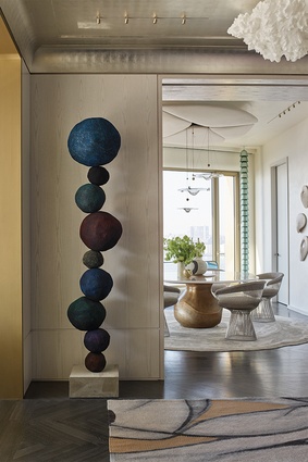
The entry gallery, the through-line between the public and private areas, showcases just some of the art and iconic contemporary furnishings assembled over the course of an especially exciting design process. A stepped crown moulding incorporates the curve of the soffit, introducing a touch of tradition filtered through a modern perspective.
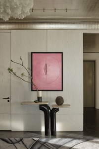
Lucio Fontana’s Concetto Spaziale pops against walls panelled in flat-cut, custom-bleached ash, finished with just a hint of charcoal. Eric Schmitt’s Dragee Console of patinated bronze and marble makes a strong, functional statement below.  Image:  Richard Powers

With ceilings leafed in white gold and walls panelled in ash bleached and stained to emphasise the open grain, the gallery is warm, luxurious and just texturally interesting enough to heighten the experience of the group of works it displays. They include pieces by Annie Morris, Josef Albers, Ingrid Donat, Perrin & Perrin, Dan Flavin and others we curated, including its centrepiece, Lucio Fontana’s Concetto Spaziale, a most brilliant finishing touch. 

The living room encompasses two seating areas oriented to capture panoramic views that sweep east and south. Each grouping mixes pieces by some of the 20th century’s best-known makers with custom designs that enhance the art-above-all point of view. A captivating painting by Ellen Gallagher, the very first work selected for this project, informs the room’s elements from form to colour palette. 

Stationary wall wings separate the living and dining rooms without a more formal closure; these incorporate the soffit profile, as do the details of the cowhide-lined built-in units. Over the dining table, a petal-like arrangement of suede-wrapped panels and delicate descending lights flowers on the ceiling. The library houses an ever-expanding collection of catalogues and art books, as well as comfortable seating and lighting for serious readers. The shelves float on a wall of fabric-wrapped panels set to reveal shadow lines created by a subtle undulation. 

A backdrop for Dimorestudio’s sconces, the custom headboard reinterprets the curve of the soffit in yet another way. Overhead, Ingo Maurer’s Lil Luxury ceiling light introduces a touch of gold, repeated by Franck Evennou’s set of three nesting tables. Image:  Richard Powers

In the master bedroom, black and gold accents highlight a tonal palette of creams, off-whites, light greys. A fantastic tangle of a lamp by Jean Royère spreads its vines across the hallway; its bold black lines prefigure those in the bedroom’s Matisse aquatint. Its curves, as well as Foster’s, influence the custom bedroom furnishings. The twin beds in the guest room pick up on the same detail.

It is rare and wonderful to share such trust with clients. When it happens, there’s no predicting what art can come of it. And not just the works of art themselves, but the art of furniture, of curating, of placement, and above all, the art of living. 

See an interview with Edward Yedid and Thomas Hickey, founders of Grade New York, here.

This feature is an excerpt from New York Contemporary: Grade Architecture and Interiors by Thomas Hickey and Edward Yedid. Published here courtesy of Monacelli Press, it has been edited to accommodate house style.


More projects