Designing with art: Grade New York
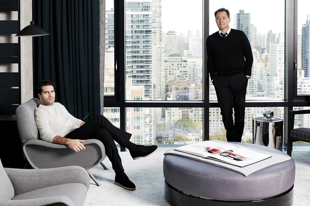
Edward Yedid (left) and Thomas Hickey are the founders of the design studio Grade New York.
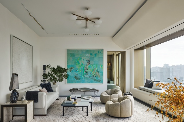
Grade New York designed this Manhattan apartment for clients with a well established art collection.
To see the full home tour, pick up a copy of Urbis 114.
Interior specialists Grade New York created a sophisitcated loft for art collectors in the city's chic Chelsea neighbourhood. Here they talk about their influences and love for interiors along with designing spaces with art in mind.
Architecture, interior design, art: all are of equal importance in Grade New York’s renovation of a pied-à-terre in Manhattan. The Brazilian clients have a substantial art collection in their home country and wanted to do something similar in Chelsea, a neighbourhood with a large concentration of galleries for perusal.
While it wasn’t initially part of the plan, Grade New York not only designed the space itself but selected all the art within it. Founding partners Thomas Hickey and Edward Yedid discuss the holistic renovation – and why they want to be the art advisors on all of their design projects.
What were the clients’ main requests?
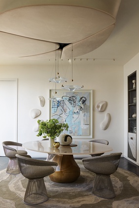
Edward Yedid (EY): We learned how important art and design are to them and their preferences in terms of palette. They wanted their home to feel calm. When we met, the husband was dressed from head to toe in softly-toned cashmere. That’s what the apartment needed to feel like. It’s located on the Hudson River so we sought to capitalise on the water views as well. We selected the furniture and works of art but took our curation role further by treating the architecture and interior as works of art, too. The dining room highlights our concept. We designed the table to celebrate the views of the water outside. Above, a suede-wrapped ceiling canopy – which helps to make the space more intimate – is shaped like a puddle. The textured surface behind the canopy gives the impression of water. The carpet below makes it feel as if the ceiling has almost flowed onto the floor.
The building itself is designed by Sir Norman Foster. How did you connect your interior with the architecture?
Thomas Hickey (TH): Foster’s façade features apertures that reveal goldish-brown linings, which fold in and return with a soft edge, and the ceiling cove looks as if it’s been peeled back. We translated this attitude into our vision, trying to create a continuation of the architecture inside. It’s something we try to do with all our projects. We always want the architecture and interiors to be in constant dialogue, rather than creating a clear delineation.
EY: We continued the goldish hues through to the headboard in the master bedroom, the crown moulding in the gallery space and the window bays. Those are just a few examples, but you’ll notice that many other elements throughout the space are in sync with the architecture.

How did you find yourselves fulfilling the role of designers-slash-art curators?
EY: I’ve collected art for 20 years – it’s a passion of mine. I started out on my own. Through that process, I gained a great amount of knowledge and built relationships with galleries along the way. Whenever possible, we want to be the art advisors for our design projects. You’re already working with the client so closely on every aspect of their project – gaining their trust and developing a beautifully-curated space – so being part of the art process at an early stage can have a strong impact. We always say we want architecture and interiors to have equal representation, to inform each other, and art is also a big player. Art adds a level of interest and character to any project, attributes you can’t get with furniture and accessories alone. It’s very powerful. Sometimes we’ll need to adjust an architectural detail to allow the art to live. The colour of the art also has a great impact on the ultimate feel of a space. We’re curating more and more because clients have seen how beneficial it is.
In the case of 551 West 21st Street, we knew the clients cared about art but we didn’t know we’d be advising on it from the get-go. It was an organic process instead. The first piece we advised on was the green painting in the living room by Ellen Gallagher. When you’re intimately involved in the details of a project, you feel like you know the client so well. I flicked him an image of it via text and he loved it. Then the journey really began. Together we collected about 10 different works across various scales, styles and prices.
What sort of aspects of an interior might you design around an artwork?

EY: In the library at 551 West 21st Street, the breaks in the shelves correspond to the works. And there’s a light sculpture by Dan Flavin at the end of the hall. We had to find the right one – and then integrate it into the lighting system. In other cases, we might specify art earlier on, and change the size of a wall or windows to accommodate bigger pieces. You don’t get that ability as an art curator coming in at the end of the project so there’s a huge advantage to being involved early.
What about clients who already have an existing collection to work with?
EY: I would imagine our clients would have good stuff – they tend to come to us because of our level of sophistication. Since our aesthetics would most likely align, we’d make it work. It’s just another challenge to deal with.
A residential context is obviously very different to a white-walled gallery – how does that affect the curation?
TH: Indeed, this is not an art gallery; it’s a home for the clients to live with their art. It’s not just to look at but to be lived in.
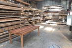
EY: Instead of relying on white walls, we came up with the idea of using panels of ash wood. They’re bleached and stained white but the texture comes through. They don’t fight with whatever you put in front of them and are more interesting than plain white walls. It’s the first time we’ve worked with this material and now we’re doing something similar for a new project. In that case, though, the space won’t benefit from wood panelling so we’re working with a plaster artist to mimic the idea.
How do you feel about purely decorative objects versus functional art and sculptures – say, a sculpture that doubles as a seat?
TH: The key term in all our work is ‘balance’, whether that’s balancing architecture with interiors or interiors with art. We wouldn’t want to create an environment with only functional objects nor with only objective art – a gallery you can’t engage with. That’s why it’s such an advantage to be a one-stop-shop, taking care of every element at the same time to make sure everything has equal weight.
See the full tour of this Manhattan home here.