Oasis: ANZ Raranga
ANZ seeks a natural feel and a touch of biophilia in its new Sylvia Park locale. Melanie McDaid finds out more.
“What would the ideal workplace of the future look like” was the question ANZ posed to Warren and Mahoney (WaM) when beginning work on ANZ Raranga, its new workspace at Sylvia Park. In searching for the answer, WaM looked to the past. “We used the structure of ancient gardens, which have brought peace and rejuvenation for over 4000 years, to structure the 2025 workplace organically.” The basic principle for the new space (six floors within a new commercial building), says WaM’s Gabrielle Gatt, is to acknowledge it is a workplace “but we countered that with a sense of well-being and oasis, and giving that reprieve so people can actually do their work well”.
Working closely with the design team at WaM was ANZ’s Head of Workplace Property, Matthew Clark. Clark explains: “… The catalyst for the whole project was creating something that our staff members could be proud of and they could really call their own – the whole home-away-from-home philosophy.” The design team responded with the concept of ‘Urban Oasis’: a simple and thoughtful solution to the brief. Each floor takes on its own nuanced variation of the theme, namely, cultivate, nurture, grow, thrive, flourish and established. It also embraces a central notion of growth coming up through the floors paired with a waterfall cascading down.

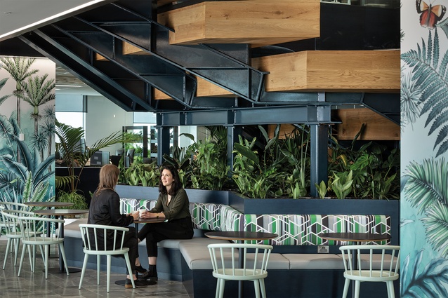
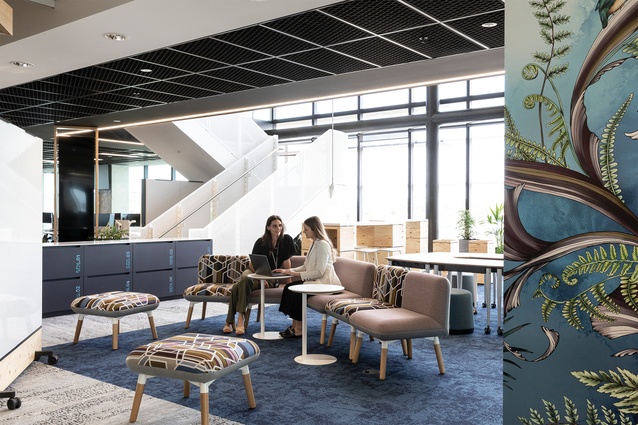
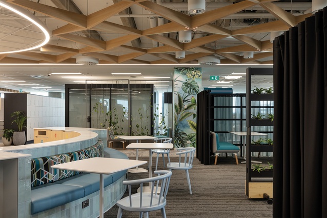
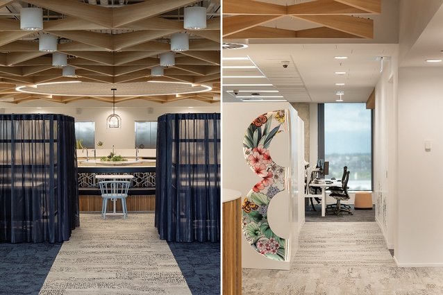
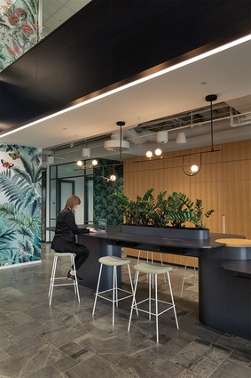
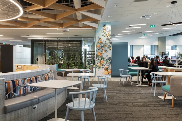
A consistent, calming aesthetic runs throughout the six large floor plates (the fourth floor to the ninth floor). Subtle shifts in key materials between the floors evidence the varying themes of ‘Urban Oasis’. Examples of these gentle shifts in aesthetic are most clear in the beautifully designed wallpapers by Shannon Cheung of Typoflora (manufactured by Materialised) – each floor boldly revealing a slightly different custom design, complete with native flora and fauna.
“Drawing inspiration from the different stages of growth in a plant, we produced a graphic wallpaper that changes as you move up the building, from cultivation and nurture to an established fruiting tree,” further explains Gatt. Sarah Morris textiles adorn each floor. The striking, geometric fabrics (taken from two of her collections for Maharam) are unique to each floor whilst also reading as a singular collection across six levels. All of this detail ensures there is a strong family connection between the floors as a whole.
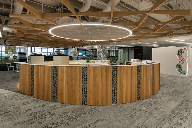
With its lively, lofty feel, the seventh floor is the main arrival floor for visitors. A casual concierge area welcomes both visitors and staff. The layout of both flexible (the brief demanded high levels of flexibility and this is achieved through some clever furniture-based solutions) and built elements retains key view shafts to working zones, which reveal the true workings of the space.

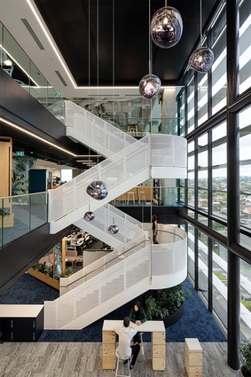
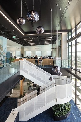
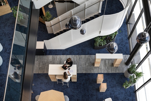
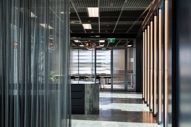
Upon arrival at the seventh floor, there’s no need to further utilise the lifts unless venturing down to the fourth floor (used for training and other in-house purposes). On the opposite side of the floor plate to the lifts and providing independent, open and continuous circulation from the fifth to the ninth floor is the base build stair fabricated from white perforated metal and decorated with clusters of Tom Dixon’s distorted Melt glass pendants hanging long and high.
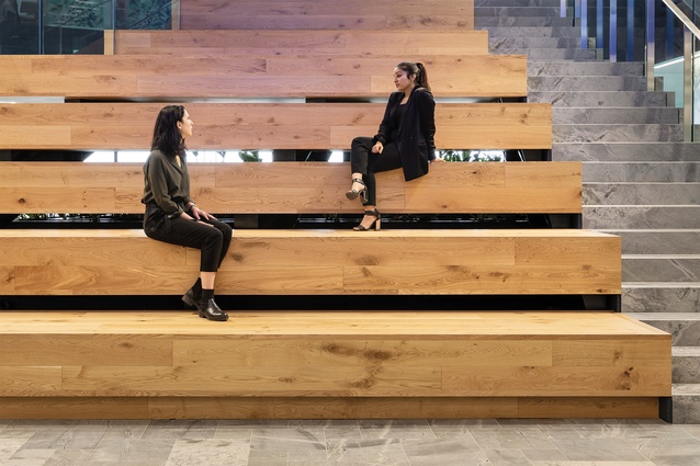
Wide, multi-purpose grandstand-style stairs (connecting the seventh and eighth floors) clad in engineered Bordeaux oak are offset from the base build stairs and provide opportunity to divert from the main circulation routes. Conceptually, this open connection offered by the grandstand stairs provides the final piece in the conceptual ‘waterfall’ of vertical circulation running from the ninth floor down to the fifth floor. As Gatt explains further, “The concept of a waterfall was integral to the design of an auditorium-style stair [on the seventh floor]. This new stair opened up internal circulation, linking all floors together and provides a central space where staff members can gather.”
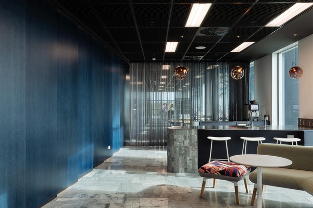
Providing an anchor point near the lift circulation axis, each floor has a ‘social hub’, which has the feel of a more residential kitchen area. On working floors, members of staff arrive into what the project team coins ‘decompression zones’, which effectively provide transition areas between work and whatever you were doing before you entered work. These spaces allow employees to connect away from work and prepare for their day ahead. They have a different aesthetic and feel to the surrounding workspaces: “The building operates across 18 hours a day. So, we really wanted it to be somewhere you could spend a lot of time and still feel connected,” explains Clark.

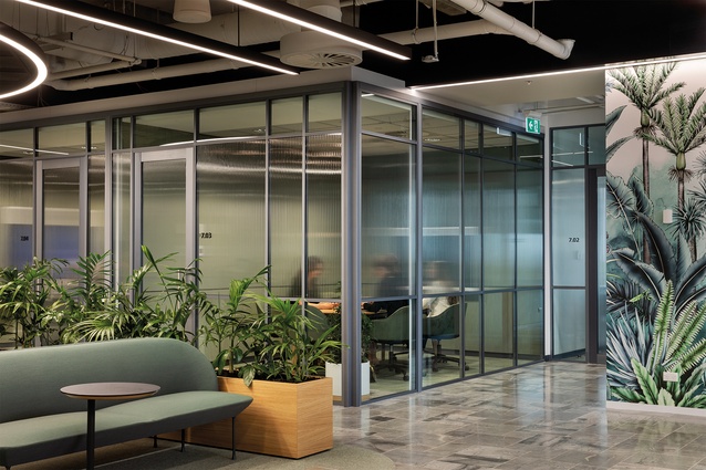
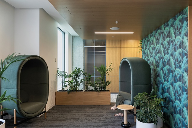
There is also a dedicated wellness facility, positioned off the main circulation tracks. Surrounded by plants, it provides a space for people “to feel like they are away from work and to have some downtime,” says Gatt. Upon entrance to the ‘Retreat’, an enticing capsule chair by Kateryna Sokolova for Palau (supplied by Unison Workspaces) is an invitation to sit and enjoy the vast views of the Waitakere Ranges. The area includes a reflection room, a parents’ room to support family needs, a flexible-use wellness room (think ’flu jabs and massage) and private pods for quiet time, even sleeping or relaxing. An engaging botanical wallpaper called Palm Jungle from Cole & Son (a London-based company known for its wild designs) lines the facility.
The biophilic feel of the spaces continues with digital waterfalls, ample natural light and many garden references. This and the level of detail give all of the spaces a personal feel. “There’s so much detail – from the pressed lotus leaves and the plaster finish to the hand-drawn wallpaper up the columns,” says Clark.
There’s a healthy, calm hum of productivity at ANZ Raranga and the building’s occupants are thrilled with the success of the project. As Clark explains, “The most successful thing for me was seeing the reaction of members of staff to the space; they were overwhelmed with what we have created for them. When we set about the design, every decision we made was through the lens of the end-user, our people. And it’s all those little, delightful things that our staff members really appreciate and that make this space truly unique.”

