The good life: Matapouri Beach house
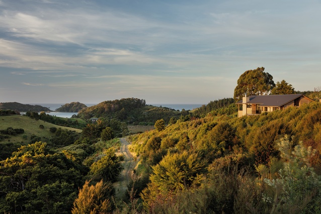
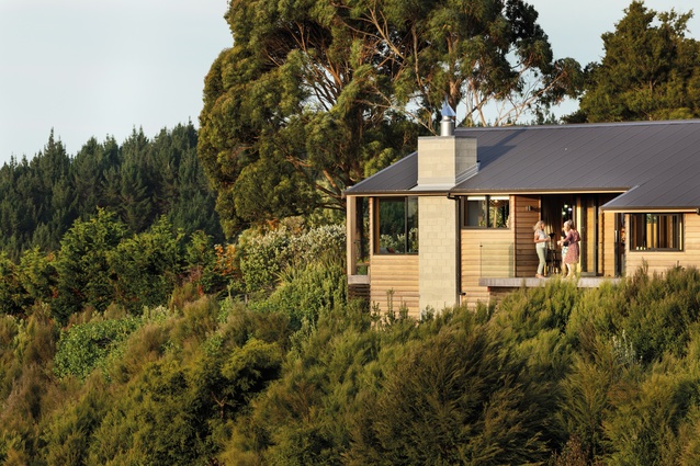
Megan Edwards Architects has created a simple, honest home in the hills above Matapouri Beach, designed for a family committed to protecting the surrounding native bush and its birdlife.
“When someone is wholehearted and clear about their vision, it’s quite easy to climb on board,” explains architect Megan Edwards of her clients Andrew and Fleur Braae. With these foundations, this simple-yet-beautiful house in Matapouri was bound to be a success.
The Braaes bought the land in 2010 when they discovered that, here, they could enjoy both bush and beach from these 10 acres of hillside above Matapouri Beach, explains Fleur Braae. The following year, they built some basic accommodation on site and, after having their son Max in 2012, the family would “spend all holidays up here with him, living a simple life, the good life” recalls Fleur. However, they soon realised they were not able to enjoy their piece of paradise all year round because of the limited facilities so “our plan to build a bach was accelerated”.
“We met [architect] Megan in 2010 when we first married and I facilitated a major renovation at Andrew’s home in Takapuna,” explains Fleur, adding that “over the years and subsequent house upgrades, we developed a lovely friendship… I think we all had a perspective on life, its challenges, the privileges and the importance of embracing every day”.
When it came to siting their new project, the process was involved but has paid off. “Now that it’s here, it feels like exactly the right place but it just took us a little while to find it,” says Edwards.
Fleur elaborates: “once we understood costs and challenges around building on a hillside, things became relatively simple and we identified the flattest piece of land we could find… We had an initial concern that this wasn’t as deeply in already-established bush as we would like but, as an engineer said to us, you can grow bush but you can’t grow that sea view”.
When it came to the build, it is recalled by all as smooth sailing. Edwards says simply, “there’s a lot of love in the house” with “a high trust relationship” shared by all parties. Both architect and client attribute a huge amount of the project’s success to (as Edwards describes him) “a heck of a nice person” – the builder, Paul Erceg. The process involved good communication and avoided unnecessary drama.
Fleur recalls: “As well as being an outstanding builder, Paul has a beautiful, kind heart. He surrounded himself with a team of contractors with real integrity, great skills, shared values and the same good hearts. We all connected as individuals, with similar ideals and they loved the experience of creating this beautiful home in this beautiful place.”
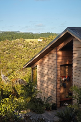
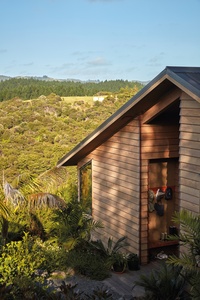
Teamwork and generosity of spirit paid off. With its linear plan, which follows the lie of the land, the house (which was initially conceived as a bach) is now the Braaes’ family home. With the building’s effective and simple elements, Edwards is understated in describing it in a nutshell – “but really, in summary, it is the ridge, the gable, the access route, a strong entry, the big masonry chimney – it’s those few elements, the New Zealand vernacular, nothing fancy”.
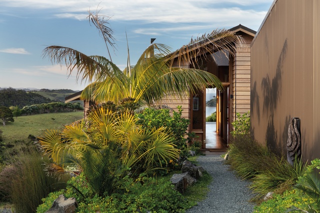
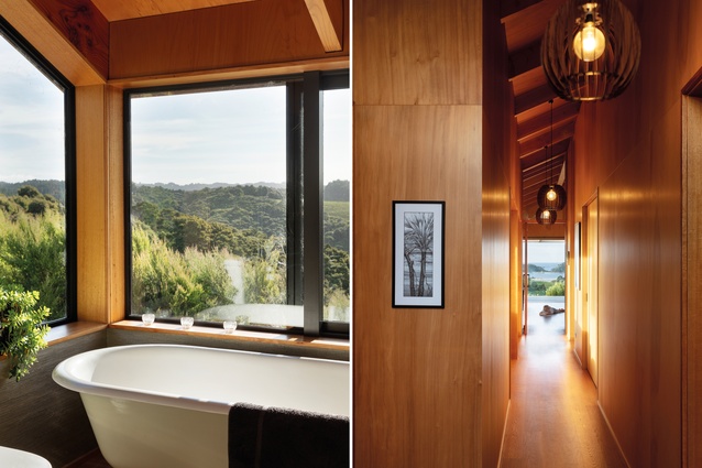
Once the entrance door is open, an unobstructed line of sight (via a north-facing entrance hall running along the spine of the house) out towards the ocean is revealed. Edwards describes the overall floor-planning of the building as “a bit like your typical villa layout, coming in past the bedrooms…”
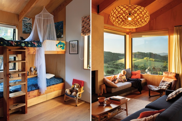
Three bedrooms include a clever and thoughtful bunk-room with bunk beds crafted from “all sorts of leftover things from the rest of the build”. Then, down a generous hallway that leads into the living space at the end, there is a stunning water view. Off the living area is a north-facing deck, which “comes out onto the land and we’ve been able to bank that land”, explains Edwards.
In an otherwise rectangular plan, there is “this bite out of the plan” – a west-facing, covered deck. “It’s west facing for the sun but deeply covered by the roof, which is nice… having a long westerly orientation with views is quite a challenge, in that you don’t want to overheat; so, by having a large covered area, you can have this glazing (set back) but it doesn’t overheat. And you get that view out and also the hall becomes not a hall but a gallery,” describes Edwards.
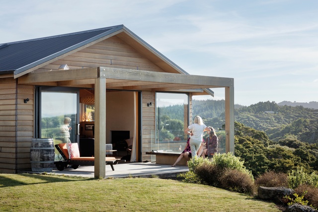
Explaining the simplicity of the overall aesthetic, Edwards states: “it looks very clean and lean and elegant, and it takes quite a lot of effort to do that… Honestly, it feels so simple and so relaxed when you are there, you would hardly think there was any detail to be resolved at all but, actually, there is. We worked with the builder on site to finetune the detailing – he was very helpful.”
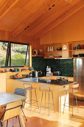
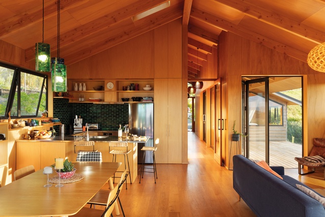
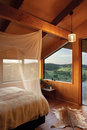
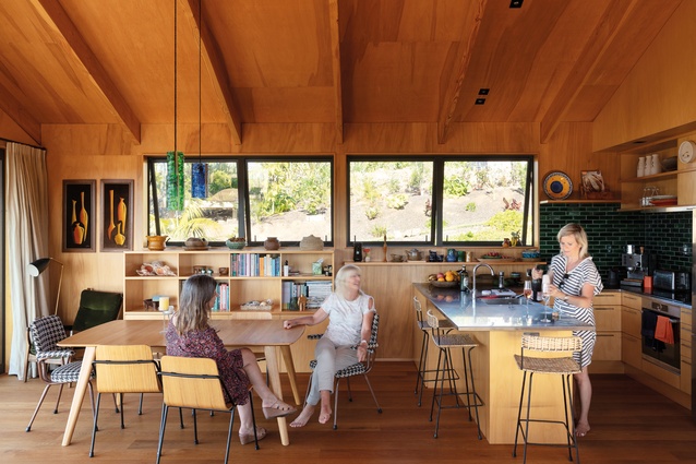
The materiality throughout the interior of the house is warm and full of texture, with Douglas fir exposed rafters and Fijian kauri plywood linings, and oak on the floor with an oil finish. But, as Edwards describes, this warmth is perfectly balanced with a surprising amount of open space and height.
“The gable is higher than it might typically be. The doors and windows are at 2.4m, and the gable then sits above that, so it’s a lofty space; it feels very generous when you are inside it. Although it’s that woodsy, ’70s’ aesthetic, the height is quite relaxing and generous and, combined with the warmth of materials, it is still kind of nurturing. That combination, I think, works quite well.”

In summing up the project, Edwards reflects, “I think it is just the overall happiness of the process. Everyone was enjoying themselves and everyone was giving of their best. The land is beautiful and there is this feeling as though the land is supporting this and what we were doing was right.”
Indeed, Fleur and Andrew’s “Project Good Life” is definitely doing something right – after nine years of trapping and planting, an infra-red camera has just confirmed the presence of a brown kiwi on the property.
Material Palette

Architect Megan Edwards explains how Project Good Life’s woody ambience was achieved in the interior.
Why did you choose exposed Douglas fir rafters?
Megan Edwards (ME): Honesty to construction was a modernist principle but, with an increasing focus on the thermal performance of buildings and Building Code requirements for insulation in roofs, exposed rafters have become less common. The space between rafters is used for insulation and ceiling linings are placed under the rafters. However, expressing the rafters creates a beautiful, simple rhythm and it’s part of our architectural vernacular. The traditional Pacific expressed ridge beam and rafter construction references our wharenui and the woolshed. Exposed rafters were revived by Group Architects’ houses of the ’50s and used in many of the ’70s’ and ’80s pole houses. They are a part of our built heritage that is worth reviving. In this case, the untreated structural rafters are inside the building only, and treated Radiata pine purlins above provide the space for insulation and cantilever to provide the eaves.
You also used Fijian kauri plywood.
ME: Yes, it could be any veneer but the bloom of the kauri veneer is attractive. It was carefully cut around the rafters so there are no beads, creating a clean look. A veneer helps deal with our more precious timber reserves and the plywood once again references Group Architects, who used it extensively.

