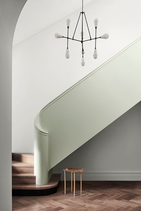
Connection and joy through colour

Moana Half Reserve from the Balance palette.
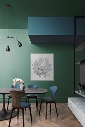
Spectacle Lake from the Balance palette.
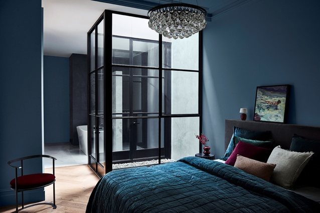
Kimberly Sea and Pure Blue Half from the Balance palette.
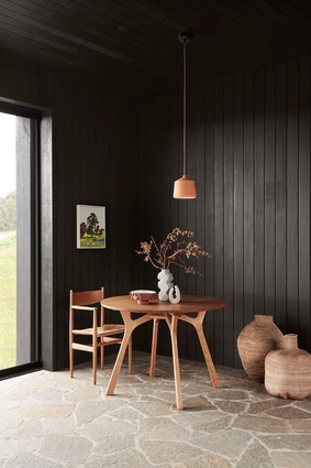
Ruahine and Kimberly Sea from the Balance palette.
Moana Reserve Half from the Balance palette.
Dunedin from the Balance palette.
Rawene from the Balance palette.
This year’s colours merge well with natural textures and finishes.
Pataua Beach from the Connect palette.
Research from the Connect palette.
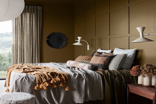
Basset Brown from the Connect palette.
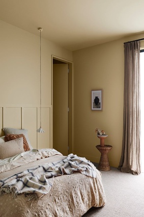
Gentle Annie from the Connect palette.
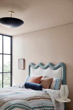
Herd Street from the Revive palette.
Diorite from the Revive palette.
Ashburton, Herd Street and Breezy Half from the Revive palette.
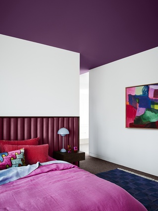
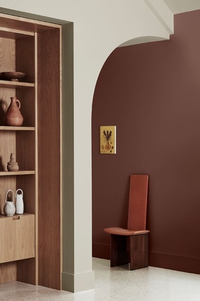
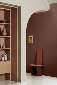
Purple Celebration from the Revive palette.

Rangiora from the Revive palette.
After a chaotic couple of years, many New Zealanders are experiencing a desire to live more simply. In homes and in workplaces around the country - and around the world - there has been a conscious stripping away of the unnecessary and superfluous, both in terms of what we surround ourselves with and how we spend our time, to create space for more meaningful connections.
In terms of colour, the forecast for the coming year reflects a desire to bond with the natural environment, communities and loved ones, with warming, earth-drawn neutrals, natural textures and an array of uplifting brighter hues.
Put together annually by Dulux, the Colour Forecast is based on year-round research into the latest global and local trends that are predicted to influence New Zealand and Australian design and how we live.

This year’s forecast is led by Dulux colour specialists Davina Harper and Andrea Lucena-Orr in conjunction with Dulux colour forecaster and stylist Bree Leech. The prediction has been informed by seminars, including Future Laboratory London and Colour Hive; Milan Design Week; trend reports and editorials; fashion catwalks; product and design launches; engagement with global and international brands; and research through Dulux’s extensive networks in the UK, Italy and France, says Davinia Harper.
“Colour forecasting for interiors is an evolution,” she says. “While fashion is an important influencer, the shifts in interiors are more subtle and nuanced. The palettes we can expect to see in our homes in 2023 are predominantly warm and nurturing, with nature continuing to be a key driver of trends. Brighter hues continue, however, they are deeper than last year.”
Sustainability will be another important focus in the year ahead, says Bree Leech. “We’re reframing our relationship with material things – it’s no longer enough that a piece is beautiful, it needs to earn its place in our homes,” she says. “Sustainability is beginning to feel more personal; we don’t just want to know that pieces are made in a way that’s gentle on the environment, butto understand the journey they have taken before arriving in our lives – for example, by choosing traceable fabrics or learning the maker’s story. As a result, there continues to be a renewed interest in the handcrafted and pieces with a story to tell.
“We have all reacted to the upheavals of the last couple of years in different ways – some people crave lightness and whimsy, whilst others seek order and reassurance. The three palettes in the Dulux Colour Forecast 2023 reflect these differing needs, allowing you to create beautiful living spaces that reflect where you are in your life’s journey,” she says.
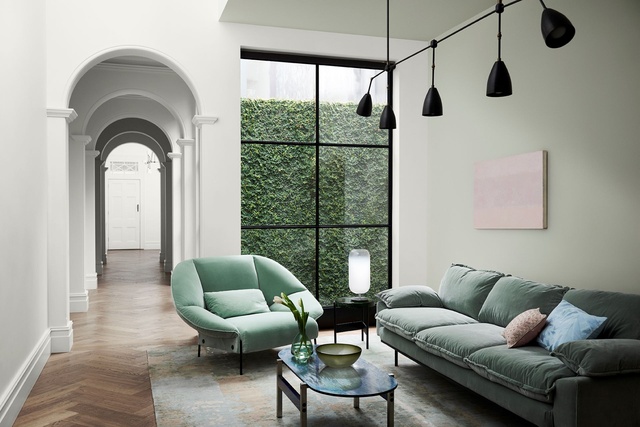
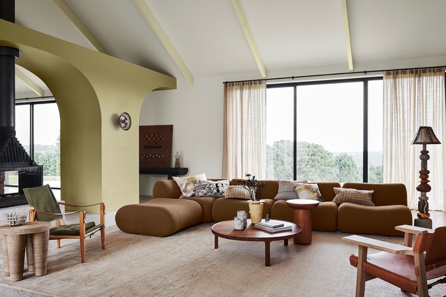
Palette 1: Balance

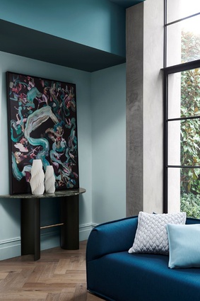
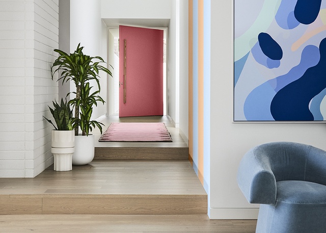
Dulux Balance is a refined palette of serene marine blues, gentle greens and accents of deep garnet that evokes the beauty and fluidity of the ocean and shoreline. “Post-pandemic, not everyone is craving indulgence, risk and change – some crave the reassurance of structure and rules,” says Harper.
Leech adds: “Balance is very much inspired by a ‘less is more’ philosophy, with minimal detailing and a restrained approach to decorating. Instead, the focus is on immersive colour and the beauty of complex, structured patterns found in nature, such as a simple seashell or fern frond.”
Luxe textures, such as velvet and silk, furniture with exaggerated, curved silhouettes, abstract art, and décor pieces with organic shapes and delicate pleating complete the look, says Leech. “Balance has an elegant, understated feel that would work beautifully in an inner-city apartment or a terrace home,” she says.
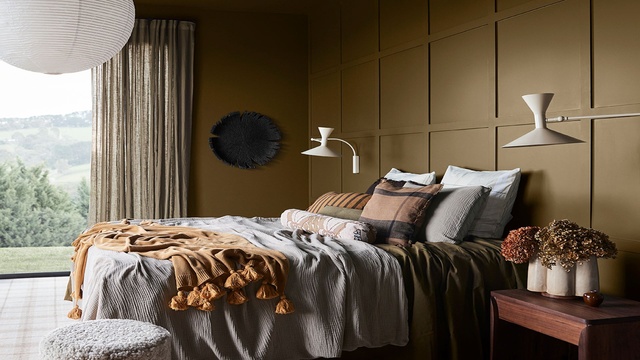
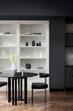
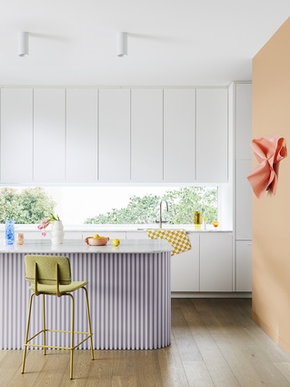
Palette 2: Connect
With its warm, earthy tones of moss, wasabi, sandstone, muddied yellow-green and burnt charcoal, the Dulux Connect palette is all about fostering our relationship with the great outdoors.
“It speaks of calm, comfort and an honest approach to living, and brings in many of the pastimes we experienced during lockdown, such as hiking, cooking, quilting and gardening,” says Harper. “Muddied yellow-green has something of a nostalgic, country house feel; cinnamon is grounding; whilst rich, warm brown adds an indulgent and contemporary twist.”
Simple, rustic furniture in timber, leather and rattan sits alongside stone flooring and bespoke, modern lighting made from recycled materials for a look that simultaneously speaks of the past, present and the future. “The Connect palette could look incredible in a cosy dining room or living area of a family home or a Kiwi bach,” Harper adds.
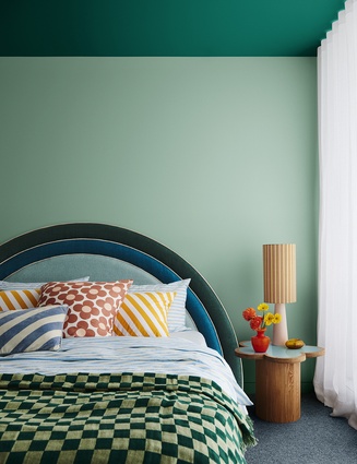
Palette 3: Revive
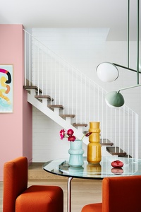
Filled with playful, uplifting, brighter colours, such as rose pink, breezy blue, sunshine yellow, emerald, violet and burnt orange, the Dulux Revive palette is an instant mood-lifter. With unexpected colour combinations, graphic floral patterns and furniture in cloud-like forms, the message is clear: interiors shouldn’t be taking themselves too seriously in 2023.
“As we emerge from trying times, we’re looking for lightness and a sense of freedom to revive our spirits. So, when it comes to our homes, it’s out with the rule book, and in with the possibilities to create something fun and joyful,” says Harper. “Pairing retro influences with futuristic features, such as pixel patterns and digital art, the Revive palette cleverly merges the past and present. And with its colourful, look-at-me accent walls and statement seating, it creates the perfect Instagrammable moment.”
To learn more about Dulux’s Colour Forecast 2022 visit www.dulux.co.nz.
ArchitectureNow works with a range of partners in the A&D supply sector to source appropriate content for the site. This article has been supported by Dulux.