
James
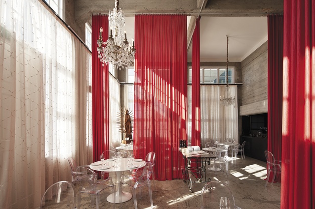
A light-filled room that features ceiling-to-floor drapes in a confident red.
A light-filled room that features ceiling-to-floor drapes in a confident red.
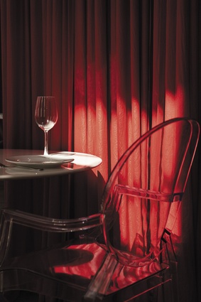
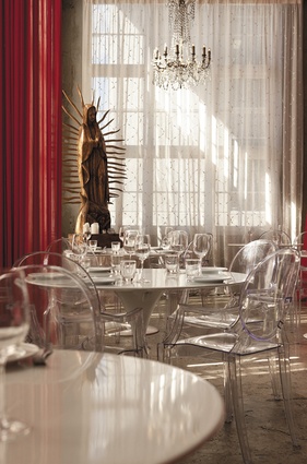
Table detail showing how the drapes create more intimate spaces within the grand scheme.
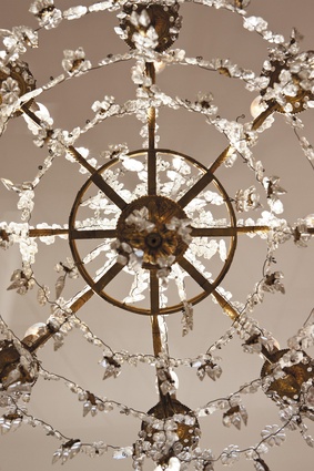
Chandelier detail.
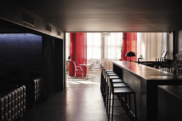
A view into the light from the aphotic back bar and lounge area.
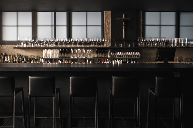
The back bar, adjacent to the lounge area, is black-leather bound. A subtle glow from the translucent windows provides atmospheric light.
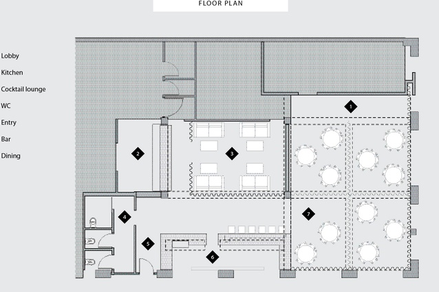
Floor plan.
The best dining experiences are those that captivate a number of senses – not just the taste buds, although, of course, what the taste buds think defines success or failure for any restaurateur. But given that the competition for the fine-dining dollar is intense, how does one restaurant differentiate itself from another. At James, the answer is as clear as day and night – the visual aesthetic, devised by architects Noel Lane and Tom Rowe, is based on dichotomy; light is divided from darkness, and there is compression and decompression as a low volume opens into high. Those themes of light and dark are age old – dating back to the first day for creationists, somewhat further still for those that ascribe to the peculiar theories of Darwin, but the effectiveness of this technique as a sensory experience cannot be questioned.
Back at the beginning of this project, James’ owners, Jamie Miller and Giselle Trezevant-Miller say they had two main objectives for the fit-out of this reworked heritage building on Stanley Street. The first was to create areas that would maximise the versatility of the space for casual or private dining, or for events and parties. This included two kitchen areas, split for the in-house dining and catering services. There are also two distinct front-of-house spaces: a dining room defined by light and space, and, by contrast, a dark, moody and intimate lounge and bar space.

The most obvious intervention in the dining space is the use of diaphanous, red ceiling-to-floor curtains. These translucent partitions allow different floor areas to be sectioned off; it’s a clever device, creating intimacy without solid partitions, and softening the hardness of concrete walls pitted and marked with the stigmata of rough timber formwork. Compared to this room, which also contains a Juliette balcony, furthering the romantic notion perpetrated by the drapes, and some interesting religious iconography, left over from a previous venture by the restaurant’s owners, the low-slung bar and lounge at the back is like a transition into a well-appointed den. Here, it’s about comfortable, soft-leather furnishings with a modern cubist visage, LED strips for ambient light and a smart-looking, leather-wrapped bar.
Another objective for the fit-out was more intangible or ethereal. It was, says Miller, to “remain fashionable, be cost-effective and remain non-permanent”. What this means, he elaborates, is that the design had to enable expediency – ease of room change and, also, easy refurbishment. The designers realised this through a mobile suite of furniture, such as a number of distinctively transparent dining chairs, and classic marble-topped tables. Fittings, such as the large chandelier in the dining space, are also non-permanent and able to be changed out when the need arises.
Design statement
The layout is divided into two distinctive rooms or volumes that contrast with one another. One is black and low-ceilinged, with leather walls and furniture chosen to create a strongly masculine room that is minimalist and modern in detail. A long bar wrapped in leather, and with inset black granite, traverses the length of this room and a serving counter of similar detail partitions the space from the kitchen behind. The light, white and high-ceilinged volume is much more open with dramatic layers of double-height curtaining. These drapes form an enclosure within the hard, roughened concrete shell. The silky red curtain fabric introduces layers of translucency and opacity between tables and groups of diners. Detail and furniture is chosen to be much more light, transparent and delicate. The sensuality of the materials and textures are deliberately associated with the distinctive rooms as are the colours and surface qualities that are activated by filtered or diffused light.
Tom Rowe


