
Westpac’s theme of connections
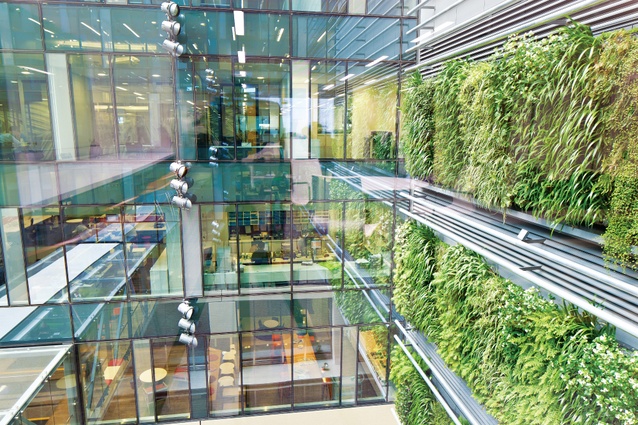
One of two significant green walls in the atrium of the East Building. The base building was designed by Australian firm Johnson Pilton Walker working with Peddle Thorp Architects in Auckland.
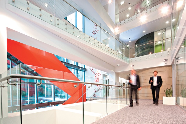
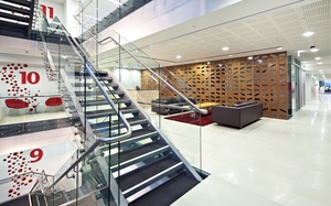
The stair seen in this image is also highly visible from the building’s exterior, and acts as a subtle branding statement as well as a connecting device.
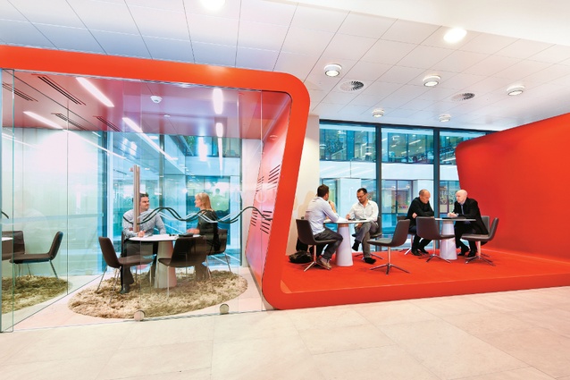
Westpac’s fitout introduces significant amounts of a signature colour — red —into the design elements.A “red ribbon” wraps over informal meeting spaces in the lobby. Employees can come out for meetings so visitors don’t have to pass through the bank’s security turnstiles.
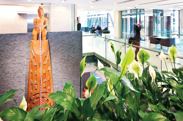
A 6m-high carving based on the story of Maui fishing up Te Ika? Maui, by Arekatera Maihi.
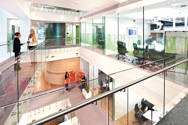
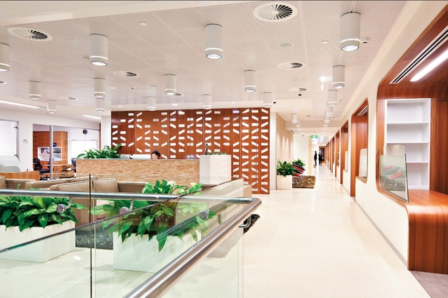
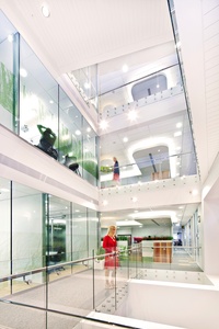
The building’s atrium showing connectitivity of spaces.
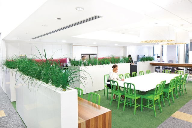
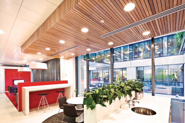
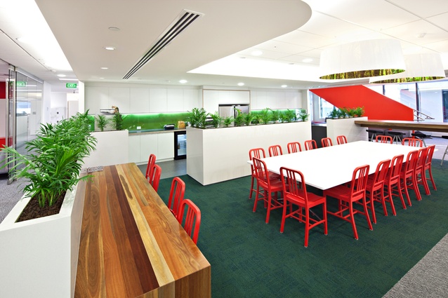
A typical café and kitchen space on each floor.
The executive floor at Westpac.
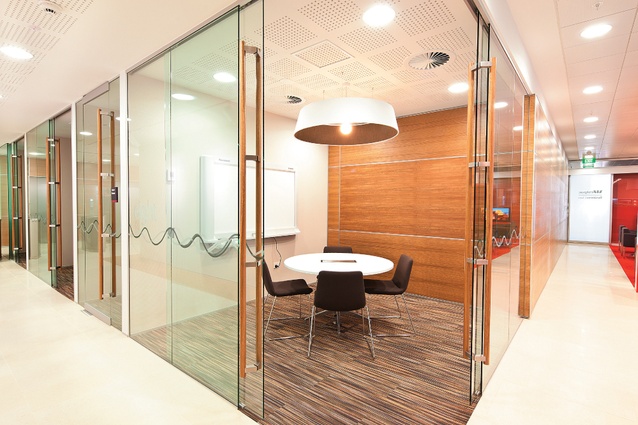
Meeting suite.
One of the executive floors on the upper levels.
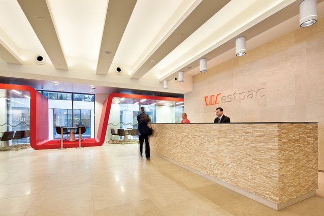
Westpac reception.
VIP Lounge.
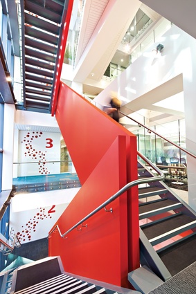
Westpac stairs.
Westpac kitchen.
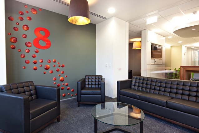
Sitting area with shells.
Six years work, an aspirational brief and an overarching theme of connectedness lie at the heart of this project’s layout of open and spacious spaces.
It’s easy when writing interior stories to focus on the outcome: rooms and spaces, work and gathering places. Sometimes you forget that the realisation of a project can be a culmination of years of effort — in this case, for Westpac and Jasmax it was six years. Six years!

It was way back in 2009 when stage one of the Westpac project was finished. That involved the renovation of Charter House, on the fringe of the Britomart precinct. Two years later, with the completion of East, the Johnson Pilton Walkerdesigned and Peddle Thorp-documented collaboration that bookends one end of the precinct, the rest of the company has finally agglomerated onto one location. Agglomerate is a good word for a couple of reasons. First, it means a collection of something, people in this instance, and much of the work Jasmax undertook with Westpac was
in defining how to give a sense of community to a collection of people, “the tribes and sub-tribes”. Second, it also means a rock produced by a volcanic eruption, a building block of a level of strata. The striation of the cliffs that formerly occupied the space upon which Charter House sits were a starting point for the designers.
The interior spaces, says Jasmax designer Sarah Langford-Tebby, are influenced by the site’s context. There are references to the connections between land and water throughout the building, and heritage imagery of the aforementioned cliff face, which depicted a number of rickety walkways connecting top with bottom, got a modern iteration in the boardwalk bridges and internal stairs that connect the café space of Charter House with the East Building. If there’s an overarching theme to this story then you might say it’s about enhancing connections — bringing hundreds of staff together from a number of sites around Auckland, and arranging them into flexible and productive modules.
Westpac’s HQ before its move was in the PWC Tower; it also had offices in Albert Street and premises in Onehunga and other suburbs. Originally, says Jasmax director Tim Hooson, two things drove the project, a couple of substantial leases were coming up for renewal, including PWC, and coupled with this was a quiet frustration that the brand of the bank, outside of its retail outlets, was physically under-represented. “The aim was to bring geographically separate business units under one roof to become ‘One Westpac’,” he says, referring to the working title of the project. “The intention was to increase efficiencies that were previously unachievable thanks to the multiple locations, and to decrease environmental impacts by restructuring and colocating all the business streams within the two linked buildings.” The project, he says, originally started under then-CEO Ann Sherry, and a “young, energised and enthusiastic group of execs”. At the time, Westpac’s Sydney head office had just undergone a similarly significant change in workplace organisation, and Sherry sought to bring some of that knowledge to this side of the ditch. A team of property and design specialists duly arrived from Sydney, including Glen O’Rorke, head of design for Westpac in Sydney. “He was effectively one of champions in Australia, skilled in looking at how they were working and wanted to be working,and good at bringing people together.” The project’s long duration meant that one of the first steps was to identify a number of easily digestible concepts that could
be easily taken up by new faces — and there were a number of executive changes throughout the duration of the project.
“Simple communicative ideas, key directives and resonant ideas were captured so that people could grab them and understand them. These were an interpretation of the aspirational brief, the key ingredients about community, connectedness and linkages; getting teams to work together.” The first strategy piece, says Hooson, was with Westpac looking at how to consolidate its leases. “What became evident was that with the exception of a couple of smaller, earlier terminations, they could get one lump terminating within a few months of each other in 2008 and another lump terminating about 2011. This was well before Westpac had considered Britomart.” The next step was a search for a developer that could produce a new building, somewhere in the CBD, at the right rental levels, that could be delivered in two stages — “that would be a win-win situation.”
It sounds a bit like needle in the haystack stuff. A tower was was out of the question as it couldn’t be done in two stages and, at the time, just two sites were serious contenders, says the architect, one down by Vodafone, the other at Britomart. For a number of reasons, Britomart was ultimately preferred. “East is a cornerstone of the precinct,” says Hooson. “The Britomart terminus and CPO anchor one end, East the other. Westpac also saw a significant social indicator in the building’s position, that is, there was an opportunity to contribute towards the rejuvenation of a part of Auckland, which I thought was a brilliant sentiment. Second, it identified within that precinct a number of highly pedestrianised creative and mixed-use businesses. That was another key, I think, to why Westpac went with Britomart — the connectedness to people and transport, in a building that was sitting on edge of a precinct that was helping to define the edge of a new creative quarter in the city. That was a pretty powerful reason.”
Despite being an Australian-owned bank, there was a directive that the New Zealand HQ should have a local feel, which is where, of course, the search for suitable reference points comes into play. “The project had to capture Westpac as a New Zealand entity; Westpac wanted to emphasise a distinctly New Zealand flavour with the fitout and we developed the notion of connecting the people to the building and the land by creating a sense of climbing through the strata of New Zealand landscape as you ascend the 11 levels of office space,” says designer Sarah Langford-Tebby. “What’s the common ground between people in New Zealand? The land. We’re all linked by where we live, and the land has a great resonance for New Zealanders.” Hooson adds that in the 80s and 90s we saw global corporates taking out corporate frameworks, including real estate — “this is how we do it, these are the colours, this is how it looks”. “I think now there’s a higher level of understanding, those methodologies don’t touch the core of people. The move in the last decade into experiential marketing and experiential outcomes. It’s no longer good enough to have a strong brand, you’ve actually got to give people and experience of what that brand is.” In essence, that means that one shoe no longer fits all.
The designers say that innovative workplaces are about a communities coming together for collective effort and success is measured in the methods you introduce to expedite that effort. The blanket corporate might have given a sense of global community, but it was at the peril of the individualism of single groups — “the sub-tribes”. “Psychologically, for people to have a strong sense of purpose, they need a sense of belonging,” says Hooson. “You relate to where you live, and where you work. Within large workplaces there are all of those tribes. Part of the expression was to give multiple identities to allow those things while remaining flexible. You don’t want to create silos by locking groups into a particular area. If we designed a floor that represented institutional banking then it effectively locks them in place. If you design a floor around another identity, like ‘high country’, then institutional banking can move within that.” Langford-Tebby says the culture within the building is reportedly flourishing, with staff embracing the individuality designed into the common spaces and taking advantage of the opportunities for social connection designed into the building — the horizontal and vertical transparency of the interior, the glazed walls of the atrium and the open staircases allow occupants to see what’s happening on other levels. And the all too important bridges reinforce the connections, linking to casual spaces that can be seen from the main circulation routes, providing new opportunities for interaction.


