Houses Revisited: The shed as read
Revisit this 2008 project where Antanas Procuta Architects (now PAUA) has some fun with an archetype in a Waikato farm manager’s house.
Why is it that farmhouses in New Zealand are usually disappointing? We have a wonderful landscape, right? We have architectural expertise in the house, right? So it should all culminate in sensitively located dwellings put together from local materials, adapted to the climate and blending in to the beautiful, untouched, 100 per cent clean, green and natural landscape. Of course, on the other hand, it could be that farms, especially dairy farms, are really highly industrialised and completely pragmatic operations made up of 100 per cent imported mammals, technology and materials, even the grass.
The latter just happens to be a rather decorous shade of green, so our nation looks at a glance to be pleasantly pastoral rather than rudely industrial. And when the farmer gets home from work perhaps he just wants to turn the telly on and put his feet up like the rest of us wage slaves. Thus our largely artificial landscape is a patchwork of paddocks sporting the same little rectangular boxes that make up the suburbs: front door; back door; three bedrooms one end, open plan the other.
So it is refreshing to find deep in Waikato dairy country a modest house for a farm manager that has a bit of fun and aims to do something not only more interesting, but more practical than usual. Geoff Lentz of Antanas Procuta Architects has produced something that at first looks like a shed among sheds but is also a very sensitively planned and successful house.
The site, near Cambridge is just off a metal road and right next to the old sheds, on a path where the hooves of several generations of dairy cows, and their less desirable by-products, have kneaded the ground to a kind of black jelly. The house is on driven piles, which means it sits up above any flood plain and is also relocatable, and the new surrounding lawn is, as you can imagine, well fertilised. The milking itself has moved elsewhere on the farm, to a new high-tech complex more centrally located.
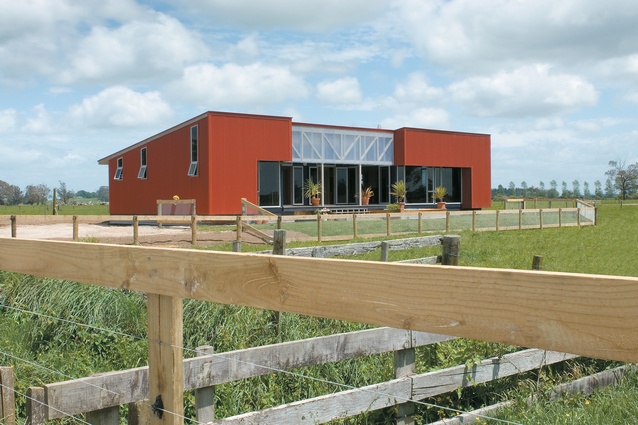
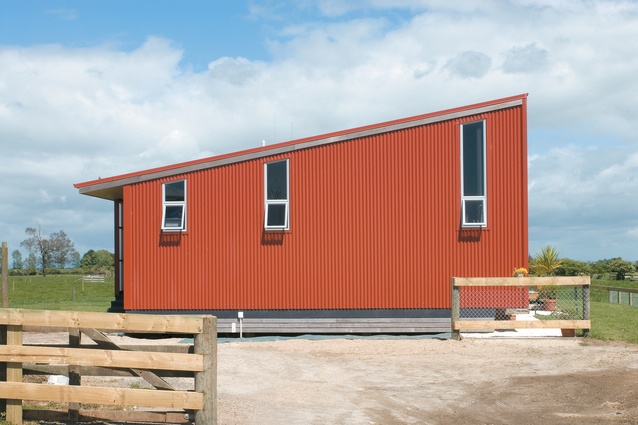
The house is a simple red box with a mono-pitched roof, all clad in corrugated iron and punctured with a couple of windows. The colour recalls the good old red oxide that has slathered New Zealand woolsheds and farm buildings for the last hundred years. None of that newfangled blending into the landscape here – this place delights in its man-made nature. Actually, at first glance, it seems quite severe and symmetrical, and the eave at the back but not on the front gives the place a kind of chippy cap-on-backwards attitude. This insouciant character would seem to swim against today’s tide of RMA-friendly, organically grown, blended-in and overtly ‘green’ houses that worthy architects are encouraged to produce, but this red shell conceals what is actually quite a relaxed and thoughtfully laid-out interior.
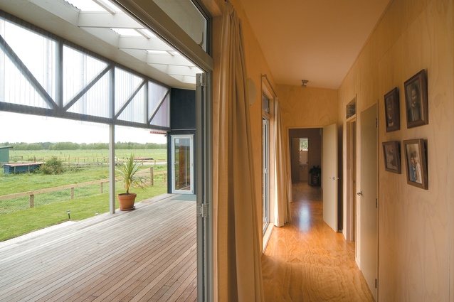
The house faces north and Lentz peels away the corrugated iron at the front to reveal a truss clad in translucent plastic sheet and a recessed deck area that turns the house plan into a U-shape wrapped around a courtyard or atrium. This is a good arrangement for both family life and work, as a farm manager’s house is also the spot where workers, contractors, agents and so on usually meet. There is enough space to gather here, or spread out and relax, keep the boots on, have a cup of tea and keep an eye on the paddocks or the road, while remaining sheltered from sun, wind and dust in what is a wide open plain exposed to the south-westerlies.
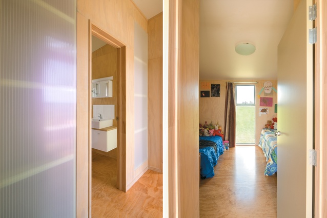
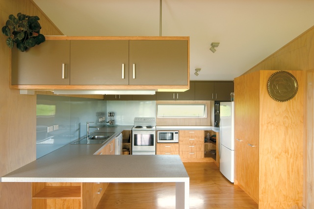
For those who live in a farmhouse, the back porch is usually the main entry and here it’s generous enough to kick your boots off, and handy to the shower, the laundry and the big chest freezer. Inside, under one big and simple sloping ceiling, the walls and floor and much of the cabinetry are blonded plywood, giving the place a fresh and natural feel. It runs the risk of seeming like the inside of a packing crate but there is enough wit and innovation here that the place feels quite smart.
For instance, access to the bedrooms is by a light and airy hall that runs around the atrium space. The walls to the bath and bedrooms have the odd translucent panel and louvres over doors to allow light and air through and provide good cross-ventilation. What is quite noticeable is a reduction in the number and size of windows to a few vertical or horizontal slots. This accentuates the atrium, the heart of the house, but also gives the living areas a bit of the feel of a snug and sheltered cave, a retreat from the weather and surrounding farm, a bit of a place to get away from it all.

Outside I like the way the landscaping, if you can call it that, has been left simple and paddockish: some limestone on the drive; farm-type fences; and a few trees planted in strategic locations that will grow up to obscure the neighbours’ suburban-style boxes.
This little house is very reminiscent of the work of post-war Modernist architects such as Vernon Brown who aspired to create New Zealand houses inspired by, among other things, the vernacular architecture of our country such as the very milking shed that’s next door here. The simplicity of the shed has also appealed to later architects such as the late David Mitchell, author of the now-classic 1980s book, The Elegant Shed, and Nigel Cook, who has conducted several experiments grafting glasshouses to woolsheds and suchlike.
This is a house that gives you faith that we can still get affordable architecture from durable, trusty materials such as tin and ply, and end up with something much better than a builder’s box or the pretentious plaster McMansions of town. There is a simplicity and thoughtfulness to the planning here, and a lightness of touch and sense of playfulness that our suburbs could learn from. Perhaps we can look forward to the return of the shed to New Zealand architecture – the shed resurgent!
Click here to see more Houses Revisited. And sign up to our email newsletters to receive Houses Revisited straight to your inbox.
Note: Since the time of writing, the architecture firm mentioned may have changed personnel, name or both.

