Colour Collab: Céili Murphy
As Interiors Lead at one of the country’s top architectural practices, Céili Murphy brings a fine arts background to the fine art of shaping cohesive, considered spaces for Architectus’ diverse range of clients.
What is it you enjoy most about the world of interior architecture?
Céili Murphy (CM): There are many things, including the variety of the work and the people, both project teams and clients. Interior architecture brings together creative thinking and real-world constraints. My background in fine arts, while working as an art director drew me to shaping ideas but I was looking for something more tangible. Interiors allows me to see concepts realised in spaces people actively experience. I really enjoy the range of project scale and duration, and the opportunity to collaborate with clients, artists and mana whenua to create environments that feel considered, relevant and connected to the people who use them. Seeing spaces evolve over time and continue to function beautifully is always a highlight.
How do interiors teams shape a project while collaborating across a wider architectural practice?
CM: Many of the projects I value most bring together architecture, landscape, cultural design and other perspectives, each shaping the whole. Interiors are most successful when involved from the very start, bringing an interior lens that helps guide conversations with clients and end users about how they want to use and activate a space. From planning and detailing through to materiality and artwork, this human-centred approach works across scales to create cohesive, considered spaces that feel alive and support how people move, connect and inhabit them.
Are there any designers whose use of colour inspires you?
CM: It’s difficult to narrow it down to a single designer as inspiration; where I look depends on the project but I frequently draw from artists, graphic designers, decorative arts, creative practitioners and natural environments. Mid-century modern often sneaks in, particularly for colour and form. On a recent workplace project, I collaborated with Andrew J Steel to create site-specific murals, adding another layer to the narrative we were building and influencing the palette across the wider project. In commercial interiors, which can already be visually busy with signage, branding, and wayfinding, I focus on using colour to create cohesion, support mood and guide experience without overwhelming.

What did you take your cues from for this collab design?
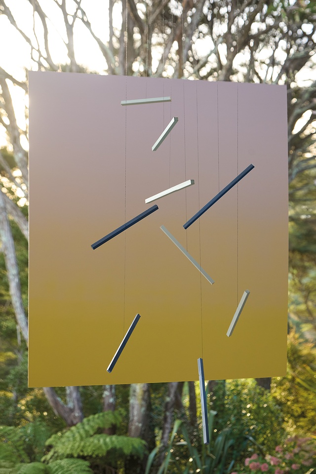
CM: My cues came from living in Titirangi, the quality of the regenerating bush, and the west coast landscape. It’s a place that has long attracted artists, and I was particularly drawn to Colin McCahon and Gretchen Albrecht, who both lived and worked there at different times, exploring horizon, atmosphere and perception in very different ways. A key painting that inspired me was McCahon’s ‘Tomorrow Will Be the Same But Not As This’, and this dialogue continues in his later work ‘As There Is a Constant Flow of Light We Are Born into the Pure Land’, which lived for many years in Albrecht’s Titirangi home. These ideas, particularly the shifting qualities of twilight and interstitial moments in the landscape, informed the palette I selected and my approach to colour as something shaped by context and experience.
What effect were you after when selecting the colours?
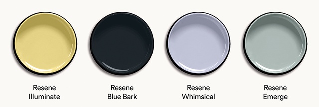
CM: Building on the cues from the landscape and the paintings mentioned, I selected a palette that responds to changing conditions and the surrounding environment. Resene Emerge captures the soft greens of the bush, while Resene Illuminate reflects filtered daylight. Resene Whimsical draws on the almost unreal tones of twilight or dusk skies. Resene Blue Bark introduces a deeper, shadowed note, and a neutral base brings the colours together. The colours are intended to shift gently depending on context, creating something calm, familiar and subtly optimistic. Seeing how these references were interpreted by the art director into a more expressive composition while retaining the original connection was a fascinating process to be part of.