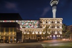
ANZ Centre
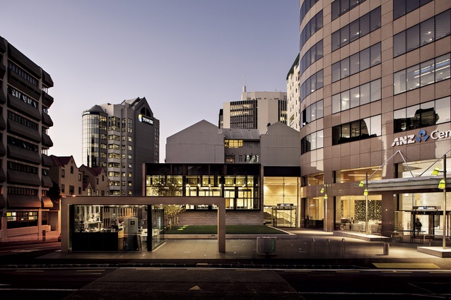
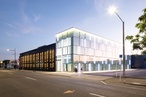
Exterior view of the ANZ Centre from St Patrick’s Square.
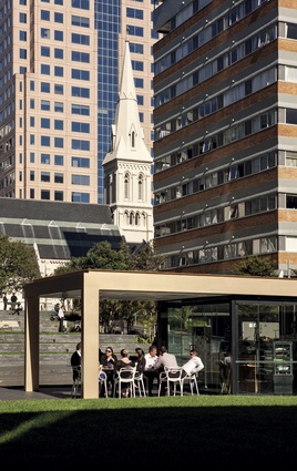
Reverse angle, looking back across a new coffee kiosk towards St Patrick’s Cathedral.
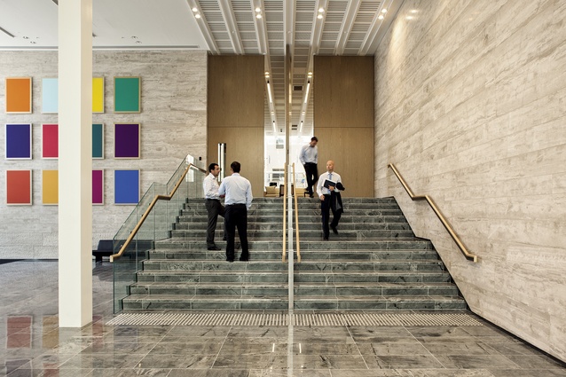
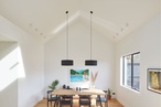
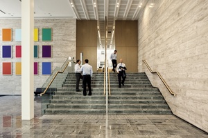
Internal access to the new pavilion, which houses an array of flexible meeting spaces.
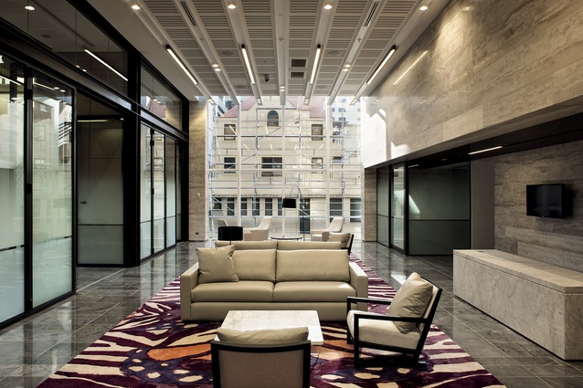
Interior of the meeting room pavilion, with rooms of various sizes off an axis that also functions as a casual lounge space.
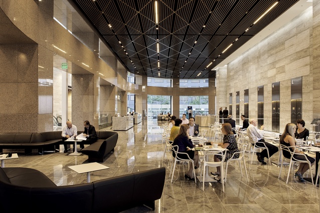
Overview of cafe seating and casual meeting areas looking towards the ANZ’s reception, with destination-control lifts beyond the subtle security cordon.
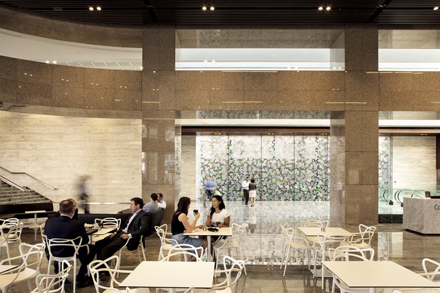
The dia-grid ceiling form is aluminium, not wood, and was employed to give enough depth to the ceiling to incorporate services.
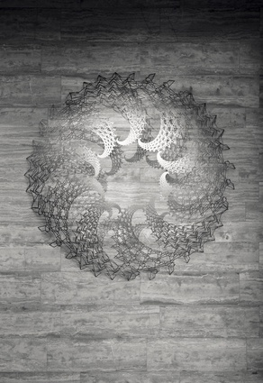
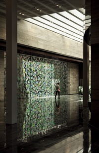
Artwork.

A work by Sara Hughes called Orangery has been applied to both sides of a glass wall which veils a firewall and the perimeter of the building next door.
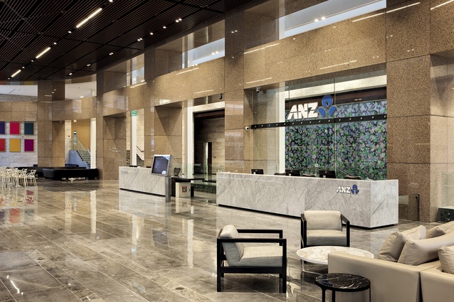
The ANZ reception, with Florida limestone reception desk. The existing cladding of the building, which was retained, is a reddish-pink stone called Rosso Porrino.
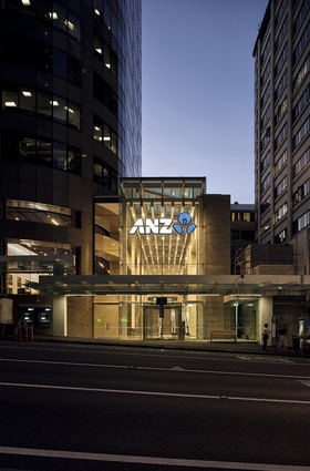
The lantern-like entance to the ANZ Centre on Albert Street.
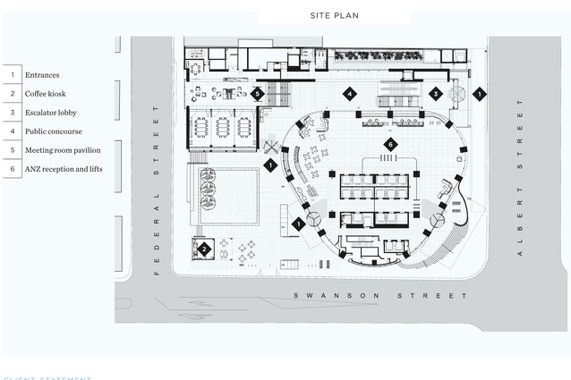
Site plan.
There are a couple of significant renovation projects happening in Auckland at the moment and while they are a departure from that thrill of the new that so often accompanies a brand new building (if they have any merit), these two projects are important because of the solutions they offer around the subject of what to do with ageing tall buildings.

One of these buildings is the former ASB building, soon to be home to the Auckland City Council. The other is still home to a bank. The ANZ Centre, now owned by Precinct Properties, was once known as the Coopers & Lybrand Tower and before that the Robert Jones Tower. This ruddy-coloured corporate edifice was for a good few years Auckland’s reigning corporate behemoth, before it was overshadowed by the Sky Tower (in 1997) and then by the Ascot Metropolis two years later.
What makes these projects so significant? Well, as is sometimes said with respect to green buildings, the greenest one you ever build is the one you never build. There’s a lot of energy embedded in the carcass of the ANZ Centre, which was designed by Australian architects from Hassell back in the late ’80s. Today, Warren and Mahoney (WaM) is working on refurbishing 23 floors of it, bringing it into line with the collaborative approach to workplaces that has become de rigueur. This work isn’t finished yet, but the ground floor level lobby, which has been significantly widened, a smart-looking meeting-room pavilion, and landscape works that jump the gap of Swanson Street to connect with St Patrick’s Square, visually anyway, are complete.
John Coop, Auckland executive director of WaM, says that at the projects’s genesis they were asked by Precinct Properties to think through ways of revitalising the tower to support the modern business methods. He describes Precinct as having a very well defined brief, a very challenging brief, but also “a great brief – a very clear strategy for what they wanted to achieve.”
It was also a brief into which WaM could provide input. ANZ is New Zealand’s largest private sector organisation, says Coop, and as such they wanted to make sure the “substance and the expression of this address matched the company’s significance”. ANZ is also a global company, with a global design point of view. Both these points led to the decision that “the right response had to be unashamedly international in its aesthetic”.
“We advocated for a strongly international sense for the architectural project, rather than being too preoccupied with New Zealand influence or a New Zealand design expression,” says Coop. “We wanted to respond to the internationalism of the building. It’s a very strong building in that sense, strong bones, clear plan, clear relationship to the site, and unashamedly a commercial tower for important businesses.”
In the final distillation, just a few words can explain the overall design objectives: “simple, clear and bold”. The architects set forth to make three or four significant design moves, to cut through a complex set of forces and a complex site.
“We wanted very clear design principles, and we wanted the main design moves to provide clarity. We needed quality of materials, and quality of thinking in the way the materials were used. And systems, the ceiling system, the canopy system, the public art programme, making sure that they were really well thought through in terms of their execution, so that we could pull it off, because it’s quite a complex piece of work.”
“If you think about the most successful corporate addresses in Sydney and Melbourne, from that period, or from the ’70s, they meet the ground really cleanly, they have iconic artworks, they have really great amenity in terms of retail and food offerings and public space.”
Coop says the best precendents when undertaking this kind of work are in Australia. “When we go to Sydney or Melbourne… we look to other precedent projects. I think about the work of Harry Seidler – Australia Square, the MLC Centre – powerful corporate addresses that do all the things we’ve talked about.”
Richard Archbold, the project architect on the job, says that from his point of view one of the biggest issues at ANZ was maintaining and, where possible, enhancing the clarity of the existing building.
“Because as a tower to ground it’s really rare in Auckland. It’s not on a podium; it doesn’t have something obscuring those views all the way up. So this perimeter, this colonnade, is fundamental.”
Archbold says part of the brief was to ensure that the new lobby was spatially more generous, better acoustically, and that the spatial flow worked better. Also, the security requirements of the tenants were addressed. “It just wasn’t functioning that well. This immediate space needed to be clearer, simpler, more generous, relate to the outside better, be more welcoming, and from a servicing perspective, the acoustics and cooling and heating need to be better.
In terms of material choices, Archbold says the starting point was the existing cladding of the tower, which was retained. “It’s a pretty ubiquitous late-’80s material called Rosso Porinno. This building, the Gen-i, and a number of others from this period all employed it. You start with a material like that as a base line and then you try and use high-quality natural materials and limit the palette to essentially floors and walls. The ceiling is not going to be stone, so we’ve got another material choice there and, functionally, we need depth in there to provide fire services and acoustics,” he says.
Coop adds: “From a design perspective, we needed to find a balance between the substance and seriousness of what goes on in this building; however, we also needed to achieve lightness and a level of delight. I think the material selection of the limestone was an important counterpoint to the ceiling design, and we reused the carrara marble in the property, and the art programme was an intentional move to enliven the building, bring some colour, but do say in a way that didn’t complicate the design itself, the fabric of the building itself.”
A second aspect of the brief related to giving the building a “strong address” by clarifying its main entrance.
“There are multiple entries, but ANZ needed a front door, and we’ve created that on Albert Street. This is highly a transparent beacon, a lantern, a legible and strong front door to welcome you in and guide you up. As part of that we needed to create a dedicated meeting suite for ANZ that met their global design standards and enabled to host clients in neutral territory. Where they could look out onto the city, have events, and have a high degree of flexibility. Bigger rooms, smaller rooms, operability.”
This flexible meeting space is located the place of a small pavilion, which was there before.
A final step, says Coop, was a more ephemeral brief – the brief of the city. “How do you actually do all that as a private sector project, but do it in such a way that the needs of the public are also accommodated in terms of maintaining the integrity of the through-cycling which was there originally as part of the project, to genuinely enable movement through the site diagonally and actually, making the project an enriching one for the city around it.”
Coop says that if you look more broadly at Auckland, there’s the bigger issue of Federal Street, whose spaces are currently no match for those streets on the High Street side of the city.
“How do we humanise this side of the city?” he asks. “If you look at Hobson Street, Nelson Street, Albert Street – they’re tough. They’re really tough environments from a pedestrian point of view. The council has a really clear agenda for humanising Federal Street and you can see that in the shared space project with Sky City and you can see it in the fantastic outcome at St Patrick’s Square. Precinct Properties wanted to play their part in this, and follow through on those successes with this project, and really continue with the making of Federal Street into a really strong pedestrian access, ideally, in the long-term, all the way down to the water.”
At ANZ, Coop and Archbold point to the addition along this northern side of the building as a device to support those needs. This new structure occupies what was previously a “very cold, slow space”.
“The perimeter of this lobby was four-and-a-half metres in from the columns, so where we are sitting now would have been outdoors,” says Archbold. “It was a very challenging entrance and a very busy foyer. There used to be a five-metre drop to a windy, unused, through-site link, which was bordering on dangerous. We’ve transformed that and turned into a positive. We’ve restored the intended connection; it’s now a safe, inviting and bright route.”